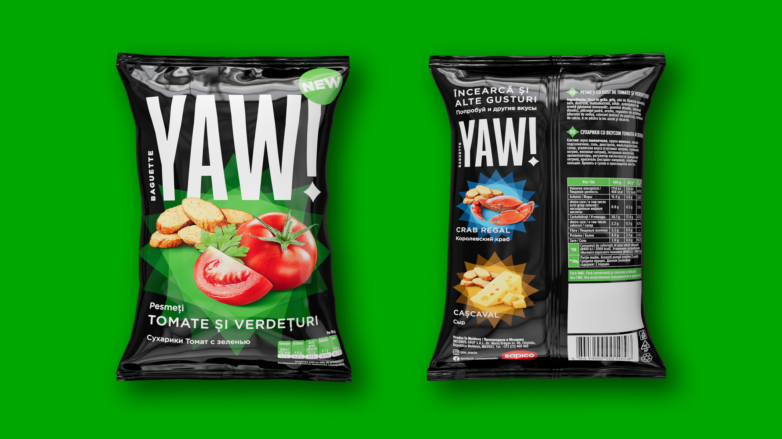
ONE OF THE MAJORsnack producers in Moldova—Sapico—ordered brand creation for extruded croutons with bright popular flavors not only for the domestic market but also with export ambitions in mind. |
WOW—we’re taken with such challenges; besides, we love the future brand’s name proposed by the client. YAW translates as “wow” from Romanian. It’s all about brand impression, brand challenge, and brand audacity— it offers everything the target audience—young people—likes. We developed brand positioning and found common features between zoomers and millennials. They’re just rushing into adulthood, want to feel cool, have style, communicate, and hang out. They’re active users of slang, so we tried to find a common language with them. After YAW, we added “Norok!” (Good luck!) to positioning. It doesn’t matter how much money you have if you want to be YAW. Grab your croutons and join the YAW people community! We mixed 99% of style and chic with 1% of carefree stupidity in there. |
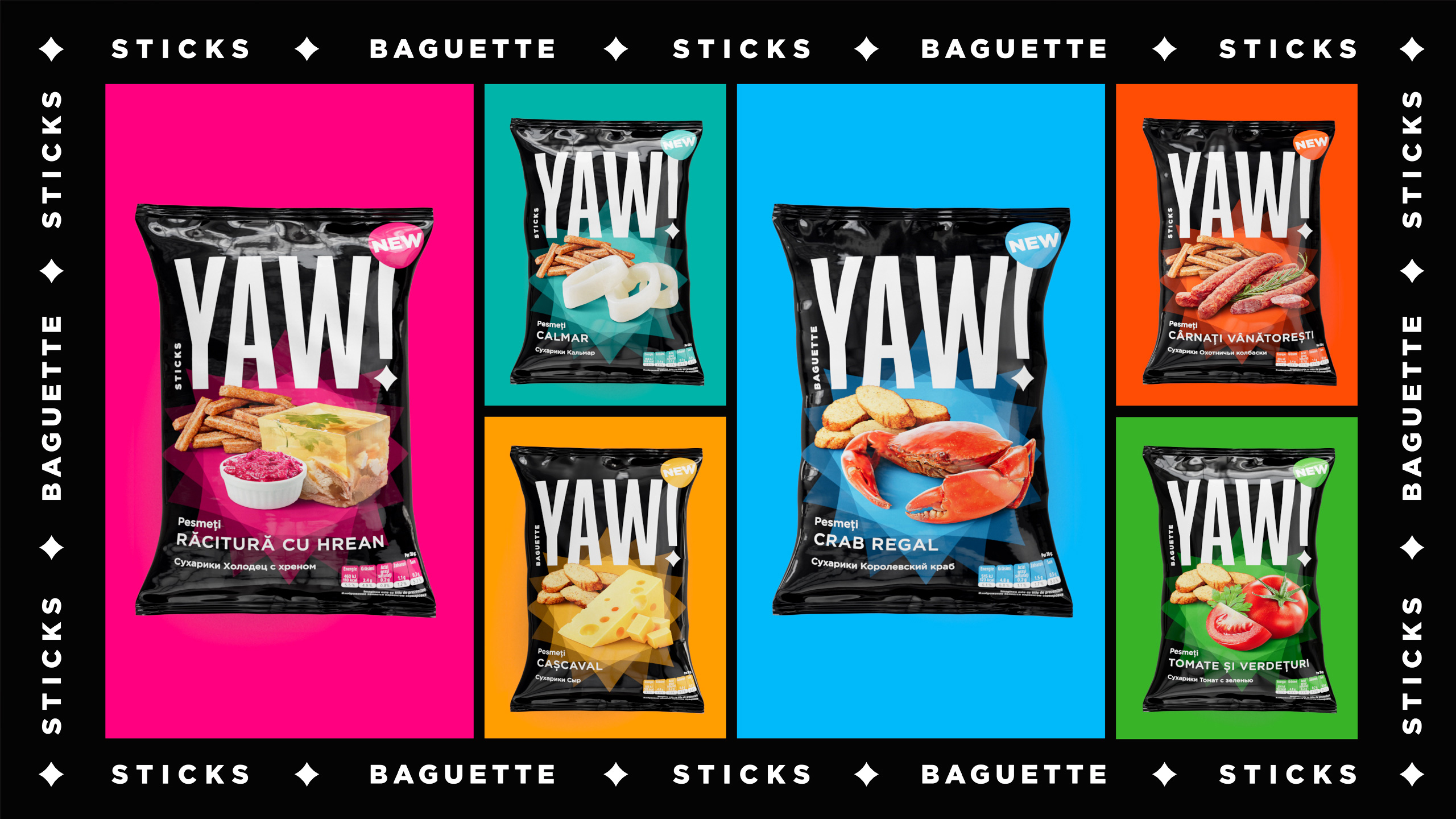
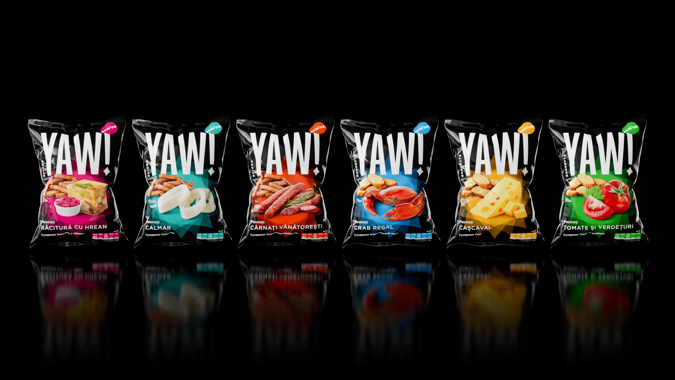
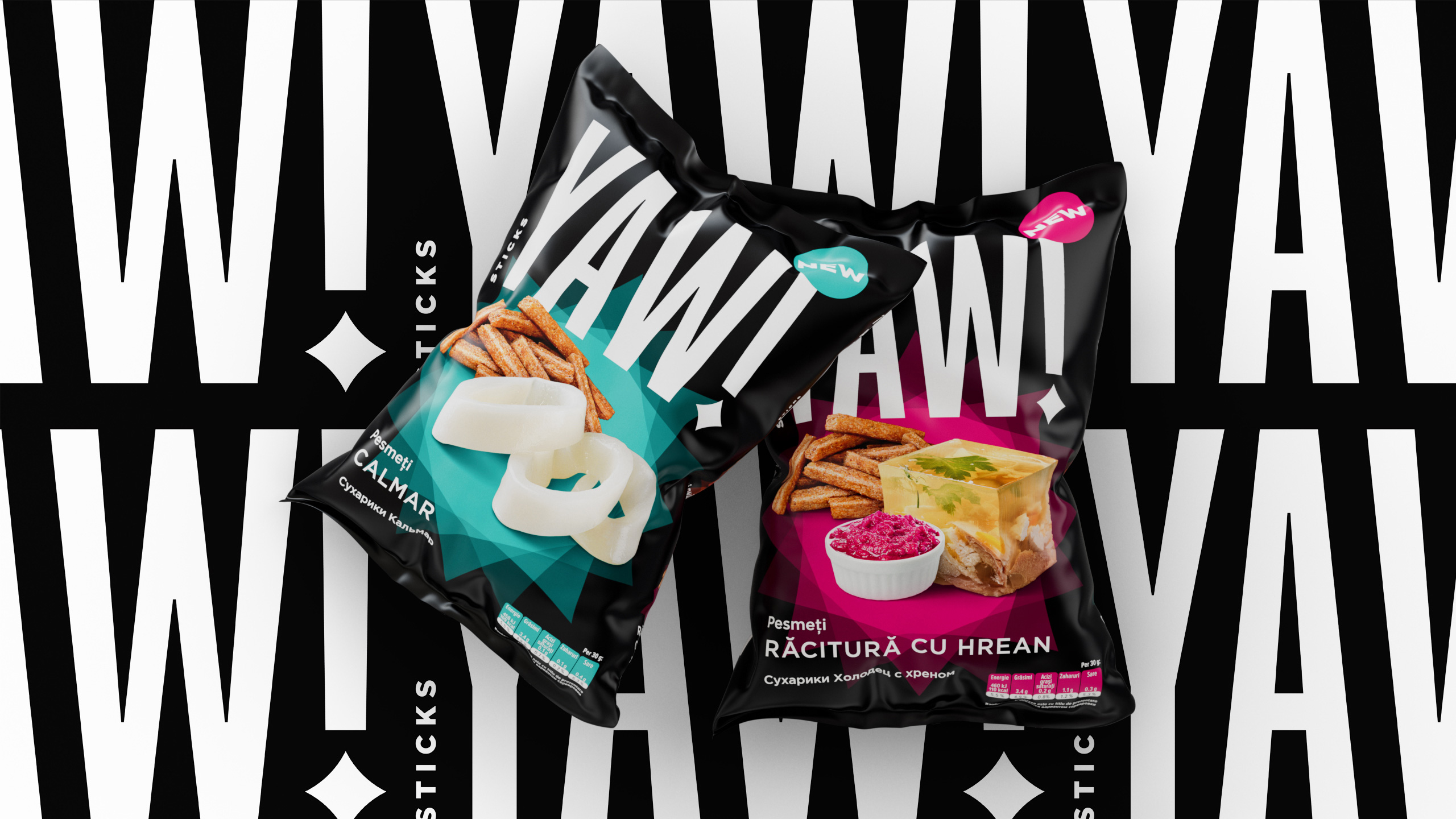
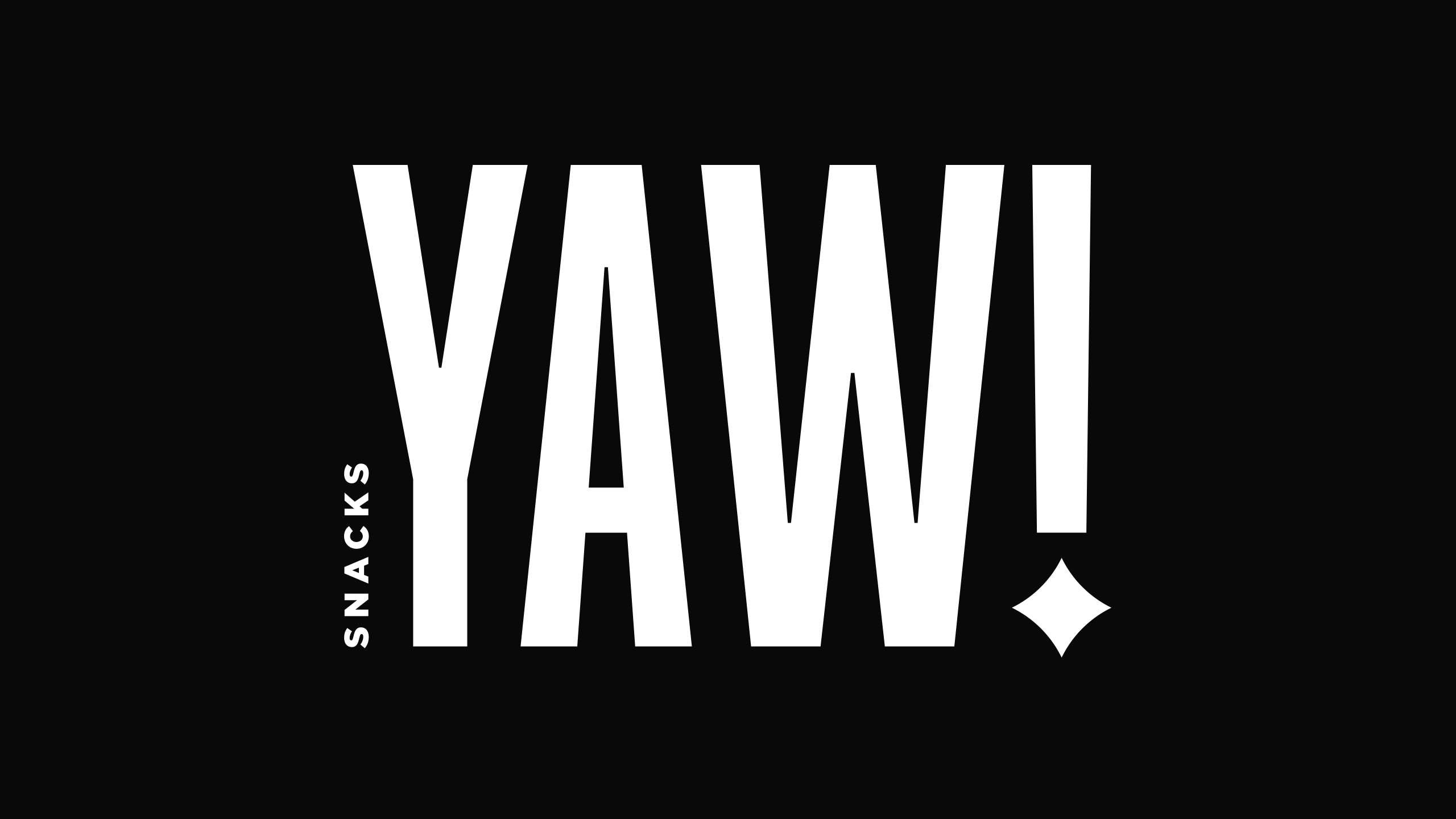
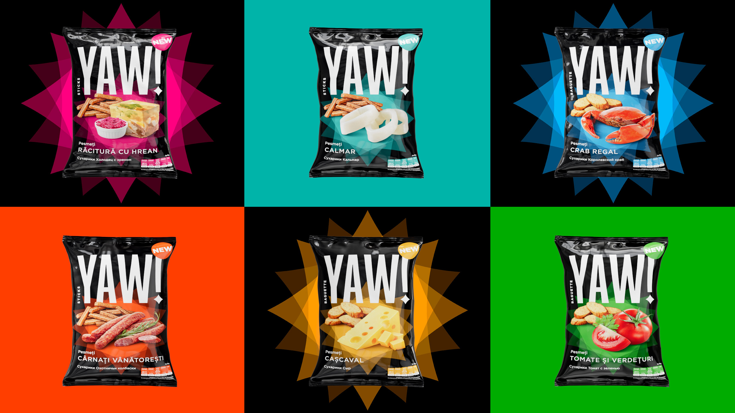
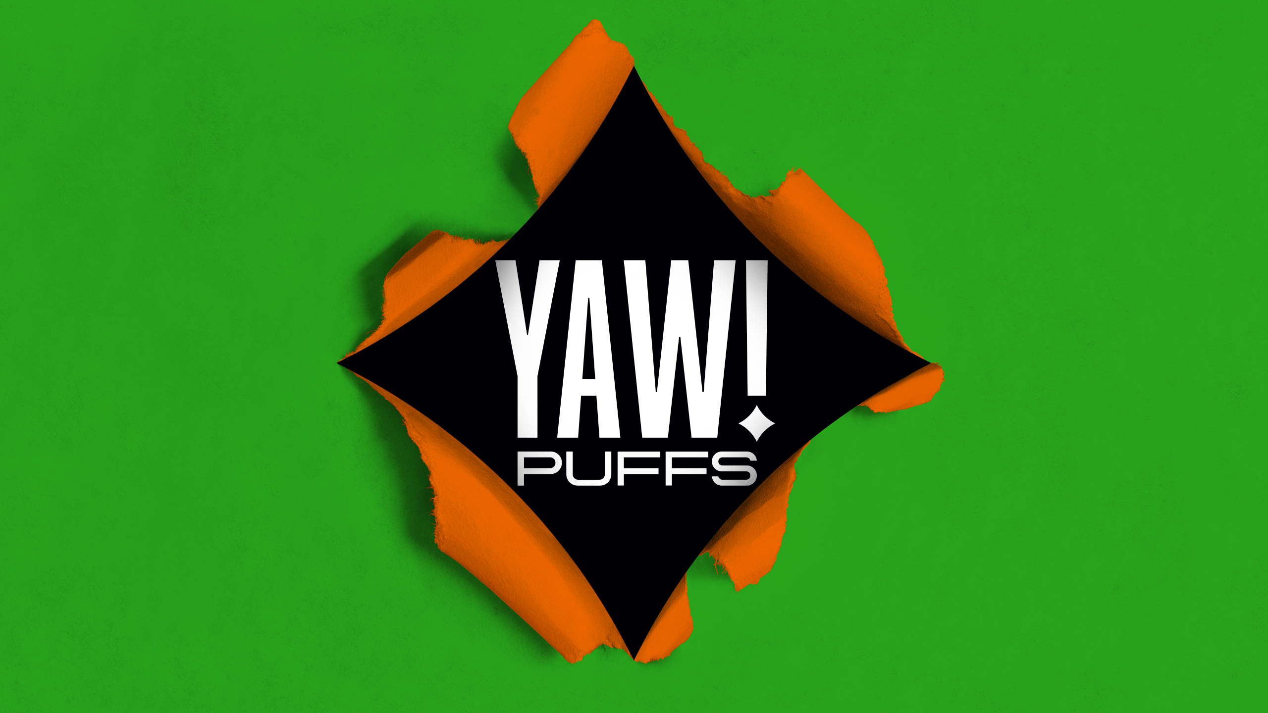
PERIOD!The period in the exclamation point forming a part of the logo turned into a corporate star figure that converts into a light show and illuminates the stage where the flavors of food zones rule: crab, squid, tomato, or “cheeeese.” It’s like a small keyhole you can look into and go through a portal to the backstage of new experiences. Black is, of course, the new black. It’s the color of youth parties, cinema screens, and the like. |
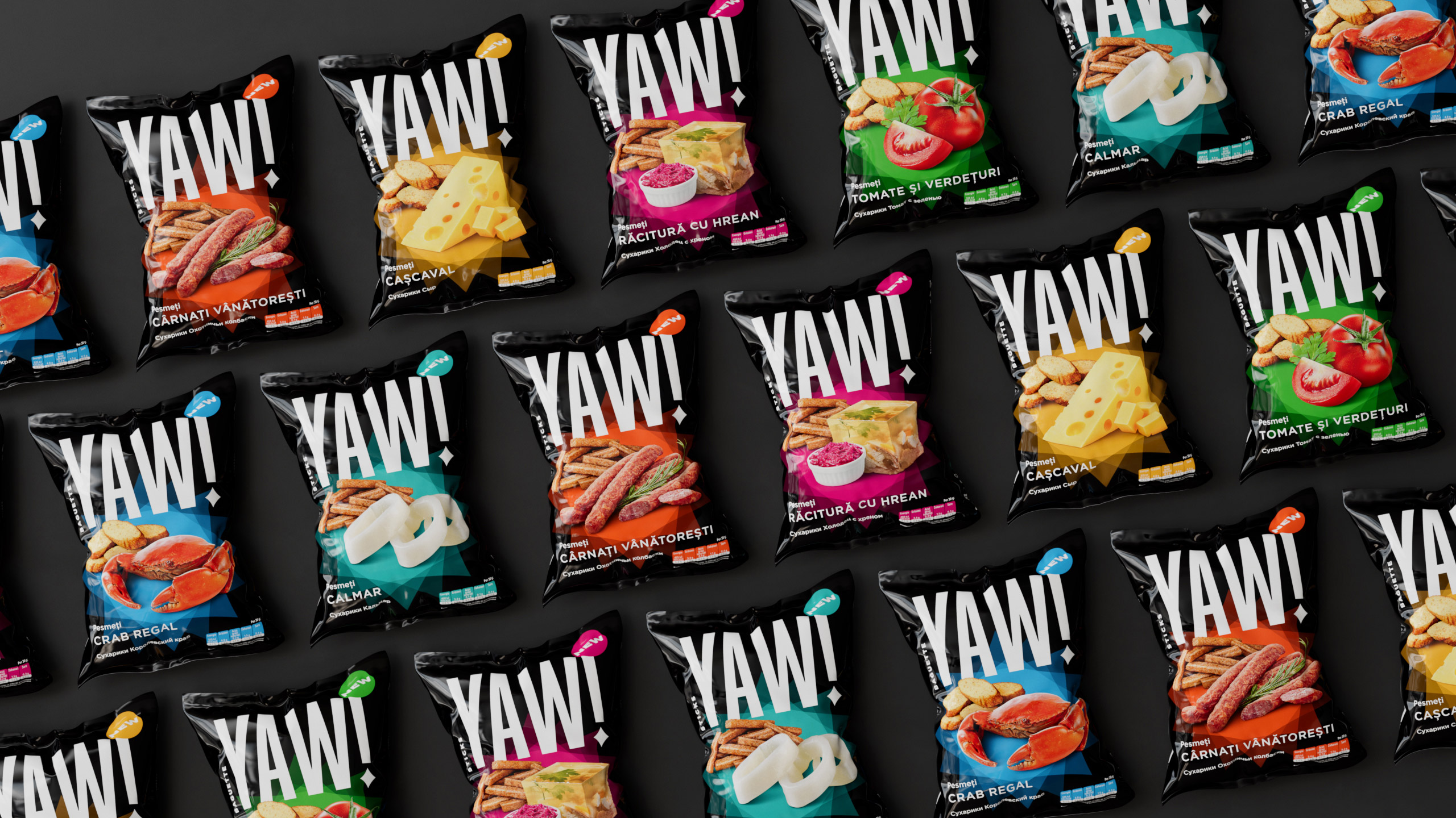
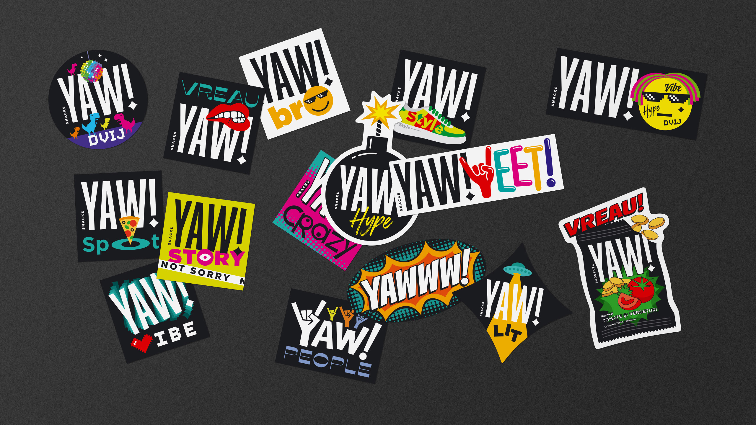
STREET FOODis a convenient thing not only when you’re quietly chilling somewhere, but also when you move forward on your business. For that reason, we created a visual YAW language—a sticker pack for self-expression and finding your people out there. You can now make YAW out of any situation or thing. |
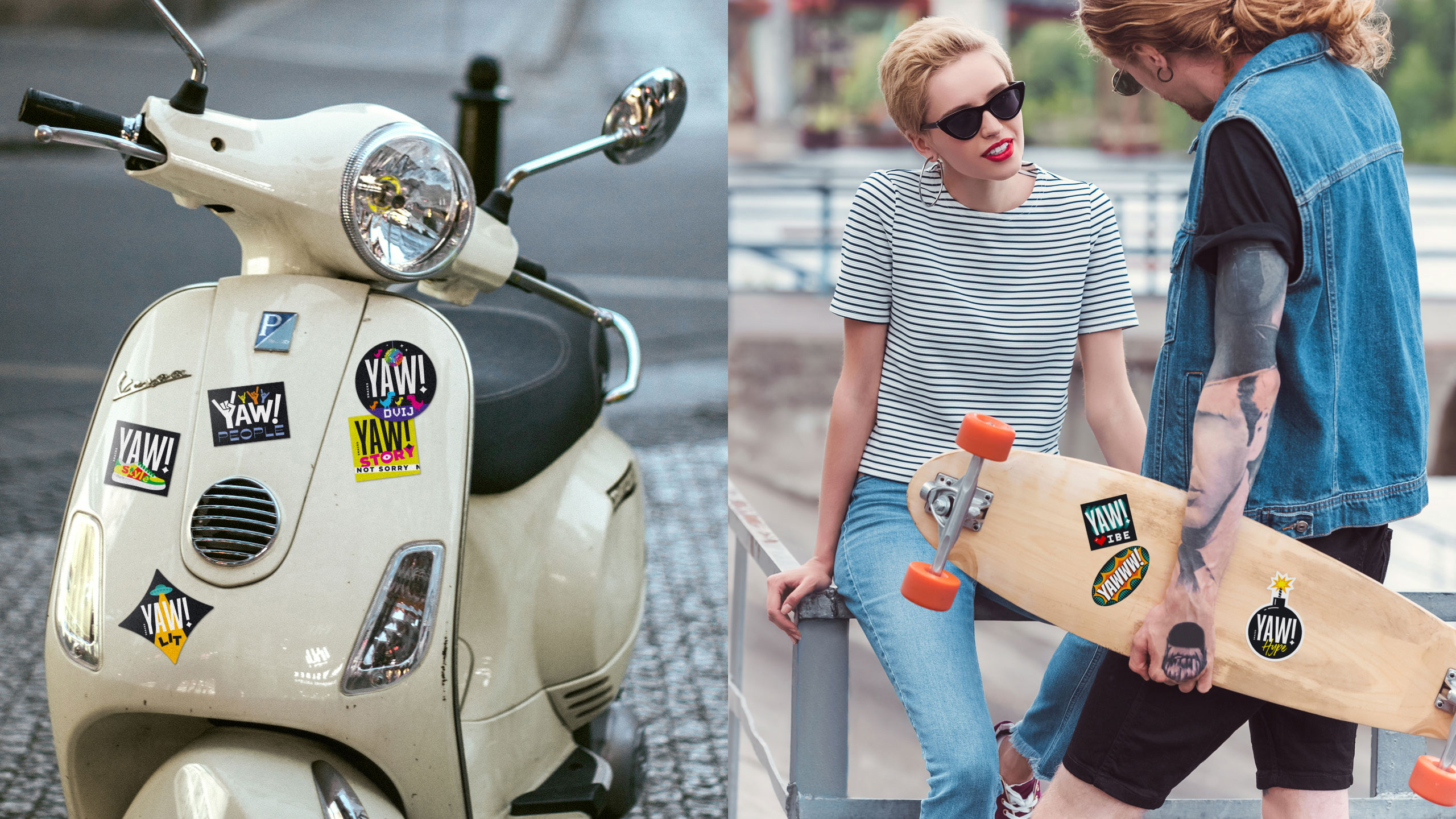

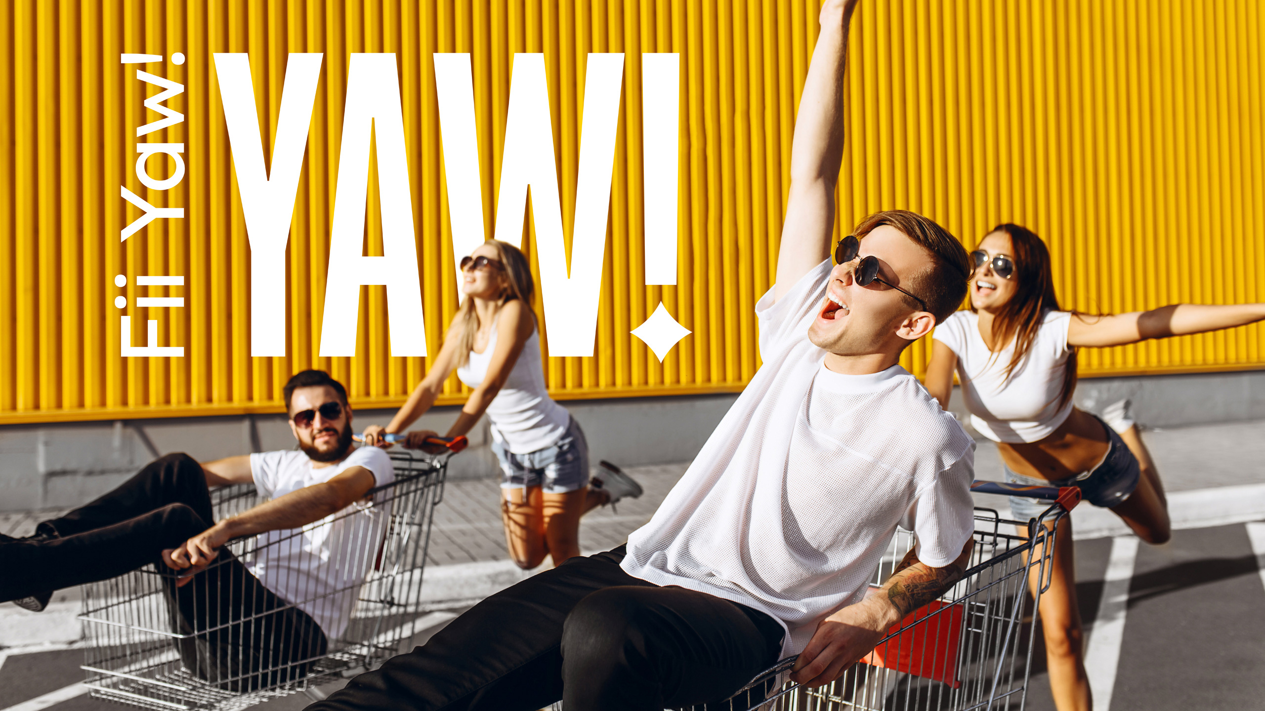
FII YAW!It sounds a little elvish, but this is the slogan we came up with for brand communication campaigns: be YAW! In a cool car or supermarket trolley, with branded merch, or just with friends—enjoy colorful YAW packaging. |
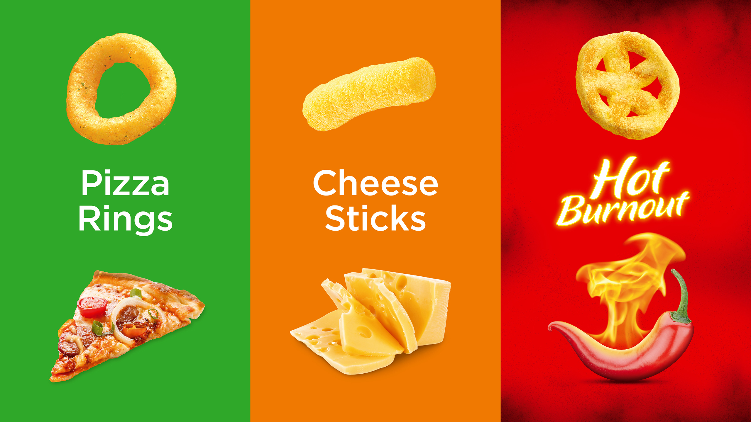
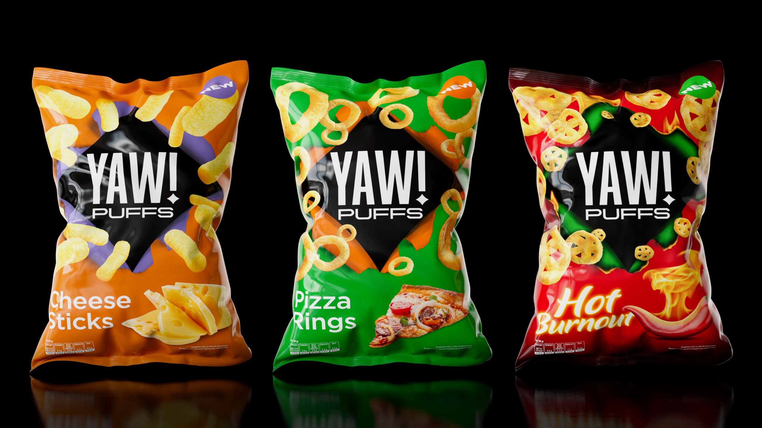
YAW SEQUELis the second line of products branded as salted corn snacks. The overall design turned out to be more explosive, but the familiar diamond sign magnetizes a logo-centric visualization that’s filled with bright flavors and colorful backgrounds. Once again, the package center seems to be pulling us into a parallel universe. |
ProjectCreative Director: Мaxim Lesnyak |
CaseDesigner: Anastasia Churbanova |