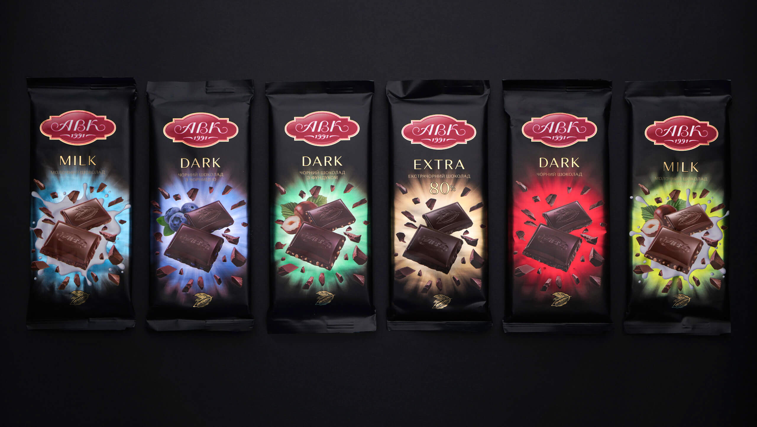
AVK. THE DELICIOUS CASEHow to make a delicious product look delicious? How to strike the eye with quality? AVK, chocolate market leader, approached dozen with these questions. So we went into redesigning the chocolate bar itself. |
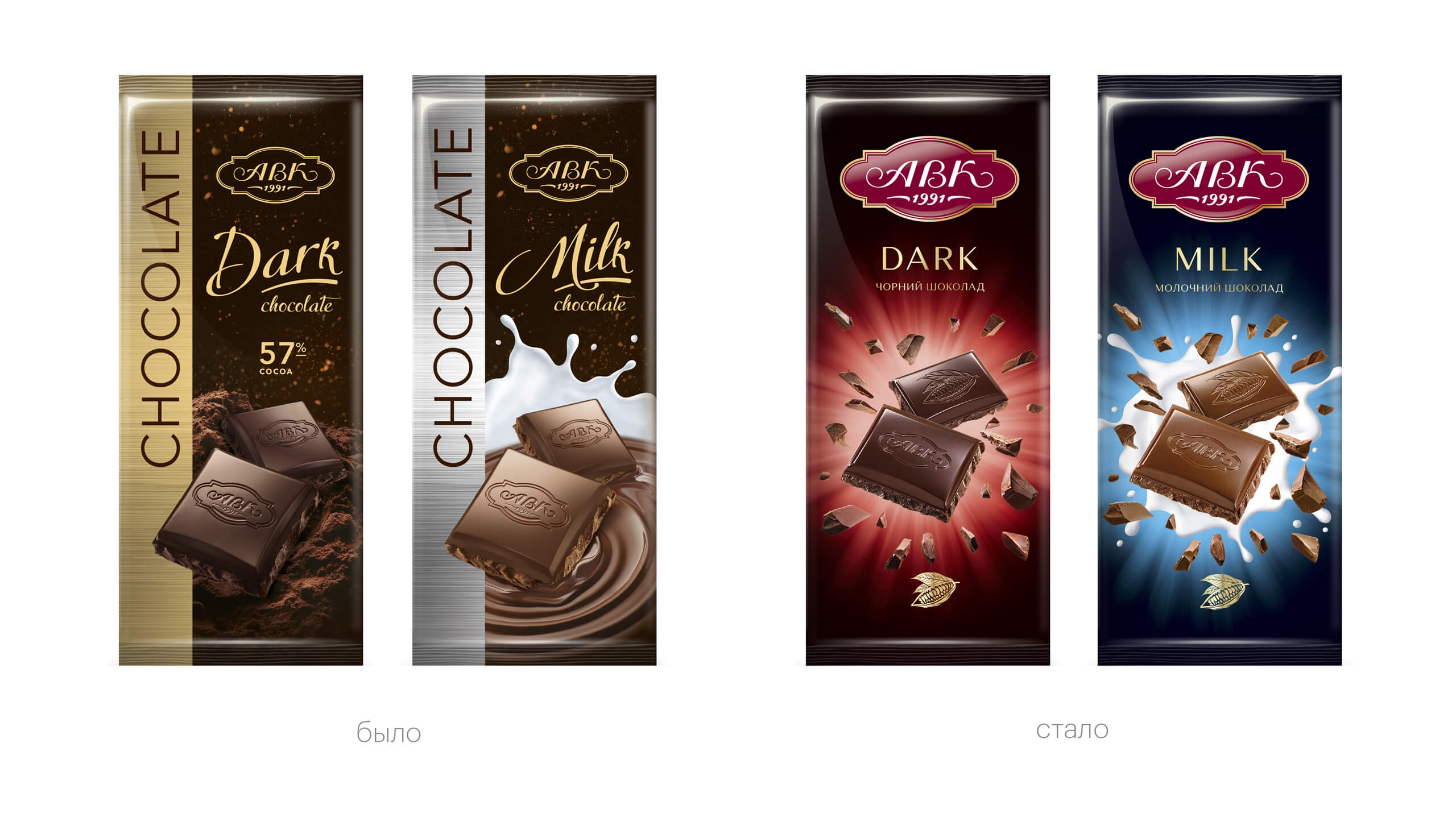
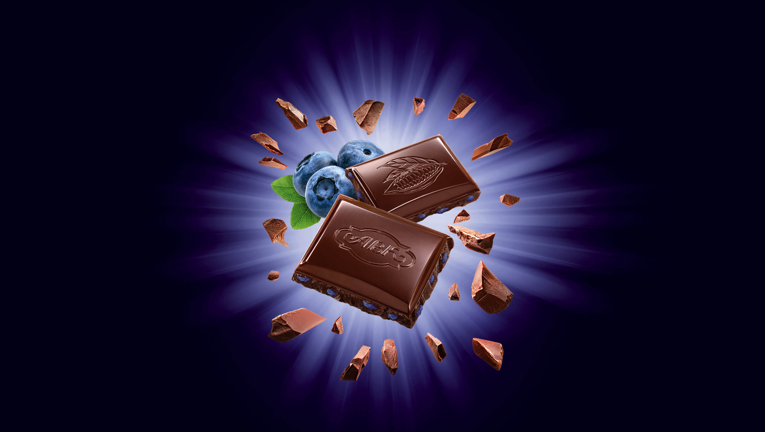
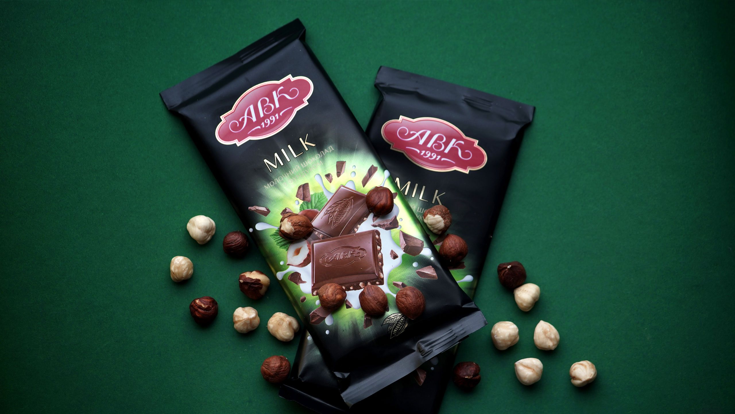
IT’S SO SADwhen a good product gathers dust on the shelf. What we needed was the outburst, color, and joy of discovery! We designed a chocolate bar that jumps off the shelf right into the buyer’s hands. |
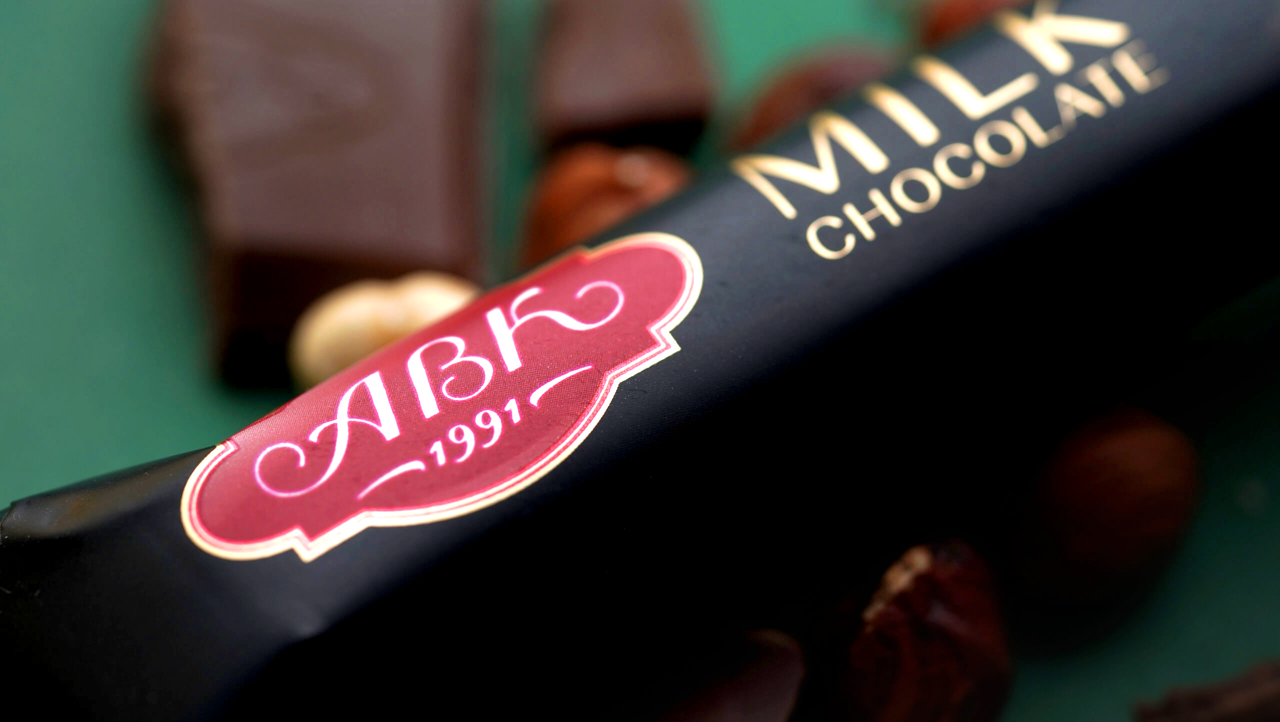
THE KEY ROLEin the new packaging belonged to a once indistinguishable but now appetizing product, and a once semitransparent but now bright, magnified logo. The chocolate quality mark as we know it was back in place. A new differentiation system helped you instantly pick out your favorite taste on the shelf. (By the way, black chocolate with blueberry is our favorite.) |
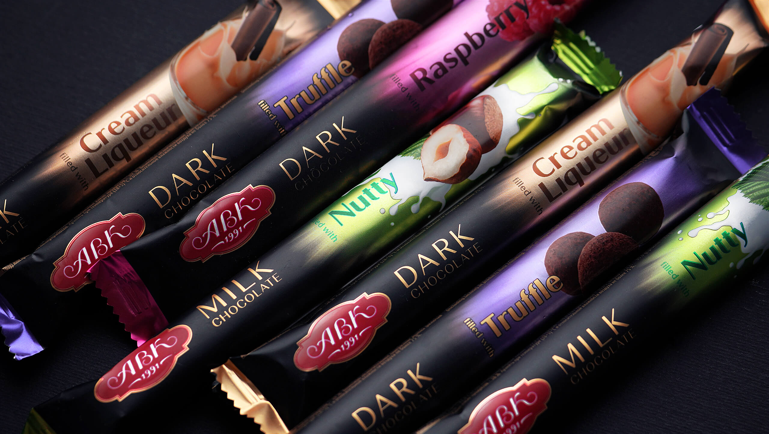
FOR EYES TO DEVOUR.That was the intended purpose of the design of the chocolate sticks. We needed a product that would instantly trigger the release of the happiness hormones in the till-sales zone; otherwise, no one would ever buy it. The packaging design was centered around the tastes, fully illustrating the real pleasure the chocolate promised. |
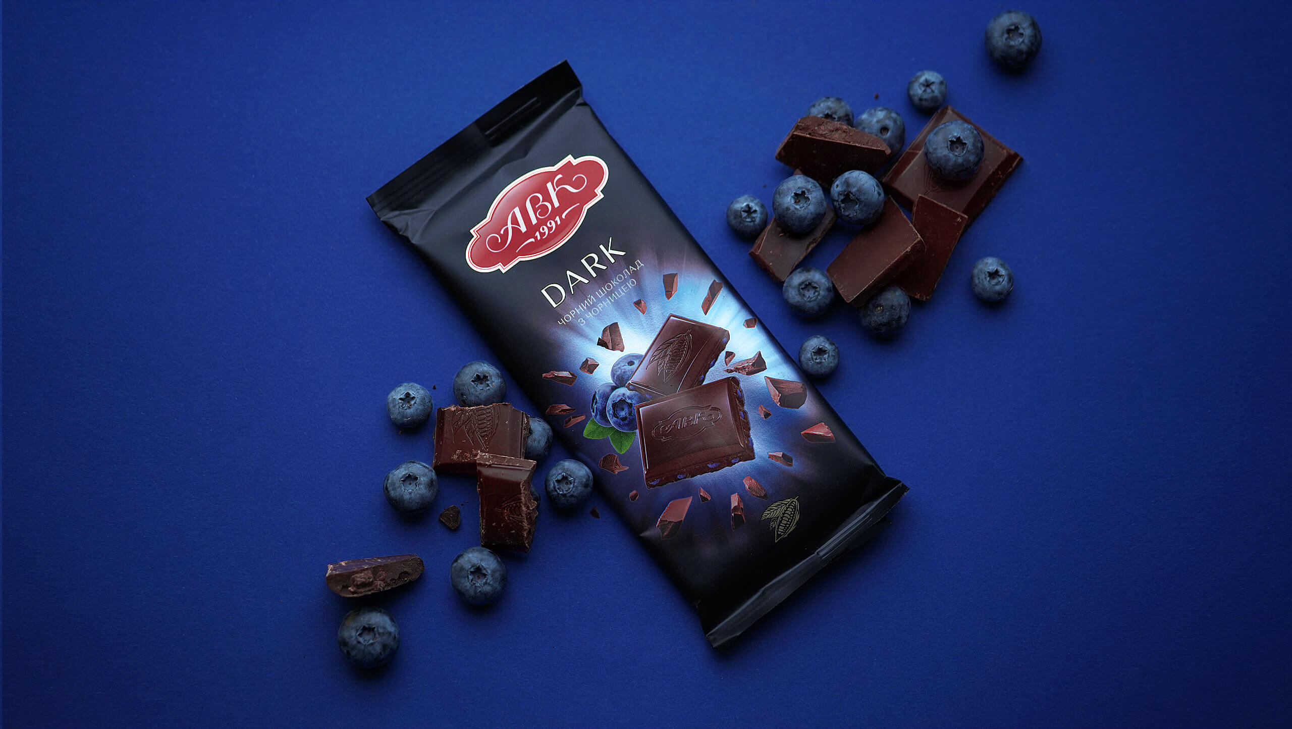

MORE THAN JUST A CHOCOLATE BAR,but the basic product of the AVK brand, powerful enough to set the style for all other chocolate products. We don’t have to worry about the foundation of the brand anymore. The AVK craftsmen will keep on creating their chocolate masterpieces, while the packaging experts will keep on creating theirs. |
