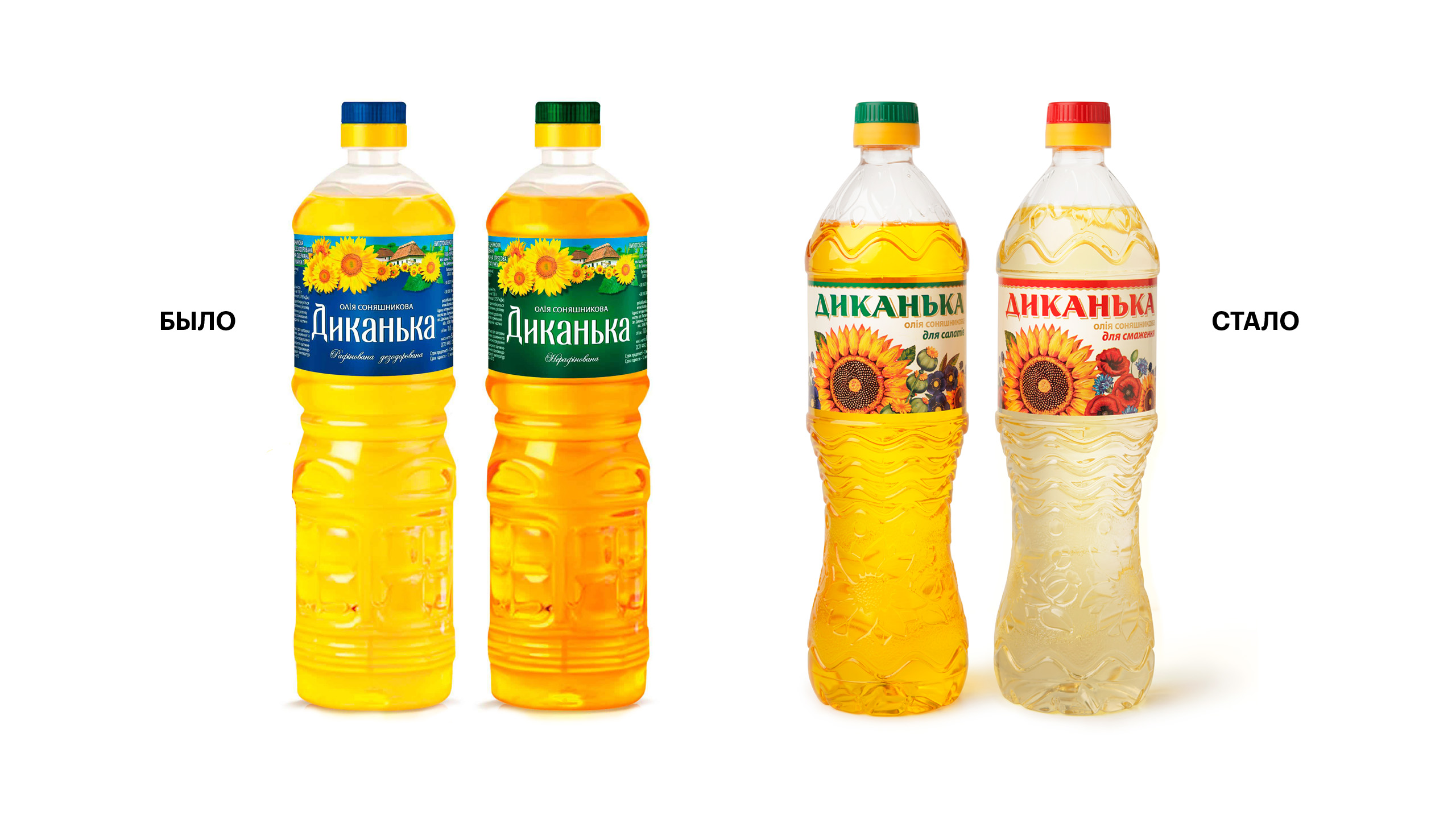
NATURAL FRAGRANT OIL,made of environmentally friendly Poltava sunflower, is produced by Ukroliya LLC. Dykanka is one of its locomotive products. It had won its customers long ago, and all it needed was updating the design. Why? The manufacturer itself has grown, and its customers’ expectations have also increased. We needed to add to its modernity, but at the same time preserve its cordial character. |
DURING THE RESEARCHwe found out that the main person for the brand was a bright house-proud woman. She loves guests, appreciates comfort, and wants everything nice around her. Her kitchen is the main area of the apartment, and the cooking ingredients are the decor. A bottle of sunflower oil should not only be functional for her but also aesthetically complement the interior. |
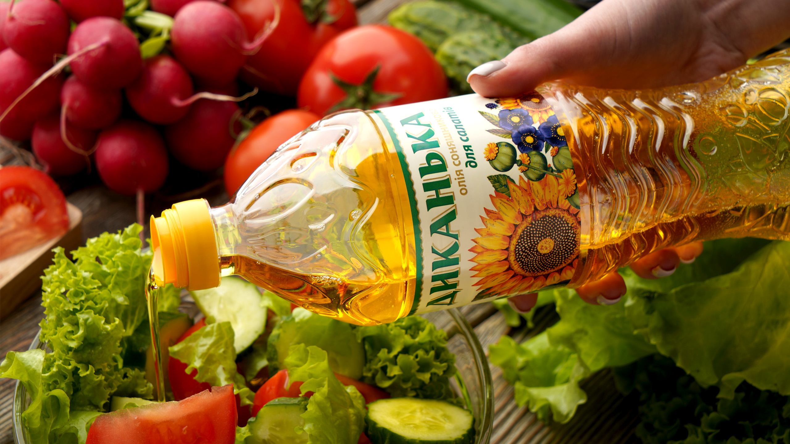
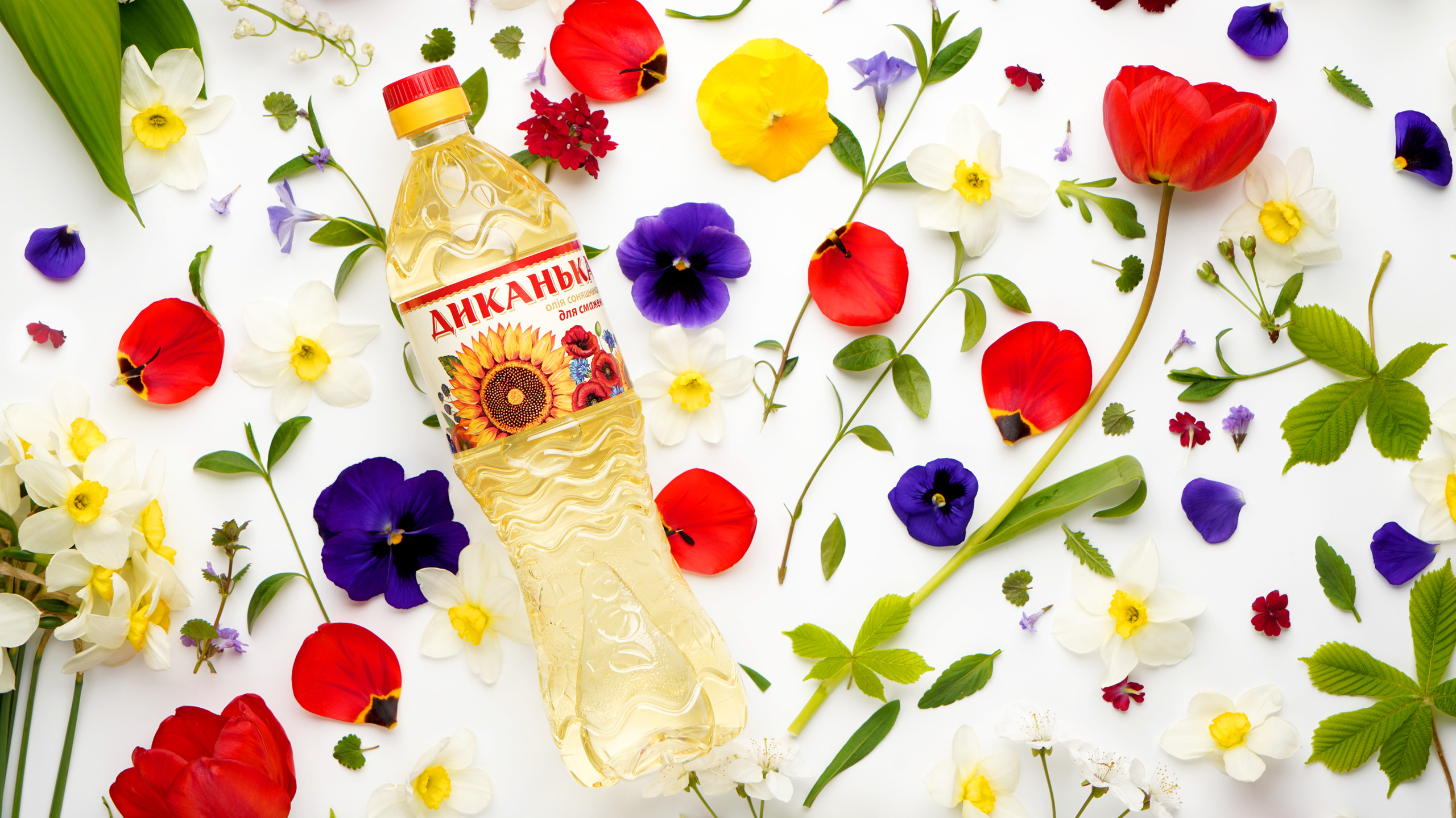
TABLE DECORATIONwas chosen to be a bouquet which looked as if it was gathered on the Poltava boundless steppes—the symbol no less Ukrainian than little houses of Hohol’s Dykanka but brighter and more emotional. It corresponds to the customers’ preferences, highlights the product on the shelf, and conveys the characteristics of naturalness and aroma. |
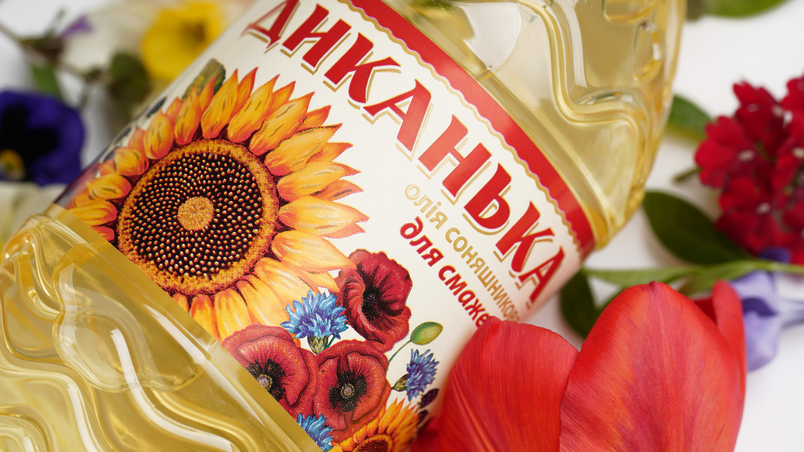
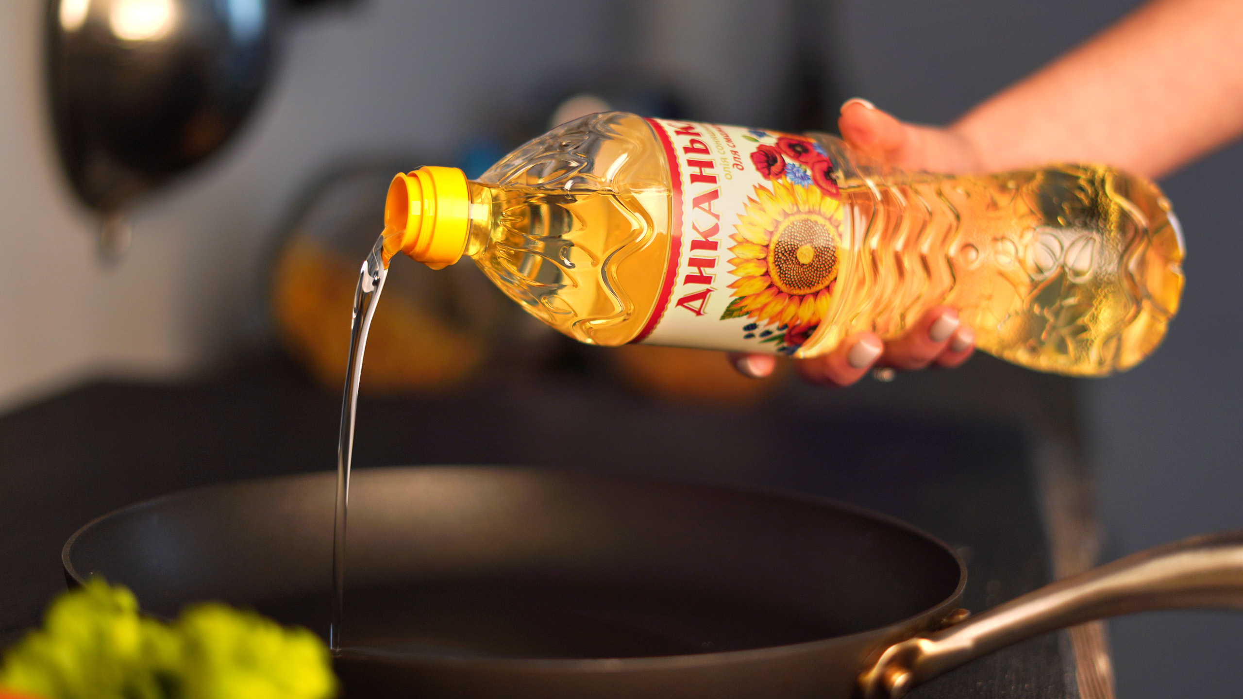
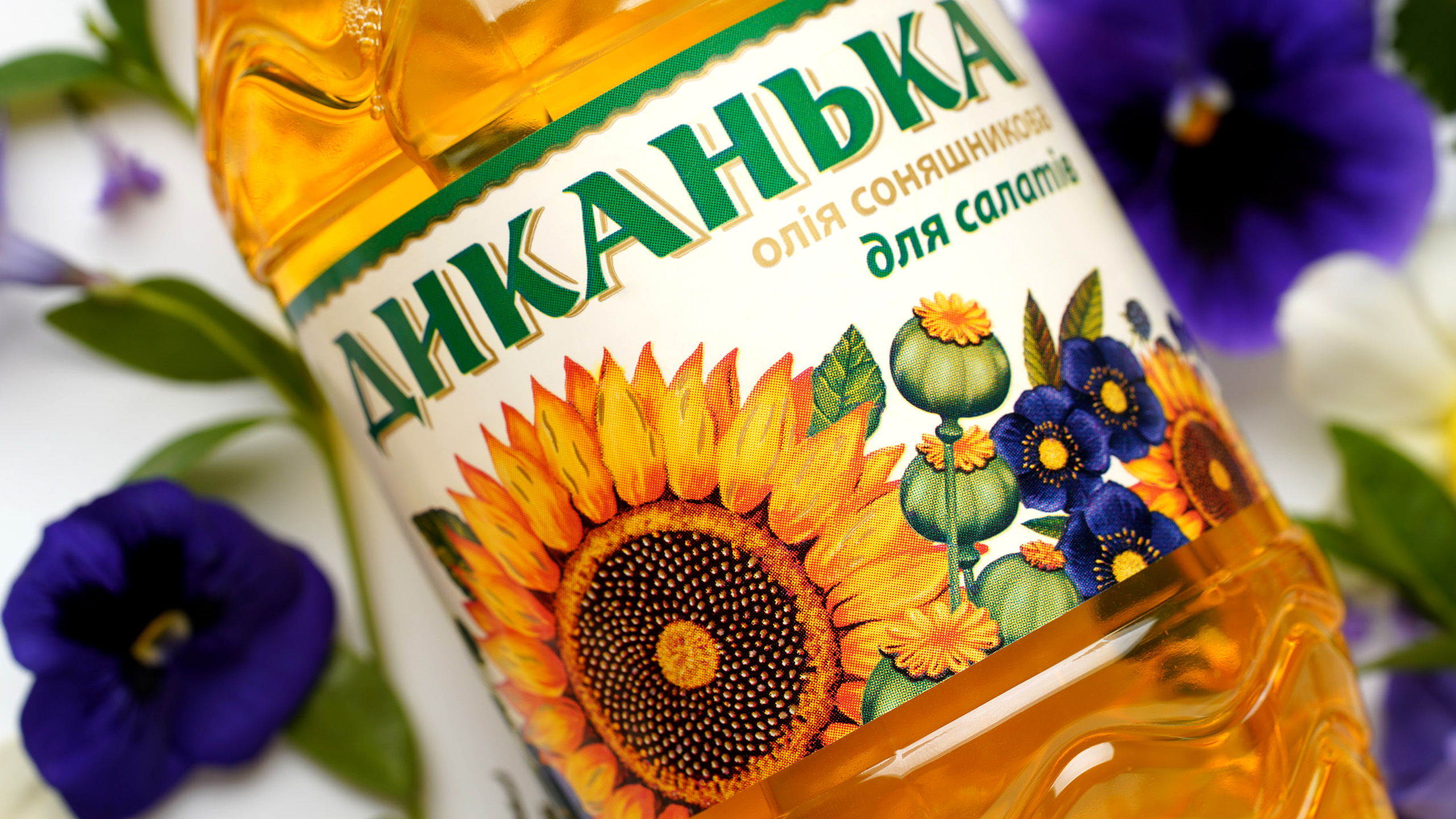
THE BOUQUET CONCEPT HAS DEVELOPEDon the bottle itself as well. The label is framed with an embossed floral pattern. Additionally, we have added stiffeners, applied shagreen for pleasant tactile sensations and sun protection, and also formed a bottle waist for comfortable holding. The sunflower stopped performing an exclusively utilitarian function and became a decorative element. It helps the audience get through the ingredients but does not merge with the mass of the same type images. |
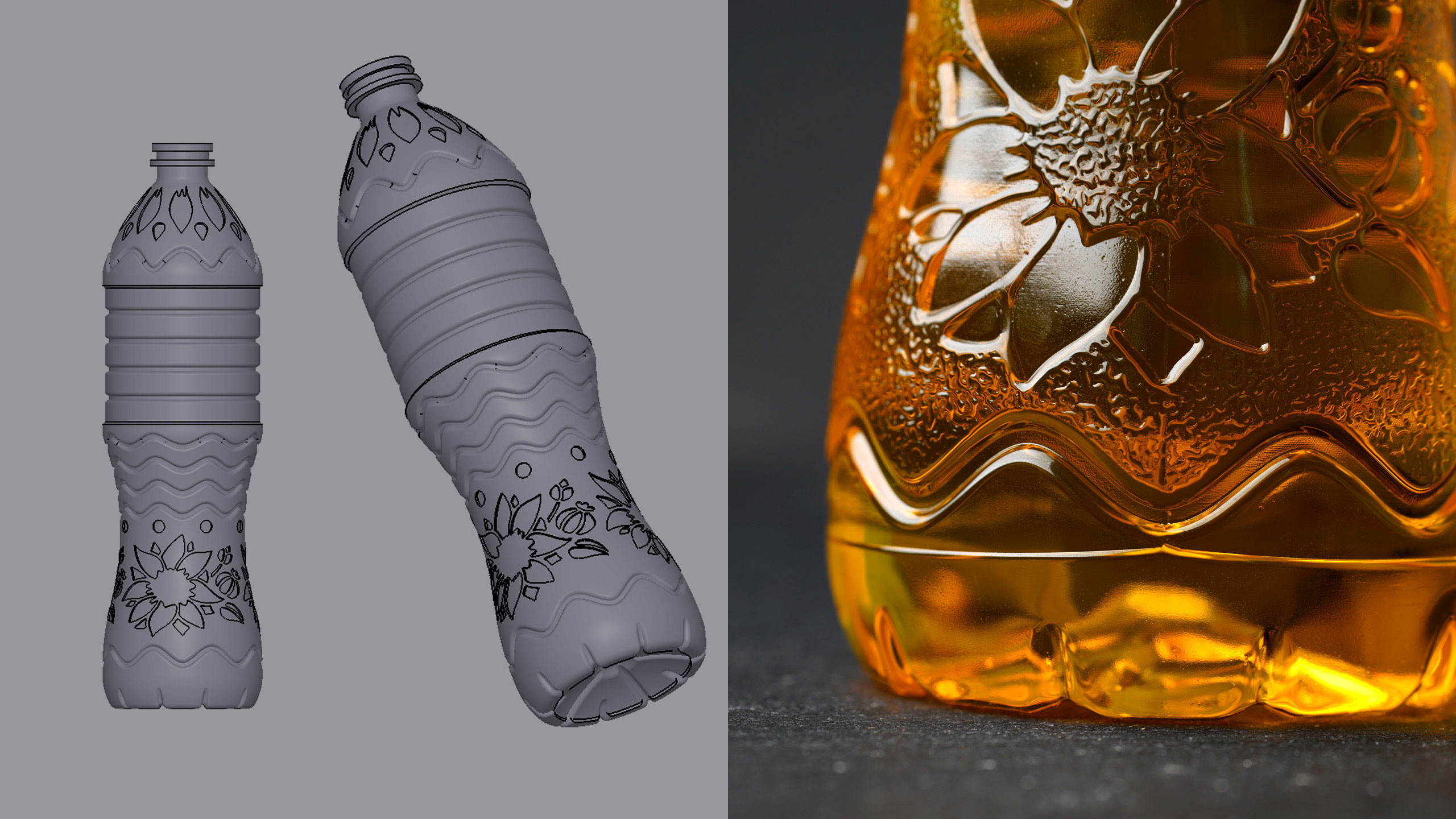
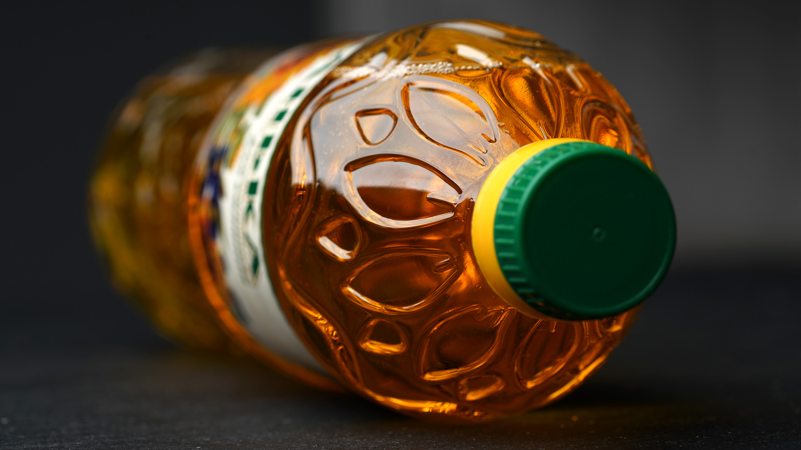
AESTHETICS AND ERGONOMICSwent hand in hand in that project. We faced a truly mathematical task of how to change the bottle shape to match a new concept but keep the label in the same place so that it would not be necessary to retool the plant. A new design has answered that question, and they have immediately begun to produce Dykanka in a new format and, moreover, deliver it to stores in beautiful boxes. |
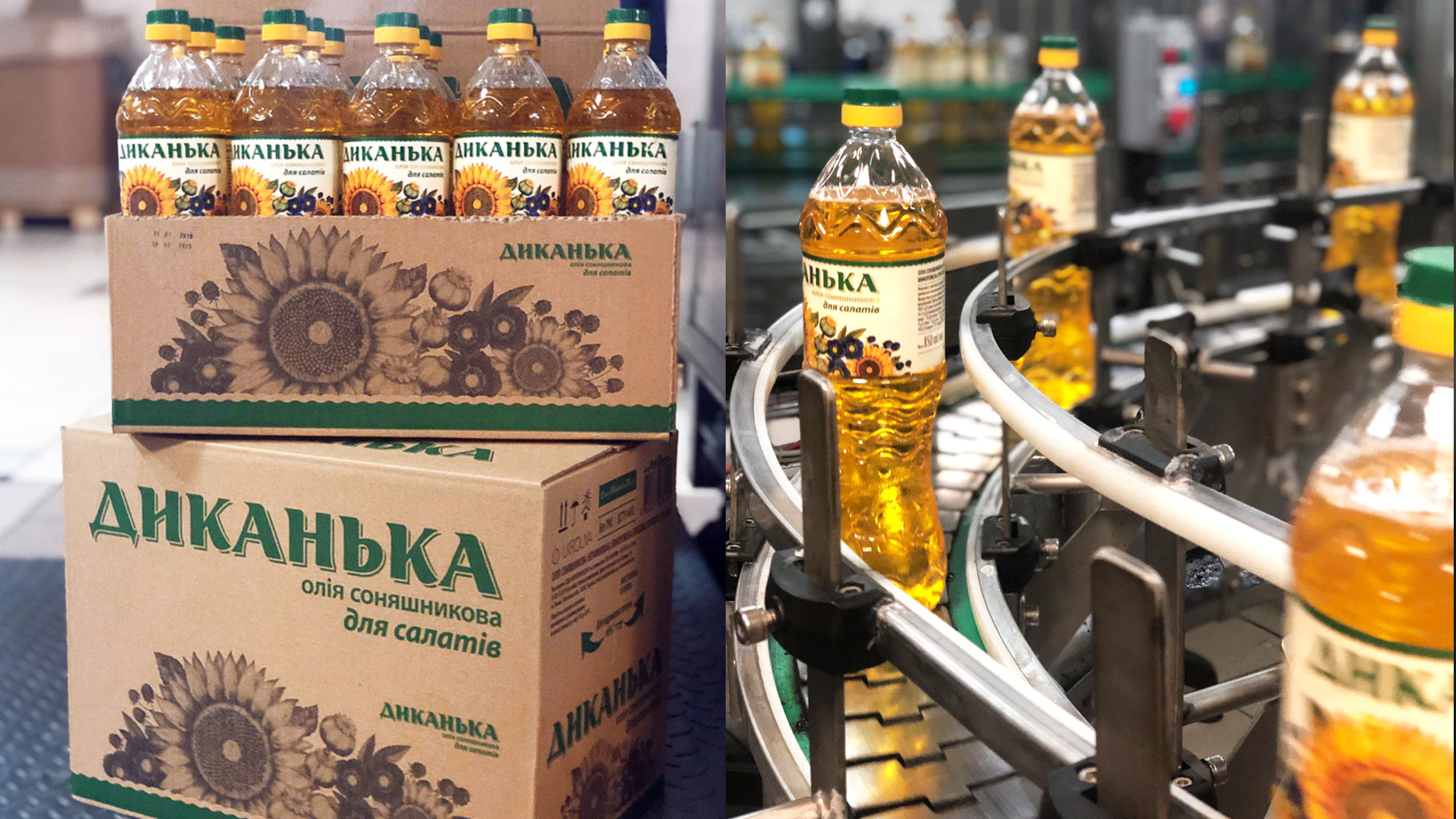
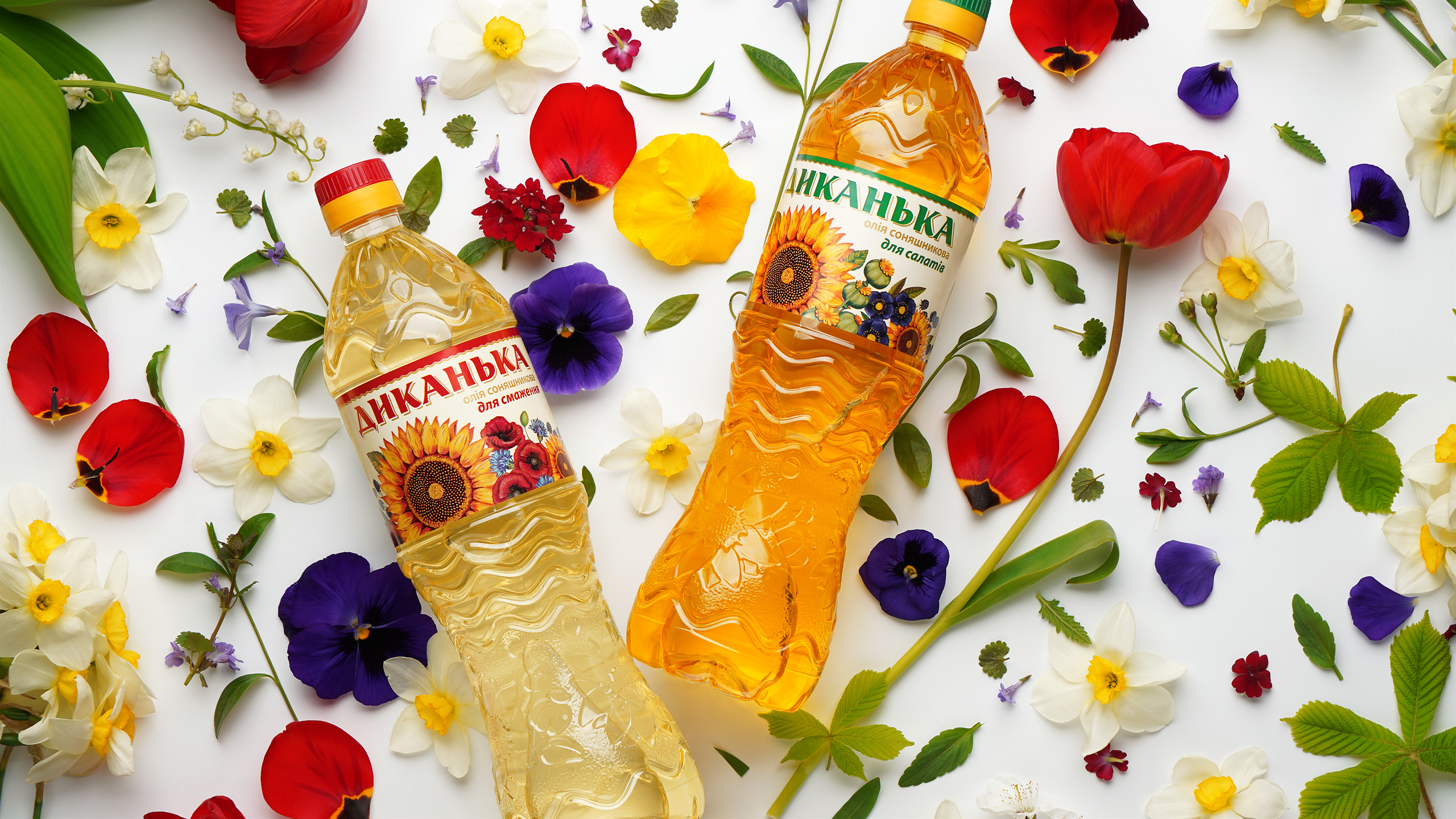
FOR TWO LABELSwe picked different flowers, making the bouquet tone the differentiating element of refined and unrefined oils. The green color characterizes oil for salads, while the red works for frying. We shifted from the traditional yellow and blue colors so as not to quote the competitors. The bouquet on the table allowed us to get away from the stereotypical folk style and please the Ukrainian housewives. |
