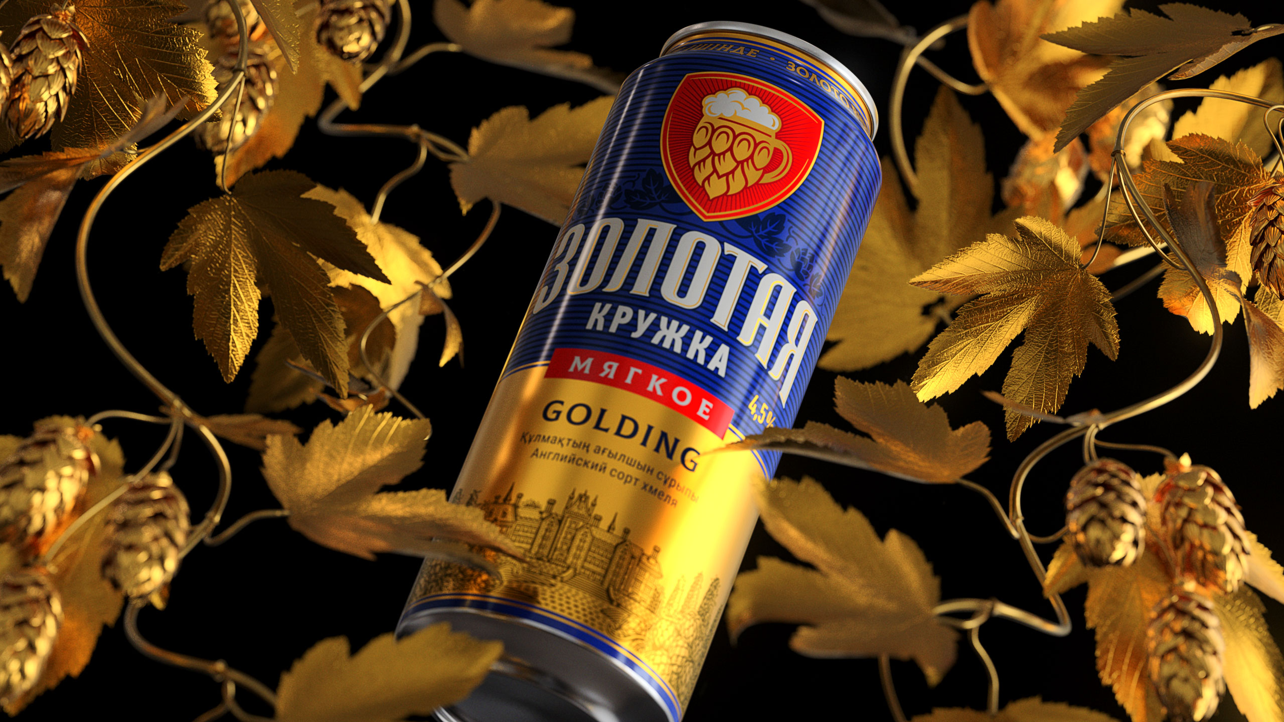
GOLD NEVER GETS OLDThis is an undeniable truth. However, people grow up, and some do so along with their favorite beer. Focused on delighting its fans with the same desired aftertaste, Zolotaya Kruzhka by First Brewery in Almaty improved the recipe by adding Golding, an aromatic English hop variety, that accents the smooth taste and the golden color. |

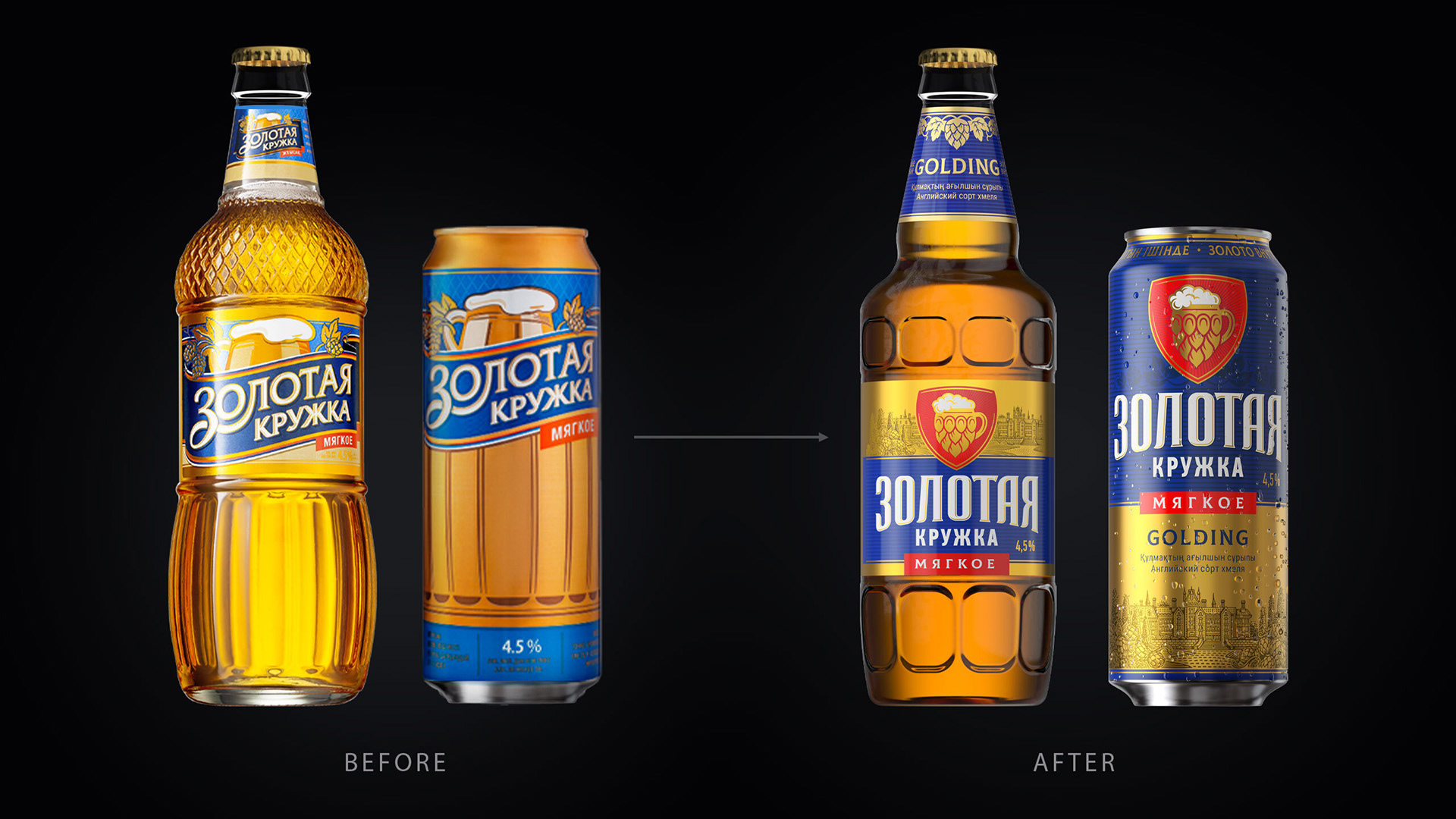
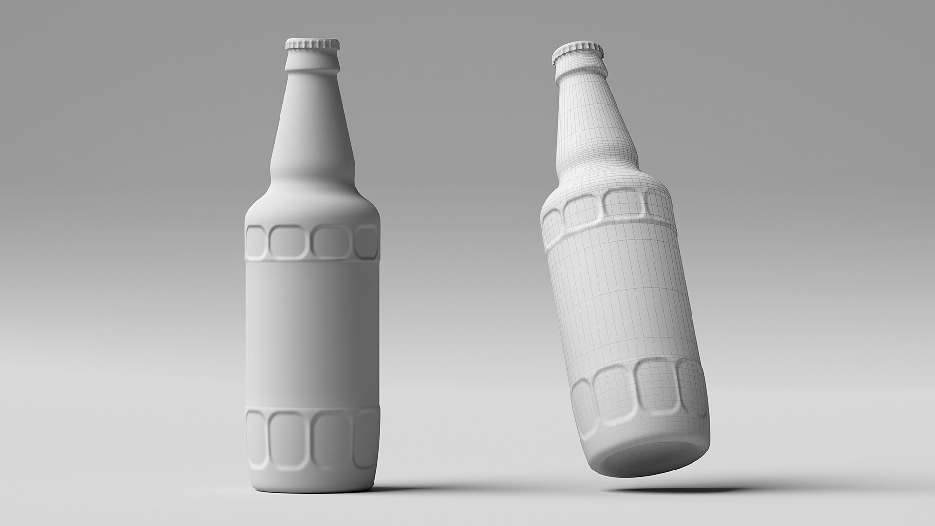
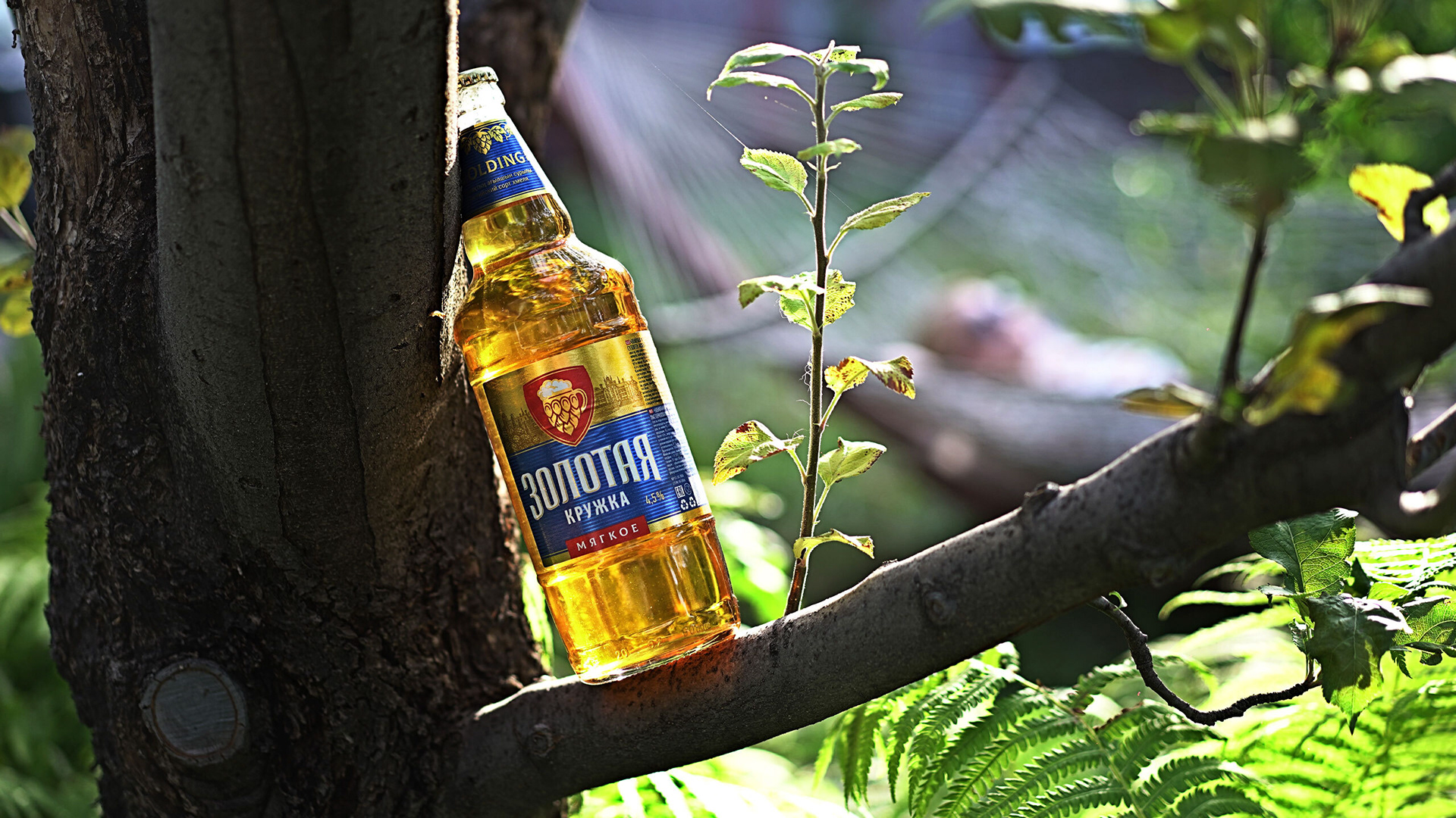
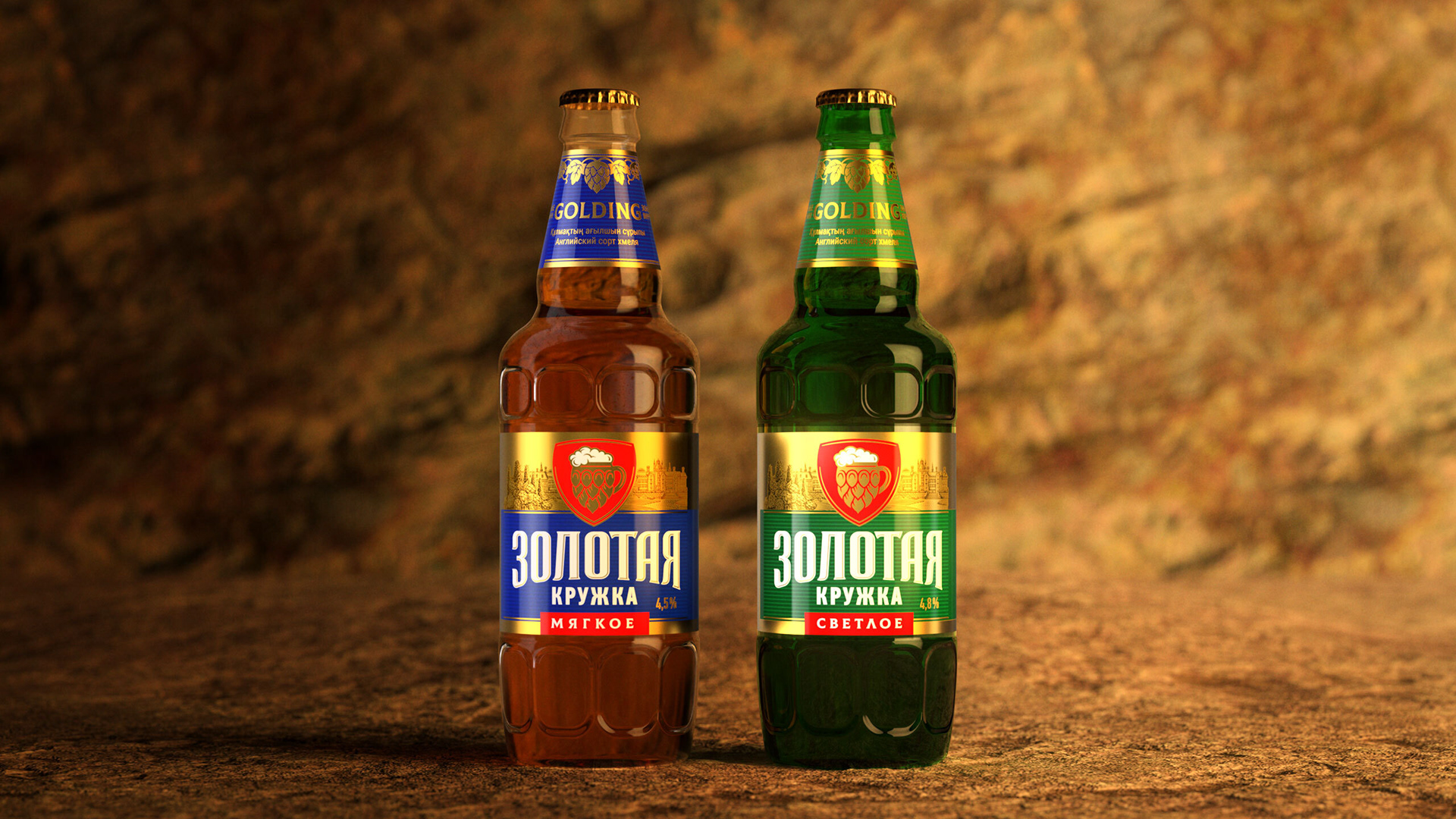
THE PRODUCT UPDATEThis required a mild but total rebranding. The first thing we did was shaping. We kept the idea because a glass is a glass. The upper part of the bottle got rid of pretentiousness and made friends with its lower part. Now, the bottle looks modern and masculine. |
THE GOLDEN RULEThis is what we took as a basis: in this project, we implemented everything that could be highlighted for sight, touch, taste, and understanding purposes. Now you pick up the bottle as if it's a real glass. |
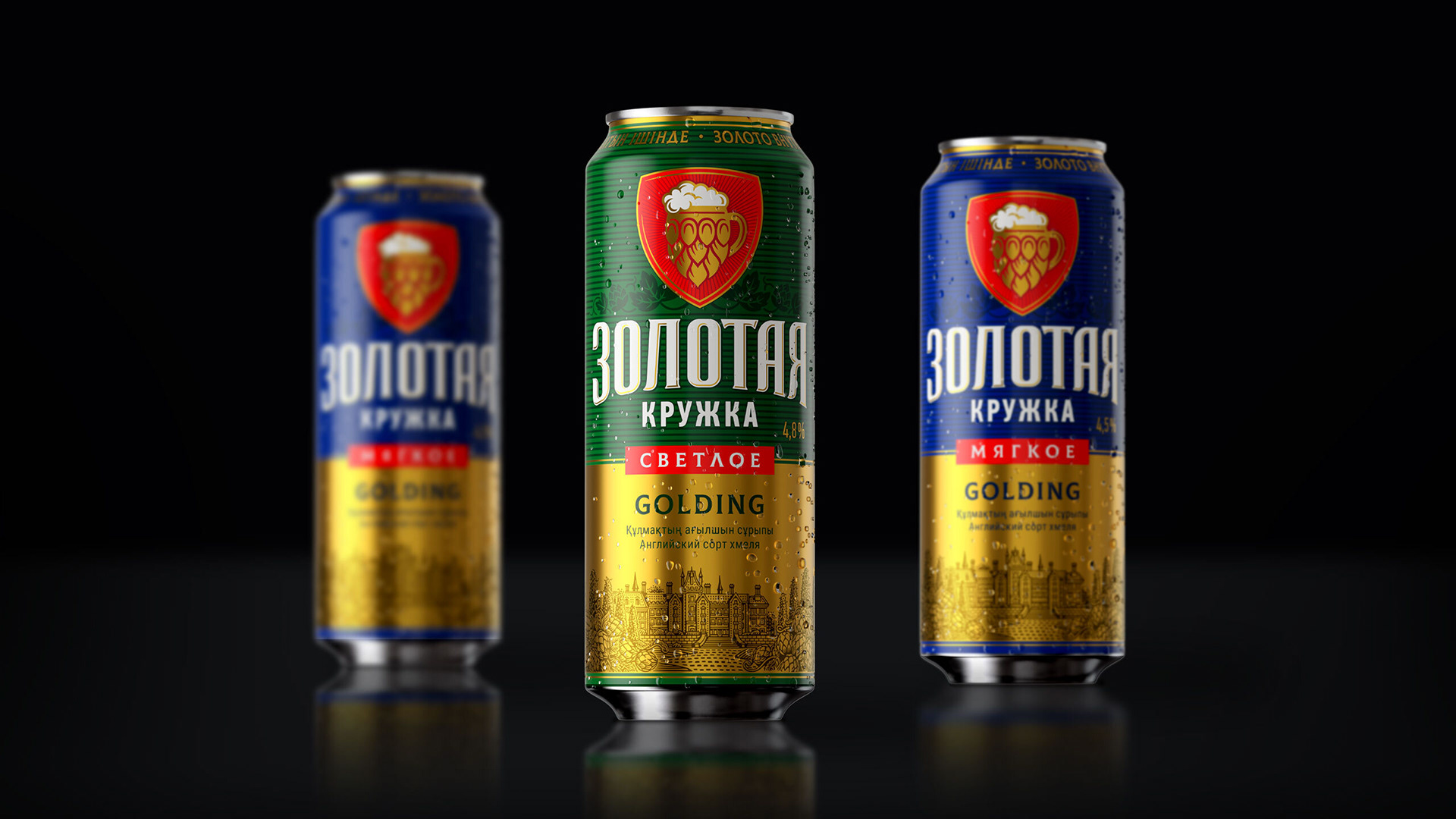
THE BRAND'S NAMEThe name and logo are now enhanced with a unique eye-catching red shield: a golden glass made of golden hops. |
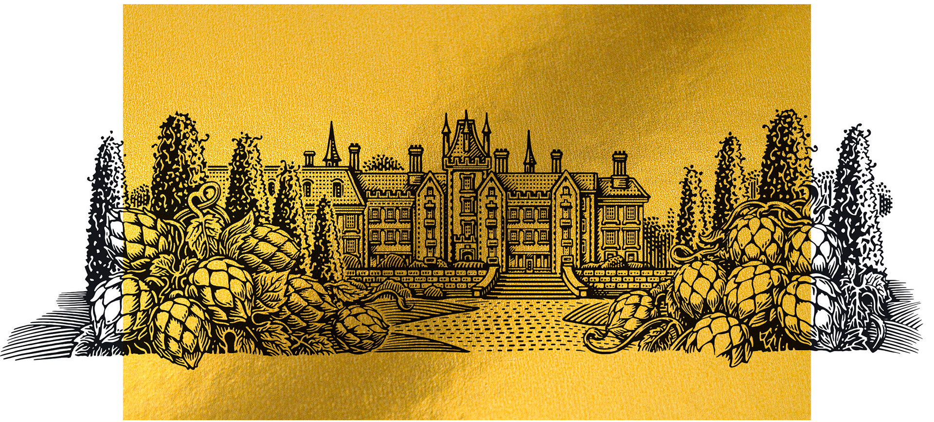
SOUTH EAST ENGLANDMore specifically, the county of Kent, where Golding hops originate from and are still grown, inspired us to create a traditional engraved illustration. To that end, we turned to the neat-handed Aleksandr Komyakhov. |
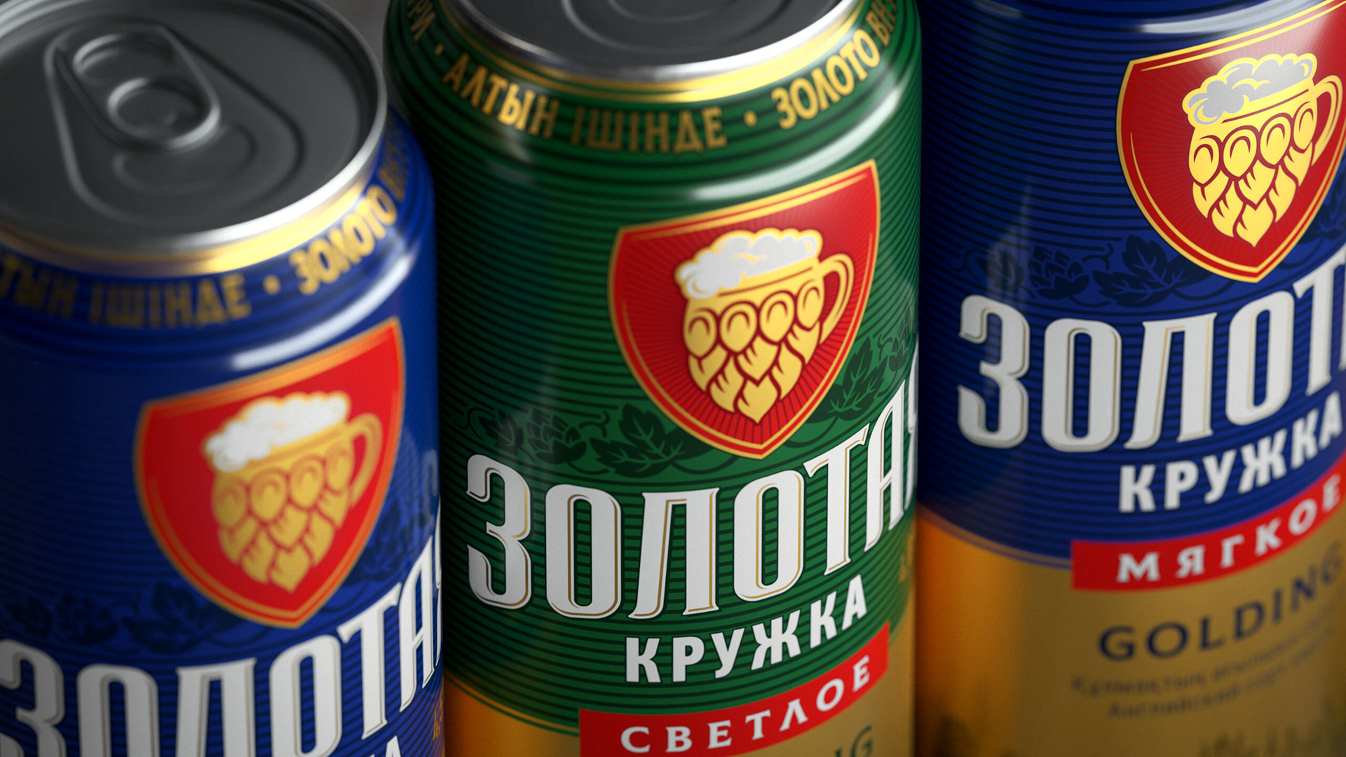
TRADITIONS AND MODERN TIMESThese are like hop shoots that intertwined in the new design of Zolotaya Kruzhka. Gold and ornamentation are historically important elements of Eastern cultural patterns. Nevertheless, Western minimalist trends are infiltrating modern life, including the graphic language of supermarket shelves. All in all, we made the logo simpler and more visible as well as unlocked the brand’s history and status through traditional illustrations and dominance of gold. |
ProjectCreative Director: Maxim Lesnyak |
CaseArt Director: Helena Gavriluk |

