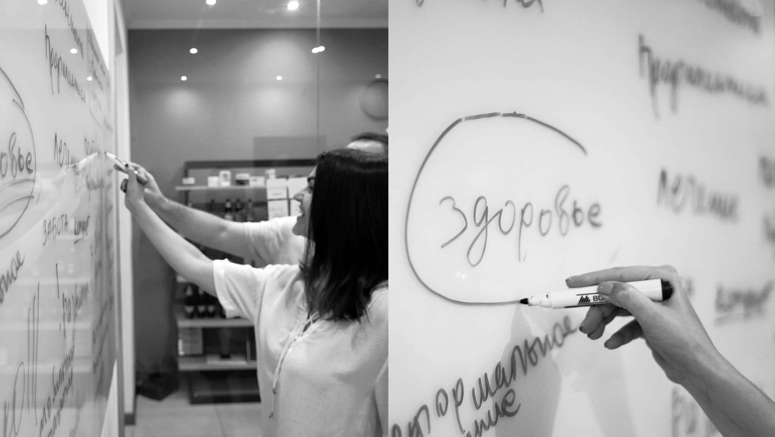
A TOUCHING STORYWe always get emotionally involved. We can’t leave emotions out, you know. This case was special for us anyway. If a vital mission is conceived, it can’t fail. We are happy to have had a hand in the birth of the KinderKlinik brand. |
IT DEFINITELY WILL DO.We had no doubts when they shared the idea with us. The owners came up with an idea to build a clinic they could entrust their own kids to. This would make other parents want to do likewise with their treasures. |
THE EXPECTATIONSof parents. What do parents need? Do they need good treatment for their kids? Medical super-equipment? That’s not really what they need. We arrived at that conclusion at a session with our client. Above all else, parents want healthy kids. We had to offer a fundamentally different approach. The market offers them treatments. The KinderKlinik brand offers, instead, maintaining the health of kids, making them resistant to illness. |
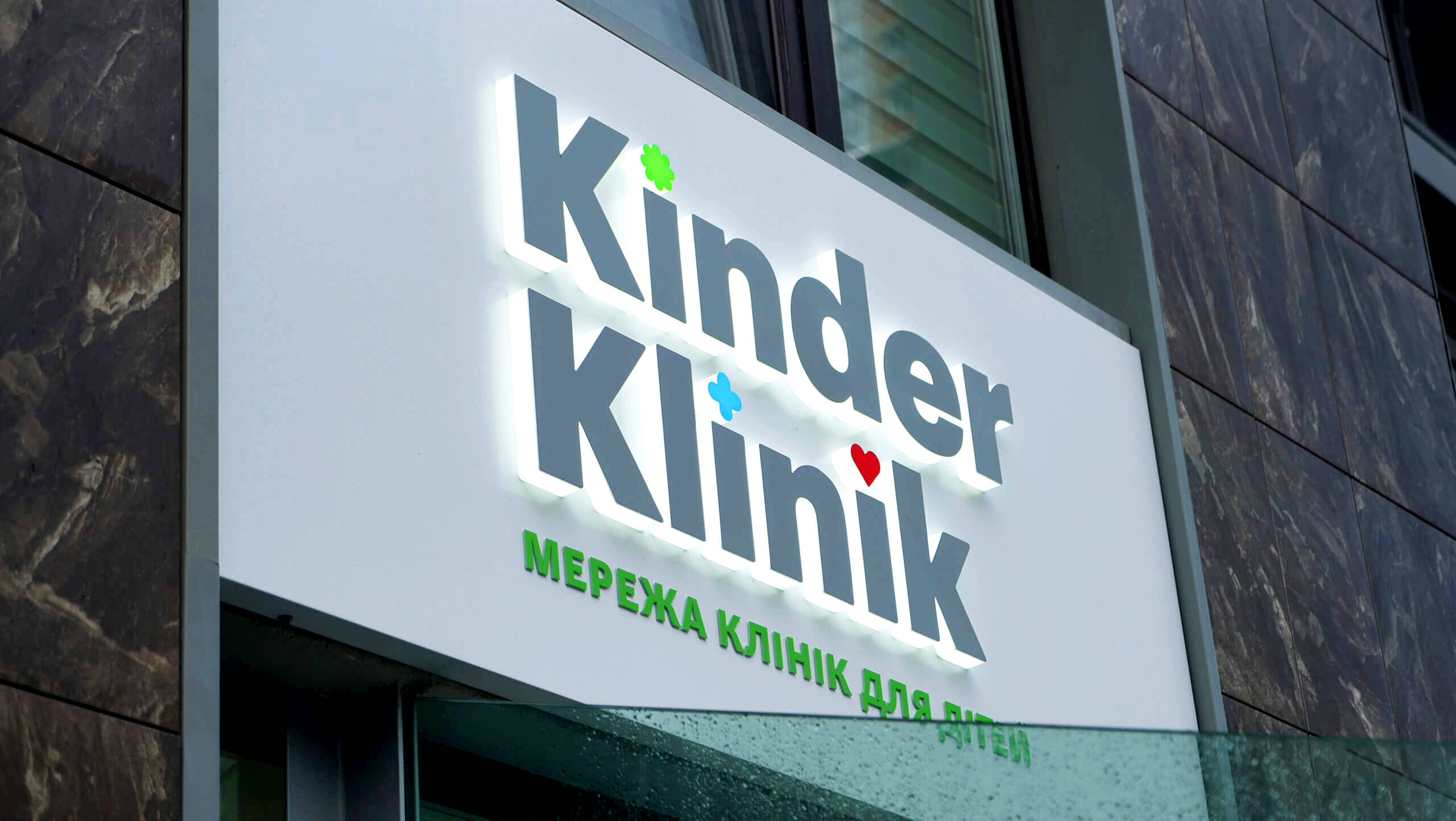
THE PICTURE OF HEALTH.That was our vision for the brand identity. We had to tell a story about genuine care, for kids to see and for moms to feel. We fixed on three symbols. Blue was about safe medicine. Red was about true love. And the top symbol was green. It was about robust health. We used it as the main color of the corporate identity as well. |
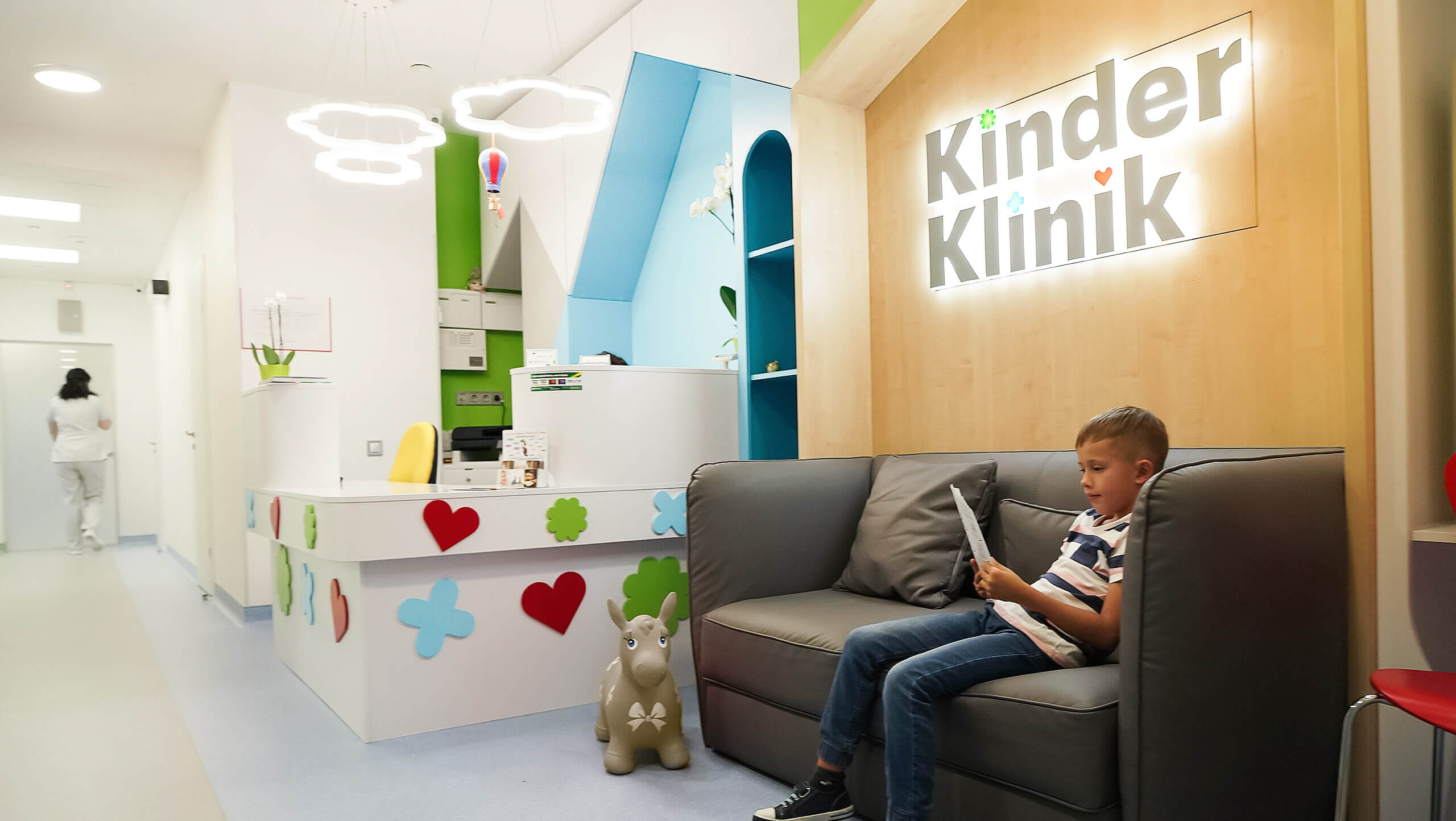
THE HOME FOR KIDSwas the aim we kept in mind while working on the interior and the navigation. We made a pattern of the three symbols suggesting a game zone with which to link the clinic. We wanted a child to find the place entertaining, so we animated the space with brain games and educational toys. The atmosphere became friendly and entertaining, both to the eye and to the touch. |
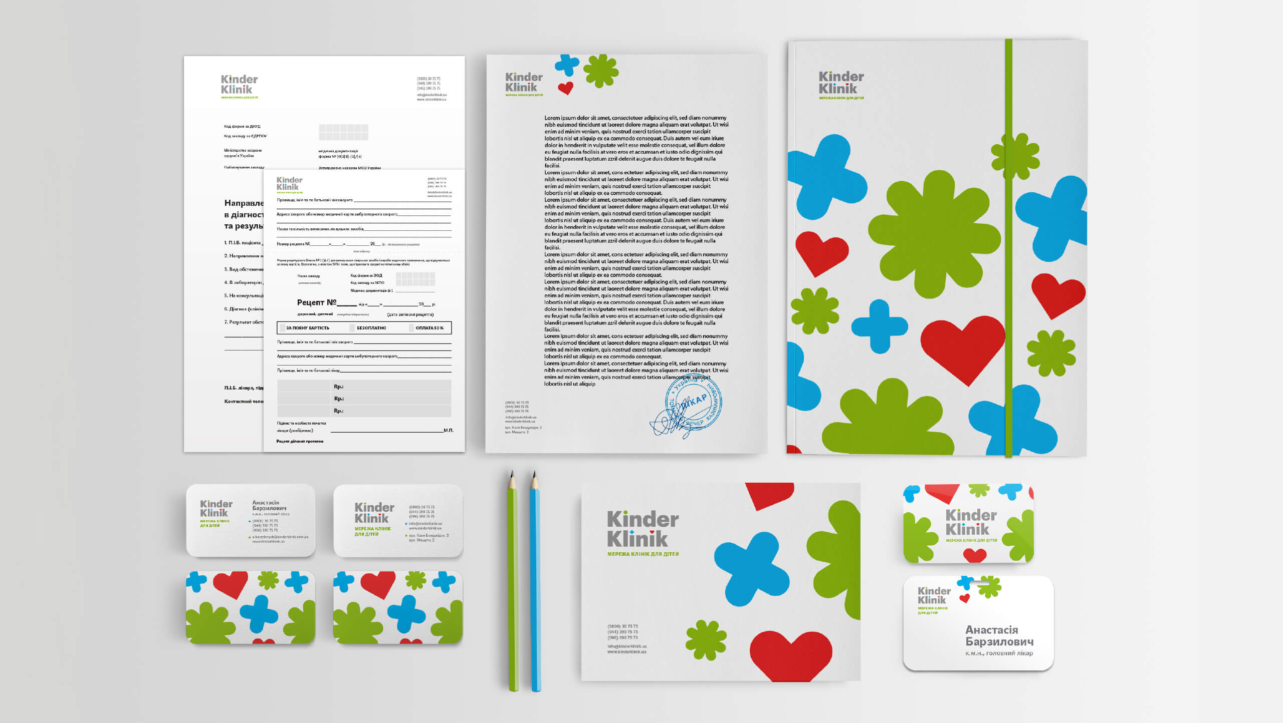

OUR KIDSare the words KinderKlinik doctors use when talking about their little patients. The brand is permeated with domesticity and care. The clinic website is no exception. We loaded it with the brand identity and attributes. The client saturated it with care for kids. The parents will find a doctor always there in their personal account, ready to answer all their questions. He will advise on the right food, the proper time to walk, and the best kind of sport to play. He knows everything about kids. |

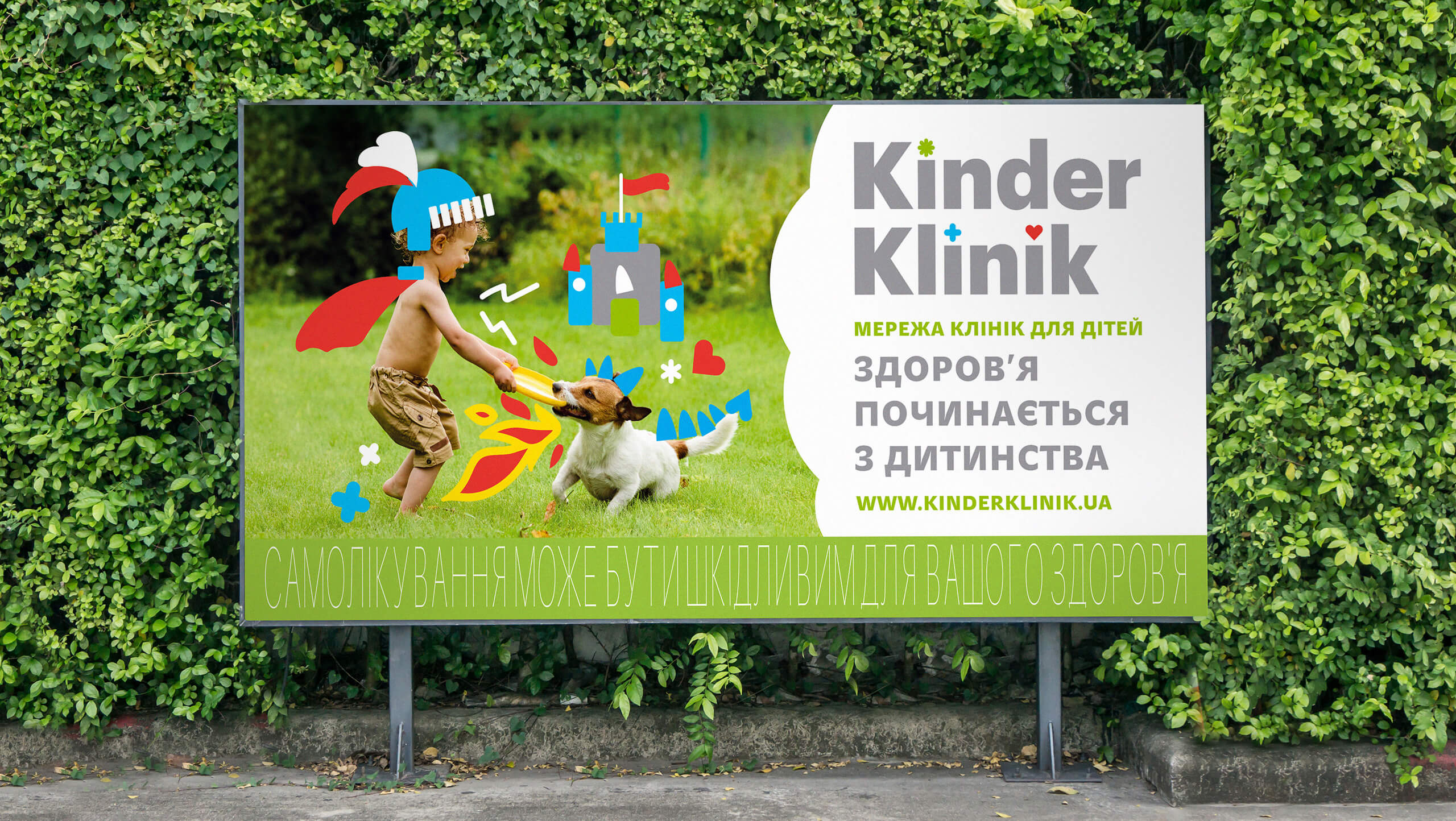
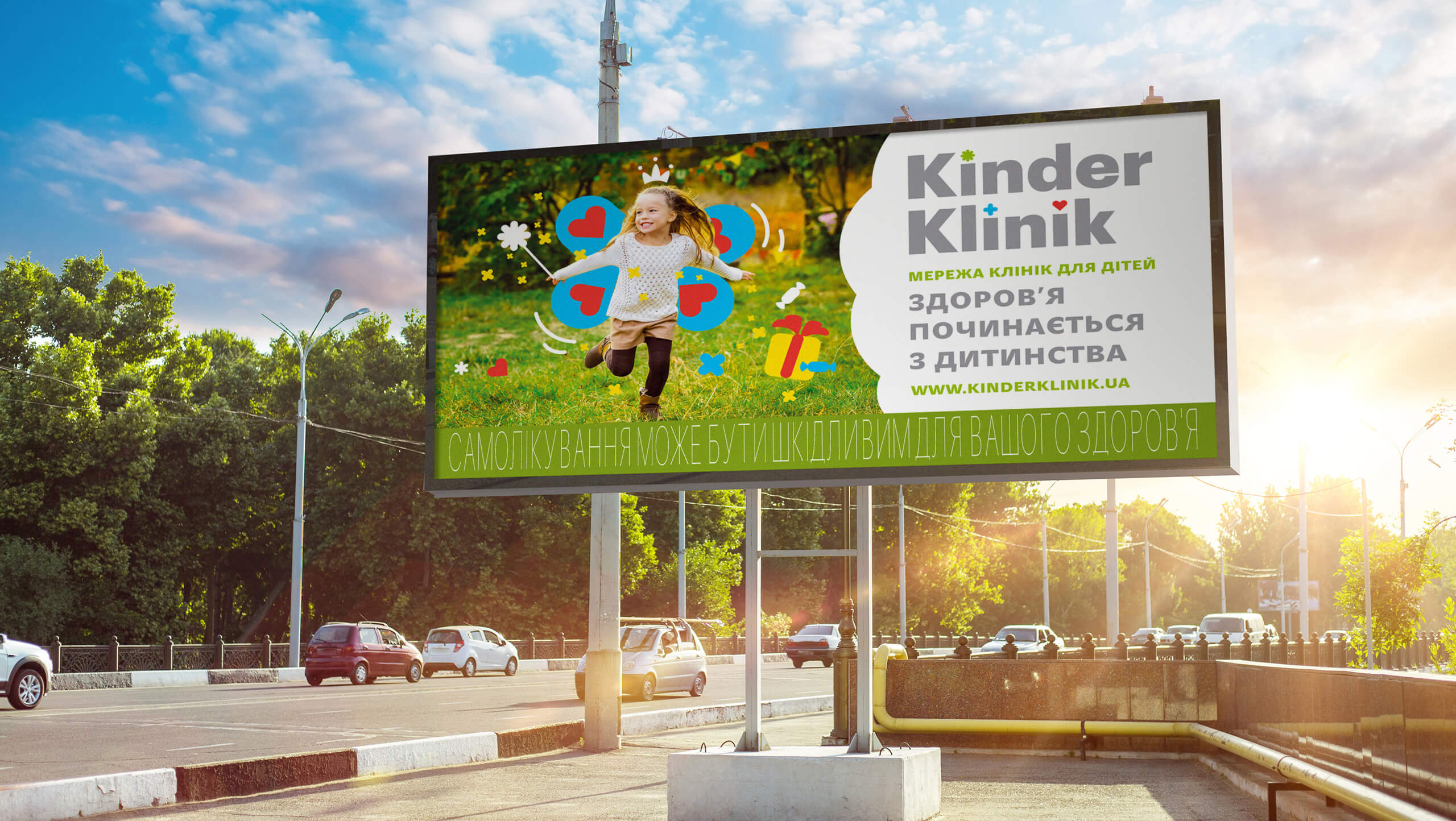
HEALTH BEGINS in childhood! This was the billboard message. Health is definitely grounded in early childhood. Kids have to grow up healthy and take time to play games and enjoy the sweets of life. This will make their parents happier, less worried. |
IT’S TRUEfor brands, too. When a brand comes to our agency in its infancy, we are more able to successfully lay the foundations of its well-being, helping it to grow healthy and strong :) |
ProjectCreative Director: Maxim Lesnyak |
CaseArt Director: Helena Gavriluk |


