THE SEA IS OUR FIELD:it provides both fish and a mind dish. Our partnership with Vodnyi Mir, a leading seafood manufacturer, began from deep diving into their range of problems and business tasks. To check the way a whale feels among the sharks, we conducted a brand audit, which resulted in several interesting facts. First of all, there is no seafood consumption culture as such in our country. Secondly, despite the variety of fruits the sea has, the brand is mostly associated with crab sticks. Thirdly, our consumer is a traditionalist, so we need to form a consumer culture and healthy eating habits step by step. |
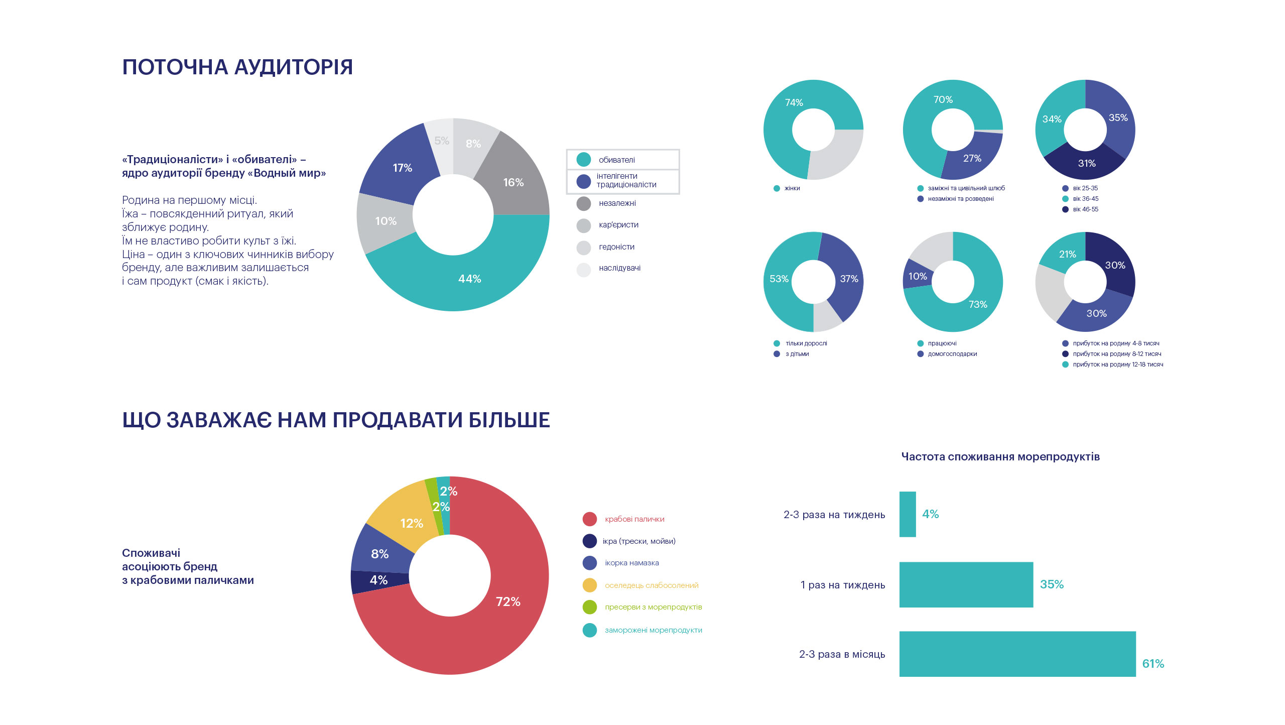
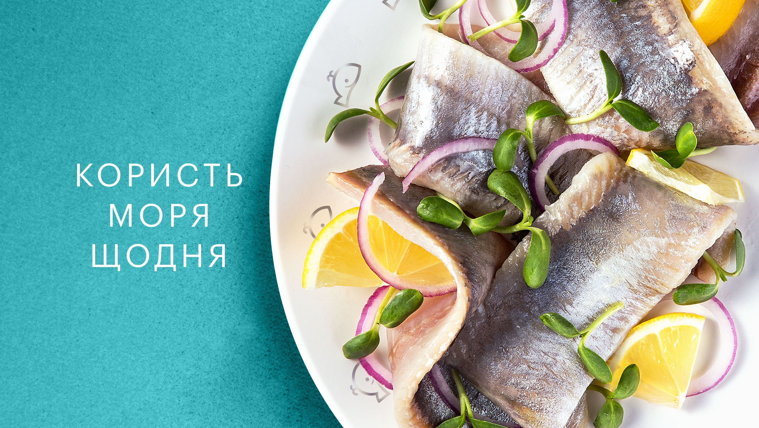
BENEFITS FROM THE SEA EVERY DAYthis is the positioning we offered based on several strategic sessions. It was scarce consumption that became the main sales increase barrier. And we decided to shift the focus from tasty to that of everyday need. It led to the idea of showing ready-made dishes as common meals of a Ukrainian family. |
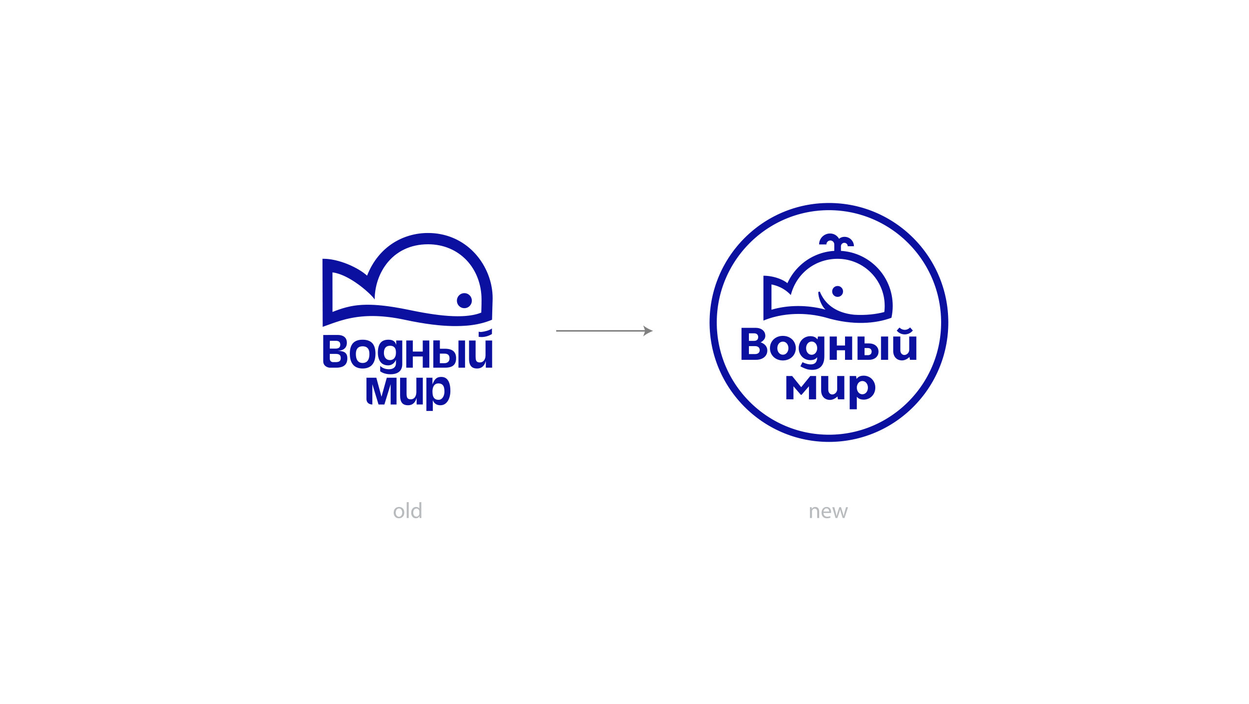
THE SEA FAVORS THE BRAVEand the smiling! The whale, our logo character, became more positive and emotional, thus, more resembling a whale in its proportions, and now has a fountain on the top of its head. The circle enclosing the whale suggests that all these sea delicacies can end up in your plate. In such a way, a plate with sophisticated seafood dishes became central to the package design. From the sun-lit sea to each family table. |
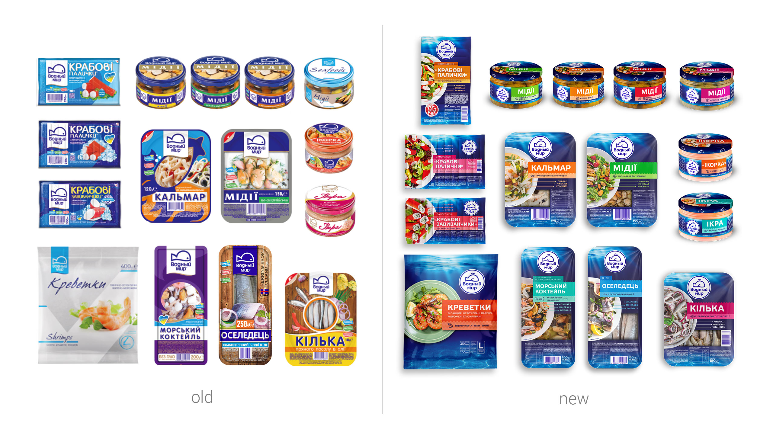
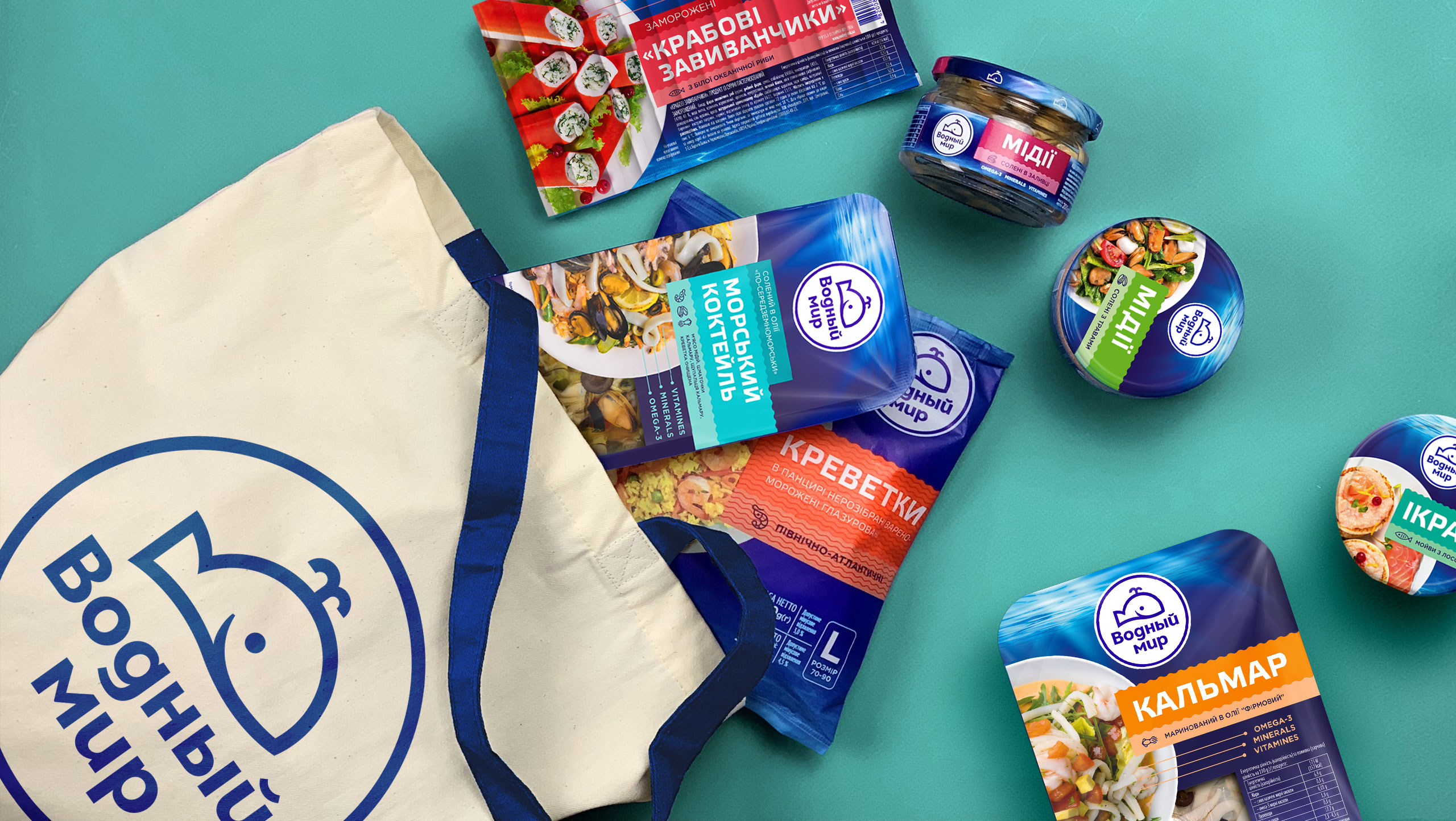
SEA COCKTAIL—this is the way the company's product portfolio looked like before the redesign. Despite a massive brand zone, they had a rather liberal packing design approach: colours, food zone, and typography were not coordinated. So we created a visual navigation system comprised of a lot of sea attributes used now for the design of each package item. |
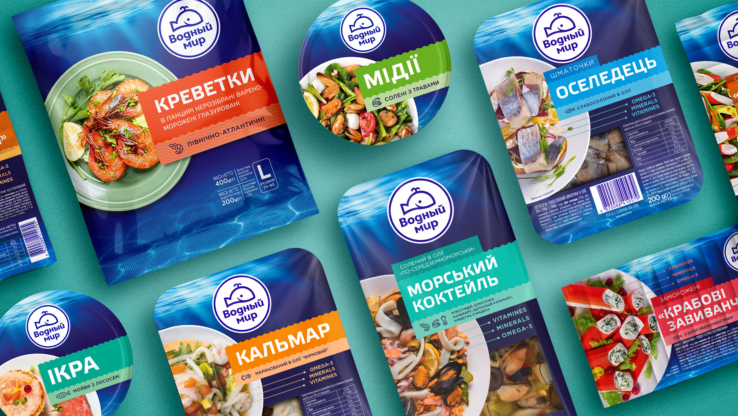
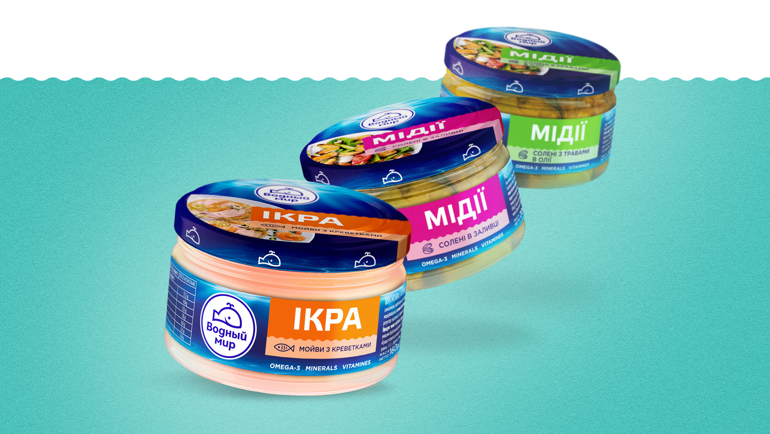
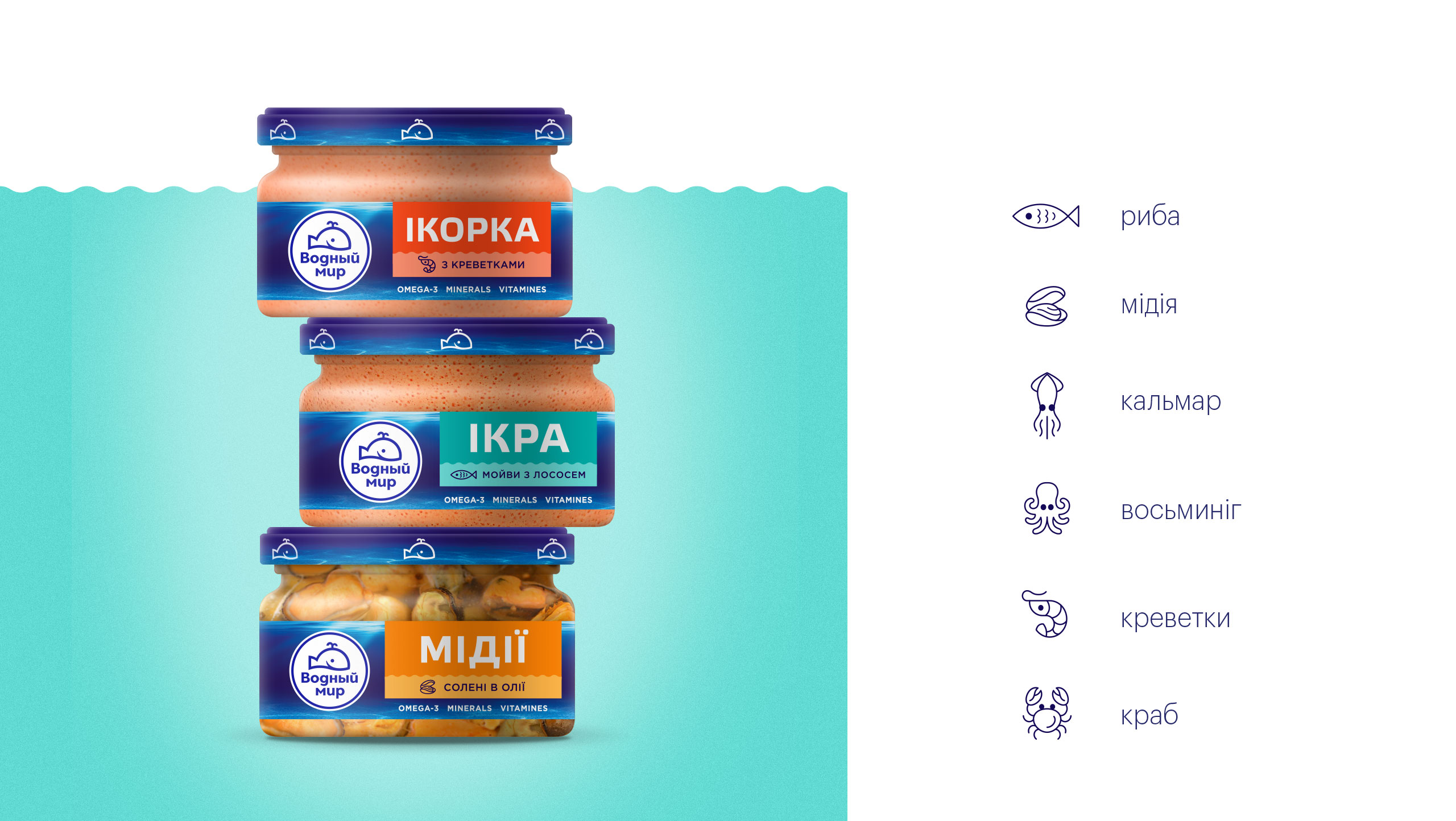
SEA CREATURESbecame nice icon characters. Yet we indicated not only the animal origin of the products on the package but also the benefits of consumption: vitamins, minerals, and fatty acids. |
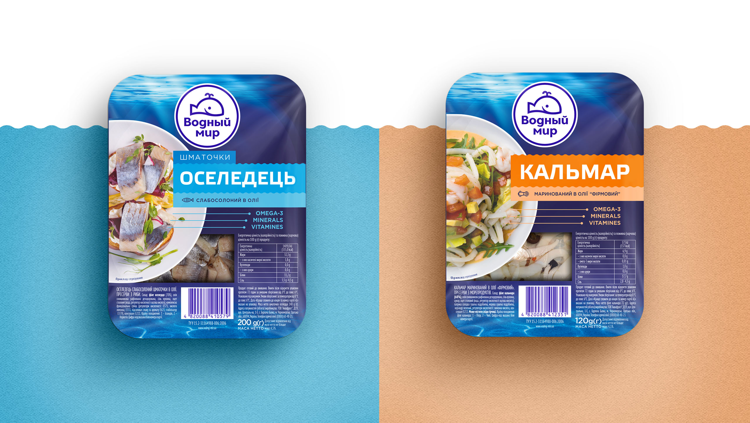
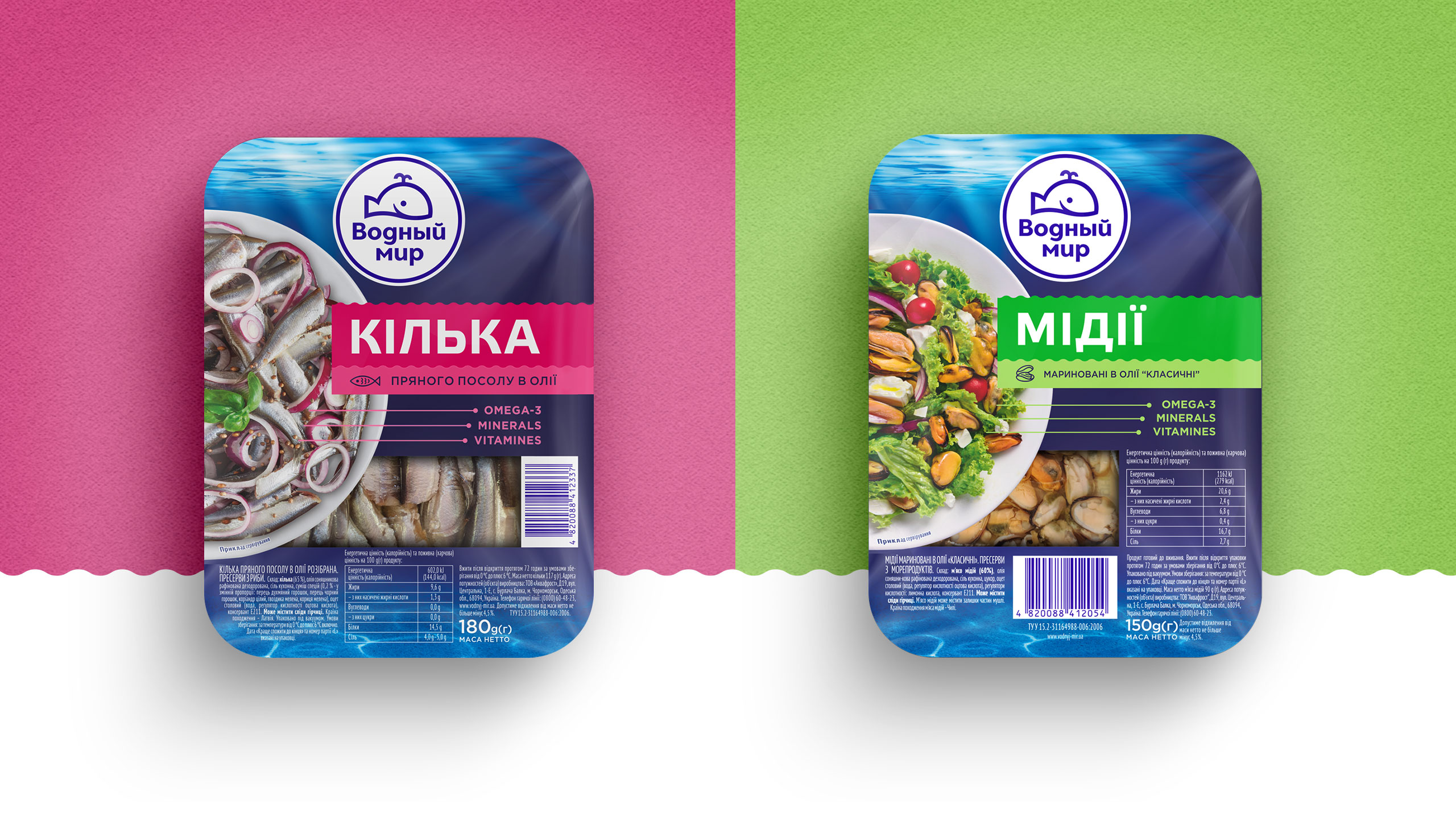
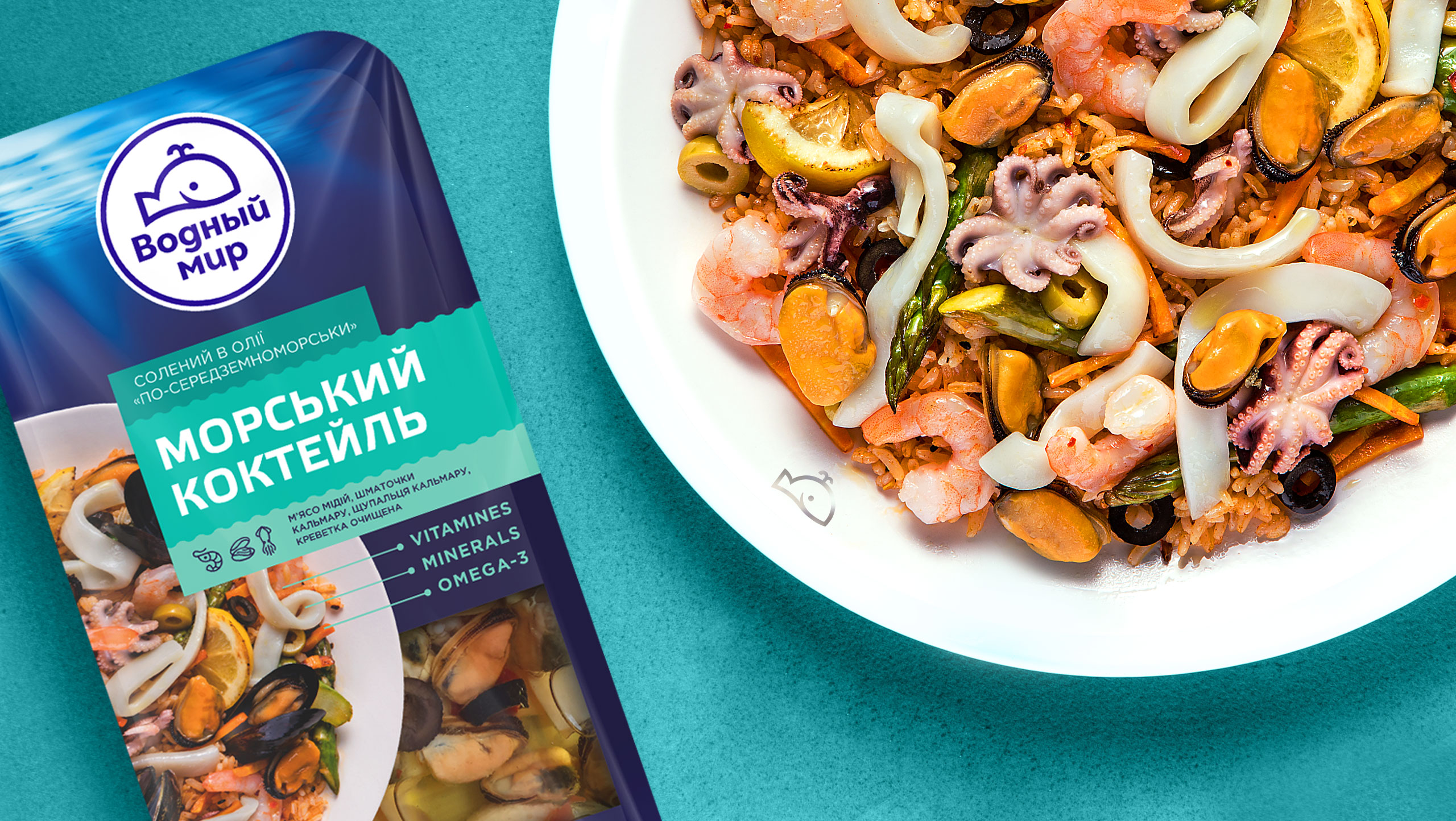
OCEAN OF WORKnever lies on the surface. Another thing to emphasize is the desktop publishing of nautical miles of technical texts for this project. The matter was that the package had only a facing to host a logo, a nameplate, a transparent window for the product, a ready-made dish, a bar code, etc., up to the last period in technical information, with its length depending on the product. There are many ways in the sea, but we seem to have taken all of them to get to the shore. |
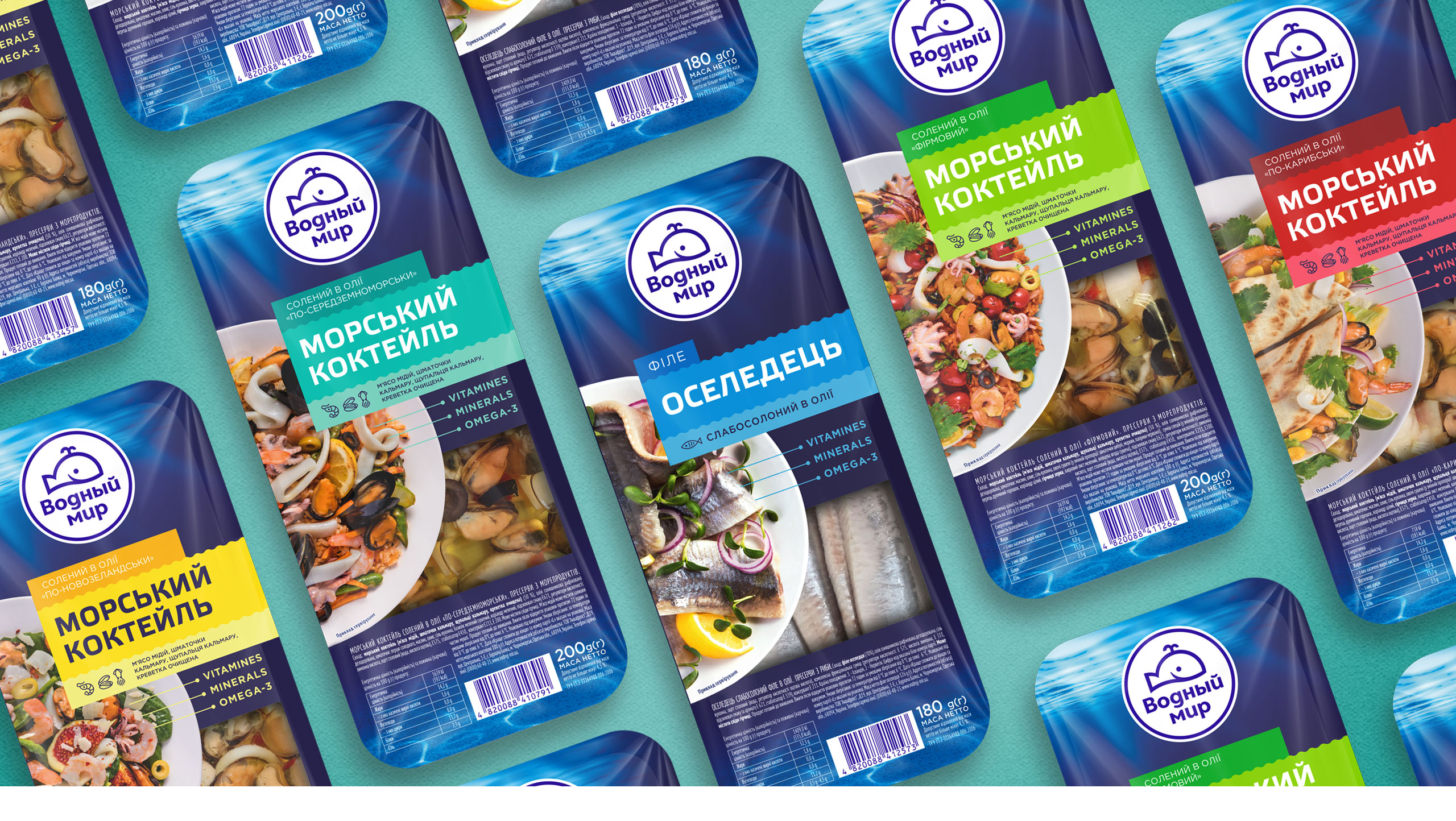
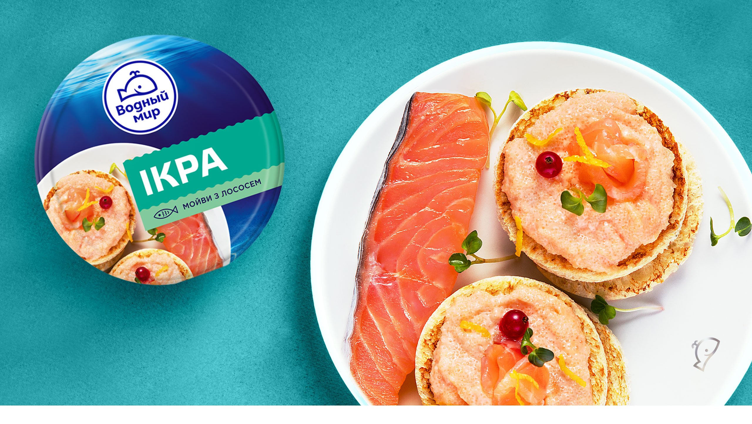
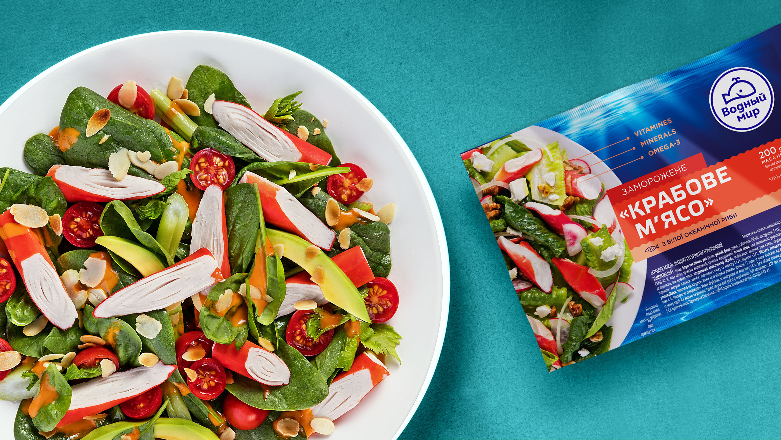
VODNYI MIRis integral, bright, renewed, filling supermarket racks with its waves and acquainting the consumers with tasty and healthy seafood dishes on the website pages. So grab your nets and go for benefits from the sea every day! |
ProjectCreative Director: Мaxim Lesnyak |
CaseArt Director: Elena Tverdokhleb |


