
A change of look that tripled sales: a children's snack packaging case study
telegraf.design
A recent study L.E.K. Consulting has had everyone in packaging rejoice. Apparently, over a half (56%) of FMCG brand owners ramped up investments into product packaging over the past two years, and 65% are planning to do so over the next two years. The dynamic is driven by a number of trends listed in the study: fiercer shelf competition, especially online, ongoing SKU expansion in the brands' product range, and sustainable development.
A recent study L.E.K. Consulting has had everyone in packaging rejoice. Apparently, over a half (56%) of FMCG brand owners ramped up investments into product packaging over the past two years, and 65% are planning to do so over the next two years. The dynamic is driven by a number of trends listed in the study: fiercer shelf competition, especially online, ongoing SKU expansion in the brands' product range, and sustainable development.
SAPICO, a Moldovan company making children's snacks (corn curls, cotton candy) under the Piffi&Puffy brand, decided to invest in overhauling its packaging design last year. Dozen stepped in to handle the redesign.
Challenge
The Piffi&Puffy brand was launched in 2018. The girl named Piffi and the boy named Puffy were featured on the packaging, in ads, and in a mobile game. There were even packaging variants for boys and girls. The product was good, and it was doing great until the competition started putting on their packaging boys and girls of their own. Eventually, the practice became so widespread that the producer had to look for ways of standing out on the shelf.
Also, another circumstance was becoming hard to ignore—the transiency of visual codes in society. Essentially, Piffi and Puffy just lost their relevance. Today's children are exposed to the global mass culture from an early age, and their tastes are shaped by the best international artists.
Solution
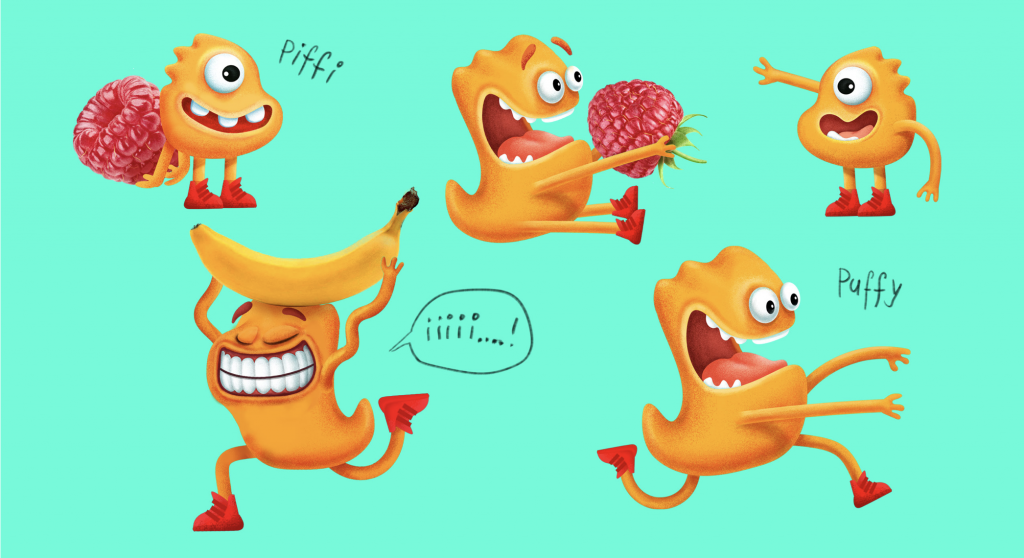
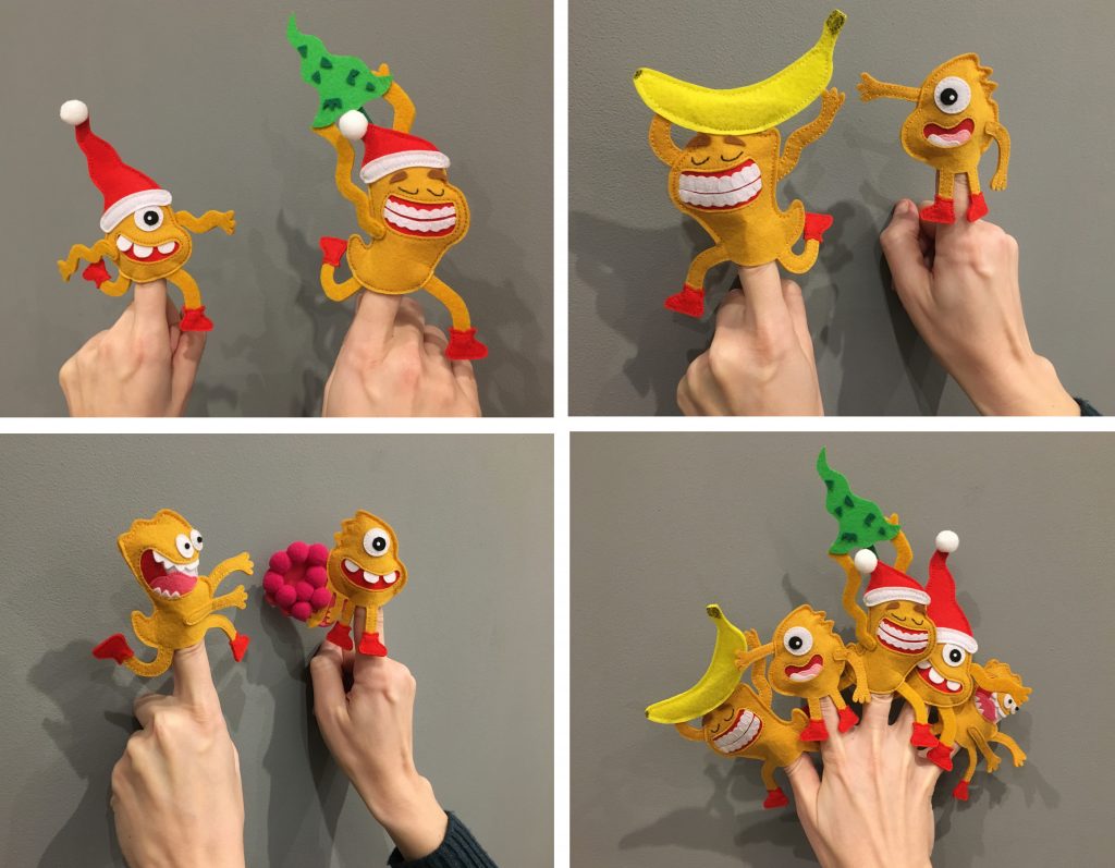
Dozen decided to put the gender-defined mascots aside. “We left behind the human imagery and division into boys and girls and came up with two funny fictional characters instead,” Dozen's Art Director Olena Tverdokhlib recounts. “We made Piffi a one-eyed shy little fella and Puffy a hyperactive toothy fidget. They look just like two corn curls. The new mascots and their names just clicked together: Piffi and Puffy—doesn't it sound like something that fills your mouth with puffy sweetness?”
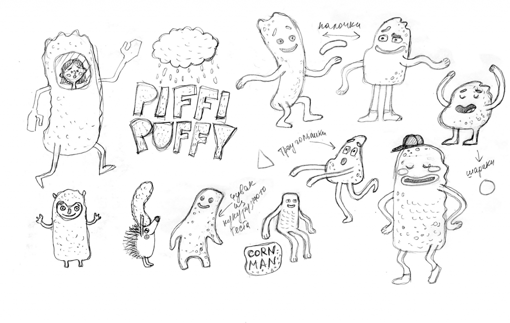
Brainstorming new characters
Result
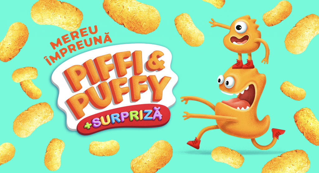
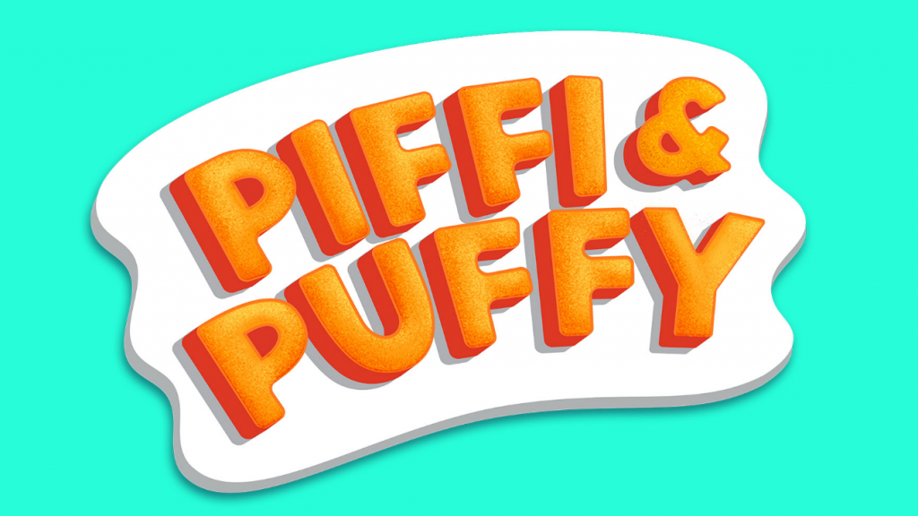
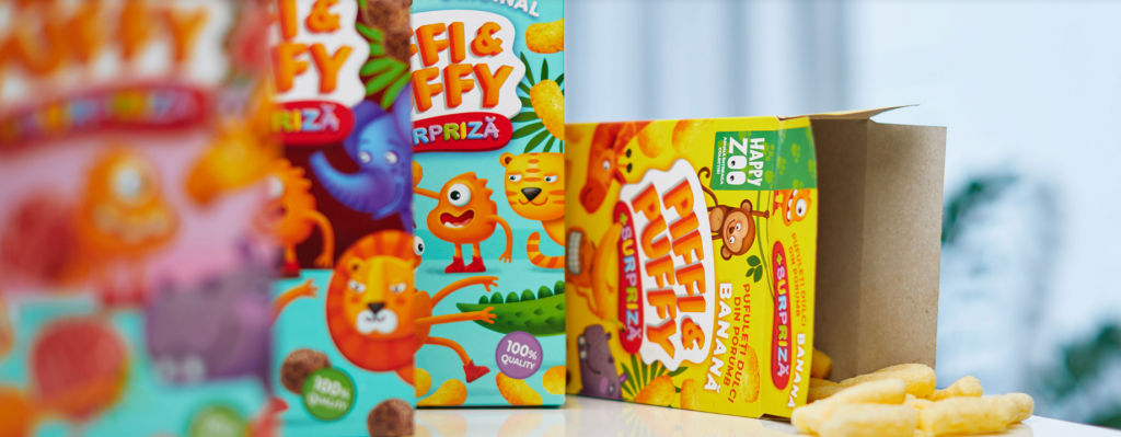
Piffy&Puffy's logo changed too, becoming embossed and as if composed of corn curls.
Now, it's the consumer experience that makes the packaging attractive.
“We buy snacks when we feel like something crunchy would make for a good pastime, so we made all characters and interactions between them explosively emotional,” Olena pointed out.
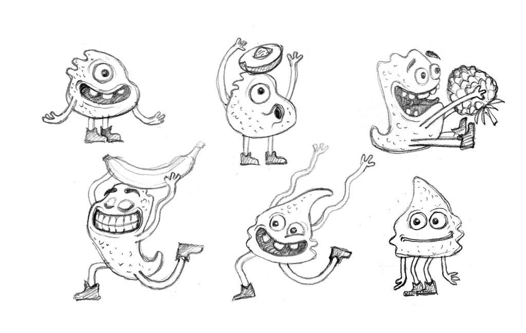
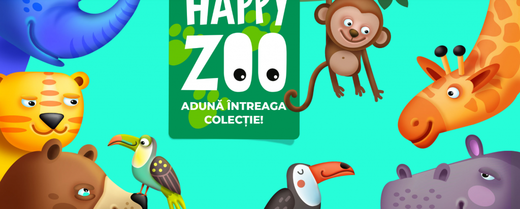
However, the packaging features not only Piffi and Puffy. The new design pictures them interacting with animals from themed collections. Happy Zoo was the first theme to be launched. With popping colors and realistic large and friendly animals, we created a small world for kids.
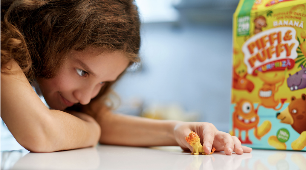
Also, each package contained a small toy to support the “play and interact” direction.
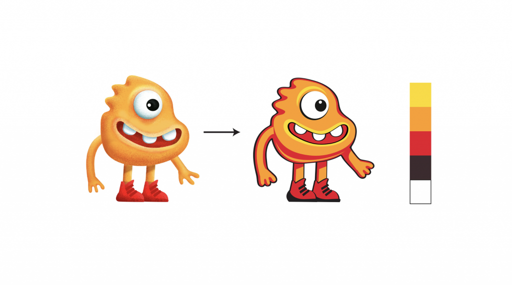
The fact that Piffi&Puffy's offering included cotton candy was taken into consideration, too. Cotton candy is packed into plastic cups, which have certain limitations when it comes to printing on them. Therefore, Dozen drew the realistic mascots in a simplified flat aesthetic as a vector image, imparting more of a comic look.
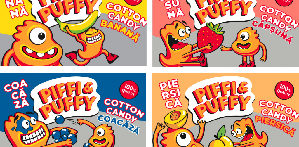
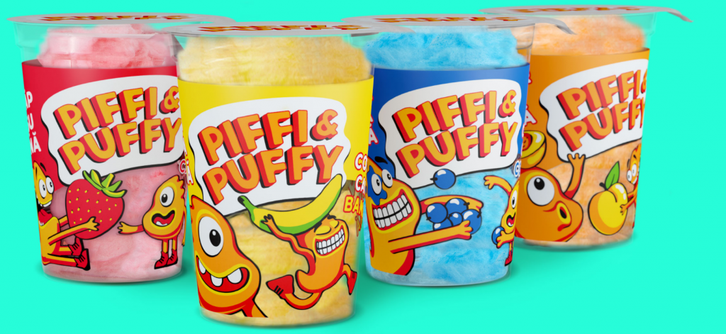
The packaging became supremely vivid, which is especially useful in the online setting.
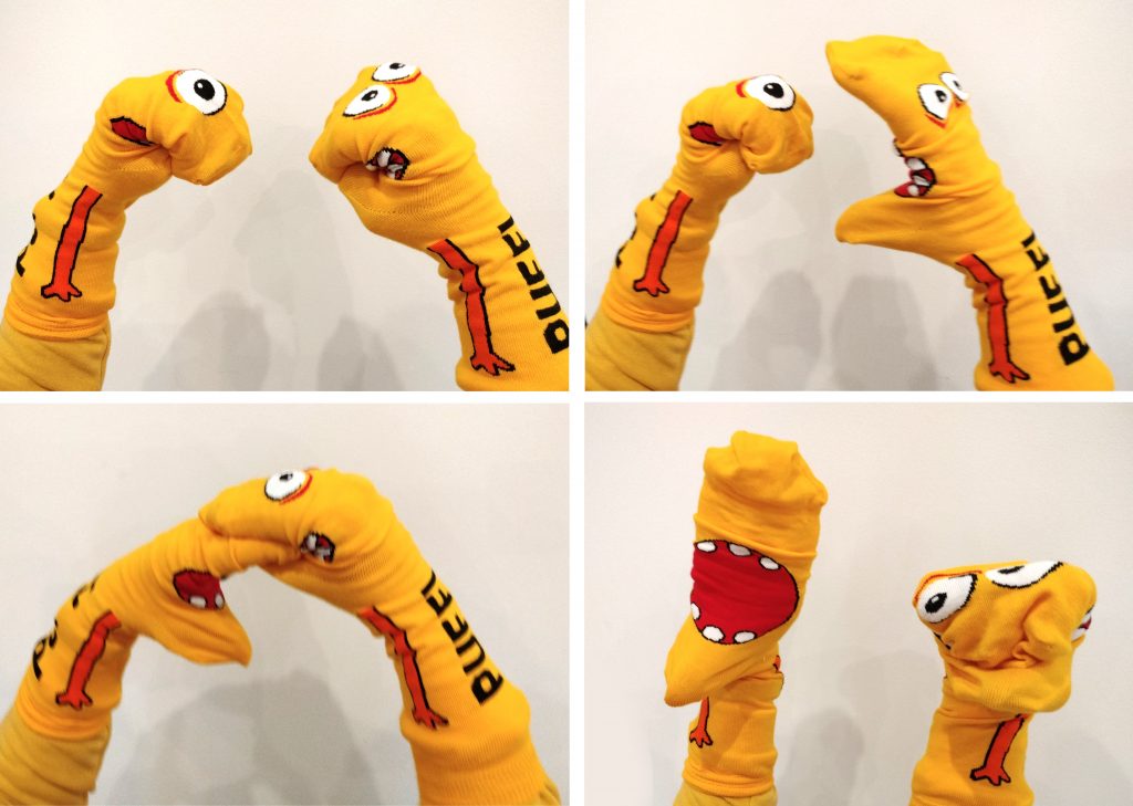
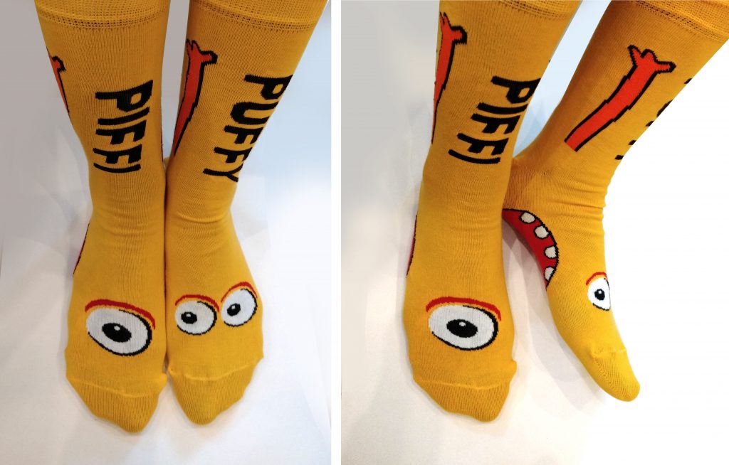
“With mascots and interactions, the producer has a perfect way of constructing new themes, games, products, and brand communication,” Olena Tverdokhlib said. Read on for a few ideas.
In 2005, P&G, the world's largest advertiser, coined the term First Moment of Truth to describe the buyer's contact with the packaging. It is at this moment that the brand's all previous communication is condensed into one impression—the three to five seconds the buyer spends in front of the shelf in the brick-and-mortar store or an online store's web page deciding what to buy. Packaging is virtually the only marketing channel that reaches 100% of the target audience and ensures quality contact. People start enjoying Piffi&Puffy even before they buy a box for themselves.
The best brand is the one charged with messages and emotions and matching the clients' jobs-to-be-done.
“Think about packaging as a part of the buyer's experience, as in emotions and life experience. You need to show that you get this and care about them. Make sure the packaging is memorable and pleasing. People are visual creatures. Our brain likes images. Some packaging decisions indeed may boost sales more than others.”
Piffi&Puffy's sales rose by 10,000 boxes per month since the new design was launched, sales basically tripling without any pricing campaigns. Also, bear in mind that these are fall and winter figures, and the high season for cotton candy and corn curls is usually in summer.
RECENT NEWS
2024-10-30
Dozen's Award-Winning Pet Food Packaging for Suziria Brands at the Pentawards
2024-10-30
Dozen wins Gold at Pentawards 2024 with the Half & Half project
2026-04-23
Рожевий колір та емоційний маскот: як створити «котячий» бренд з нуля
2026-04-26
