LIVELY PLEASURESare not just about colors. They’re about tastes, in this case. Our agency took pleasure in re-branding Flint. |
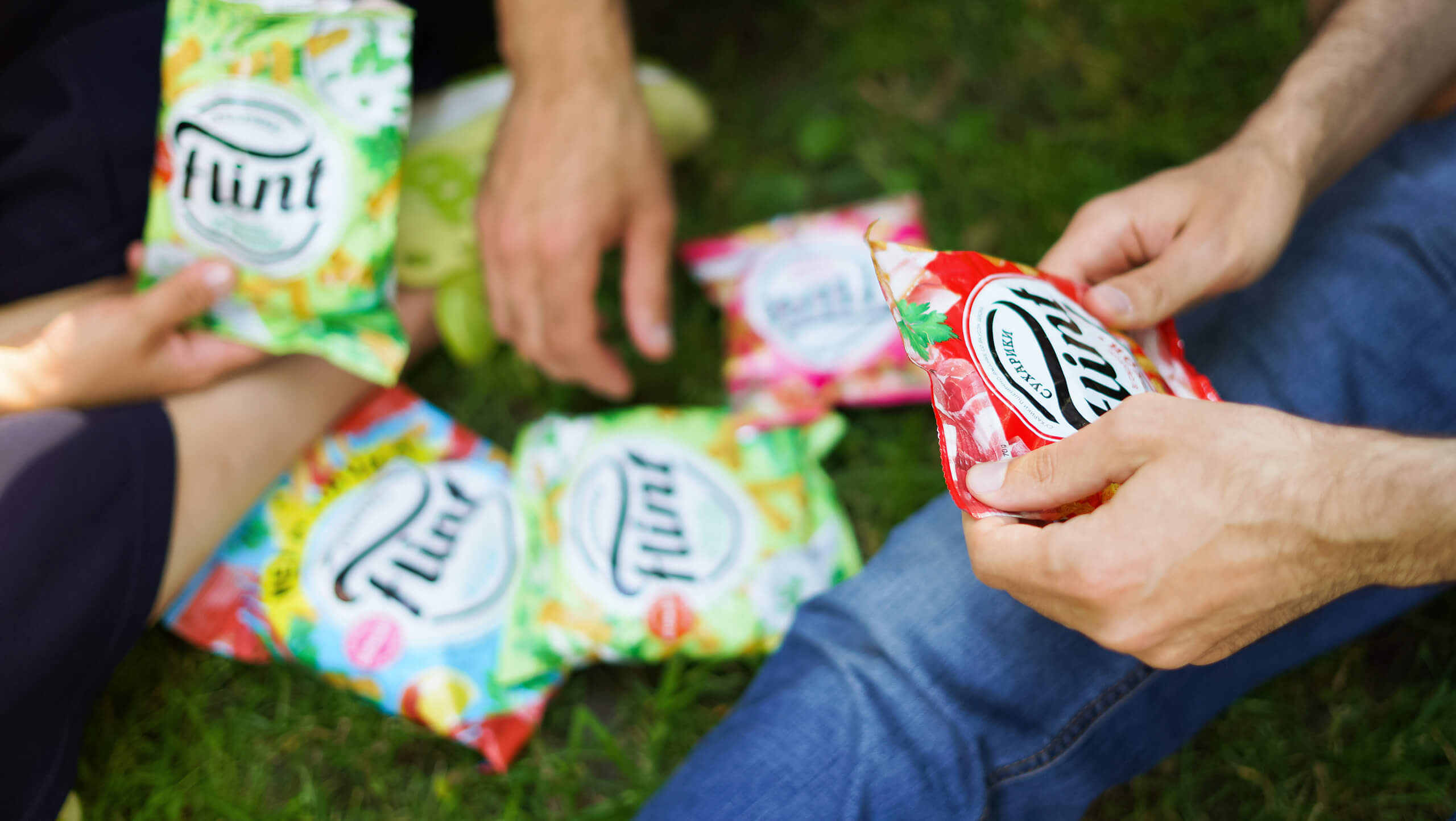
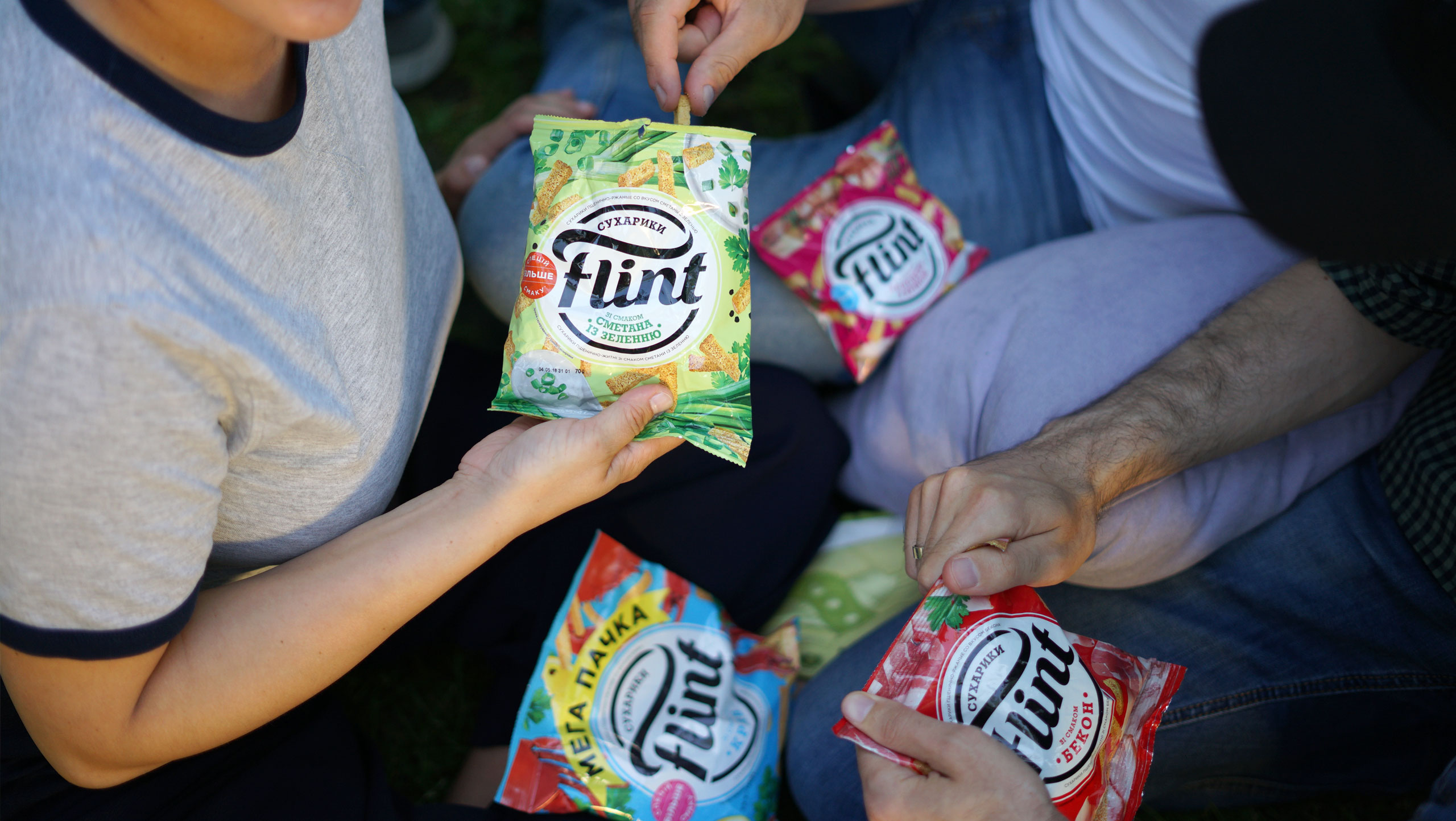
JUST LOOK AROUND—everybody is fond of baked bread snacks. But all marketing communication traditionally targeted teenagers. The best way for an agency to begin is to call everything into question. So we jumpstarted the research. We soon found grounds for our doubts: the more promising target audience for the brand was not youth, but adults. |
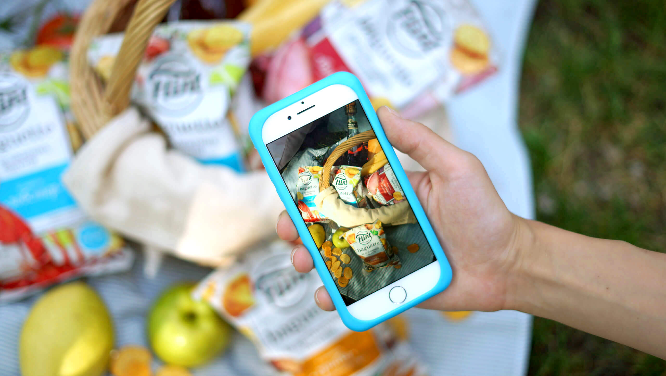
WE WENT TO SUPERMARKETSto find out about these people. How do they behave? How do they choose baked bread snacks? Do they read the labels on the packaging? We left the supermarkets for social media and studied carefully what they wrote and read. Above all, we talked to them. We became the target group’s best friends. |
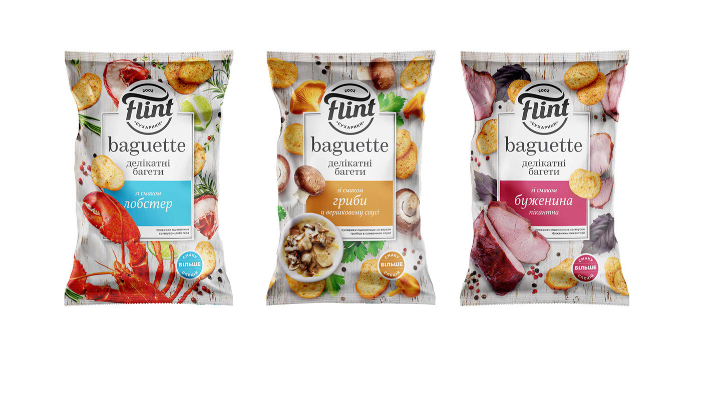
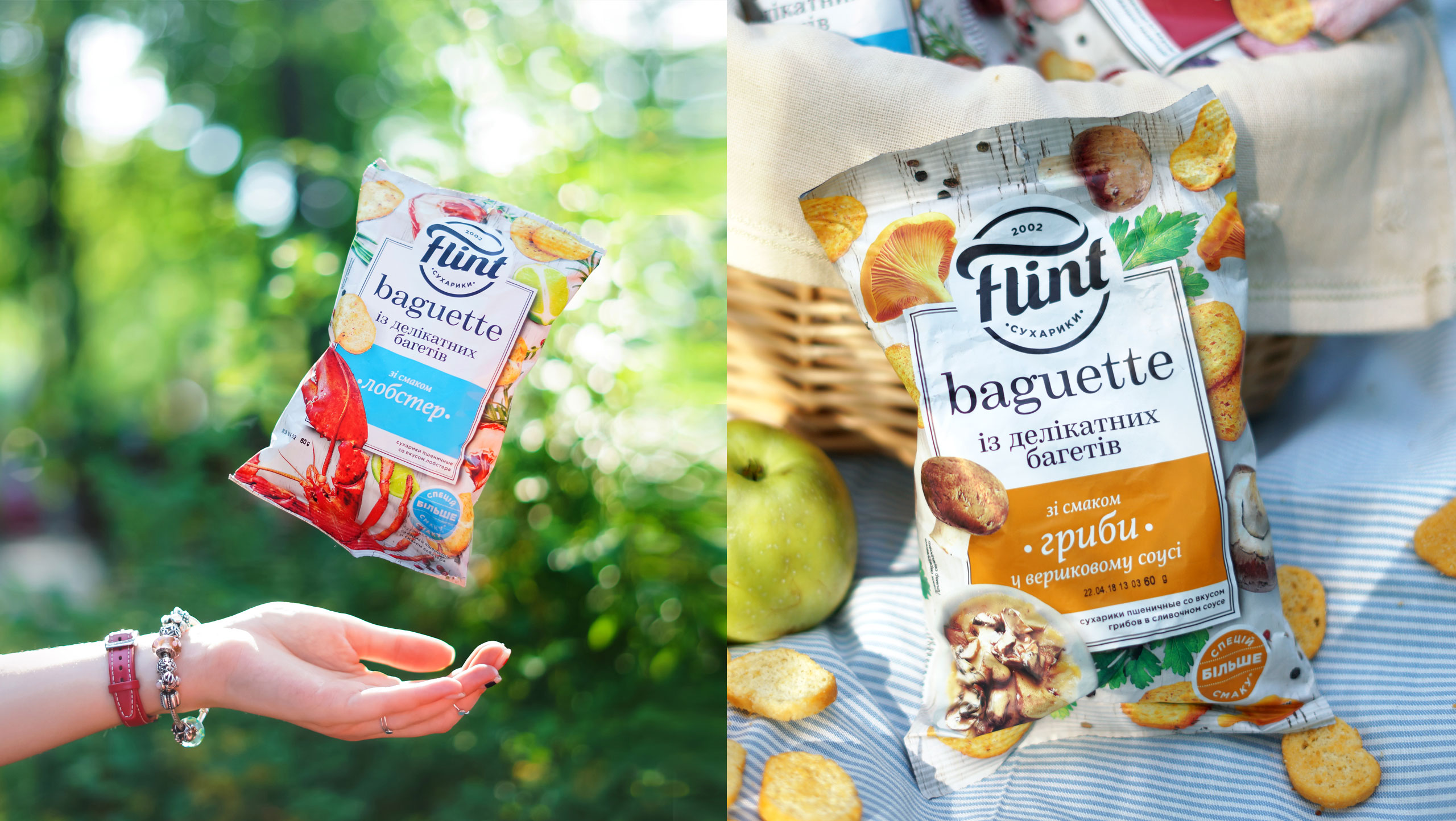
THE ARCHITECTUREof the Flint brand and each product line had this idea running through them as a common thread. The French baguette is what you need when you want to leave everything behind and savor the moment. And mouth-filling croutons went perfectly with the beer. Hey, we have only one life to live! |
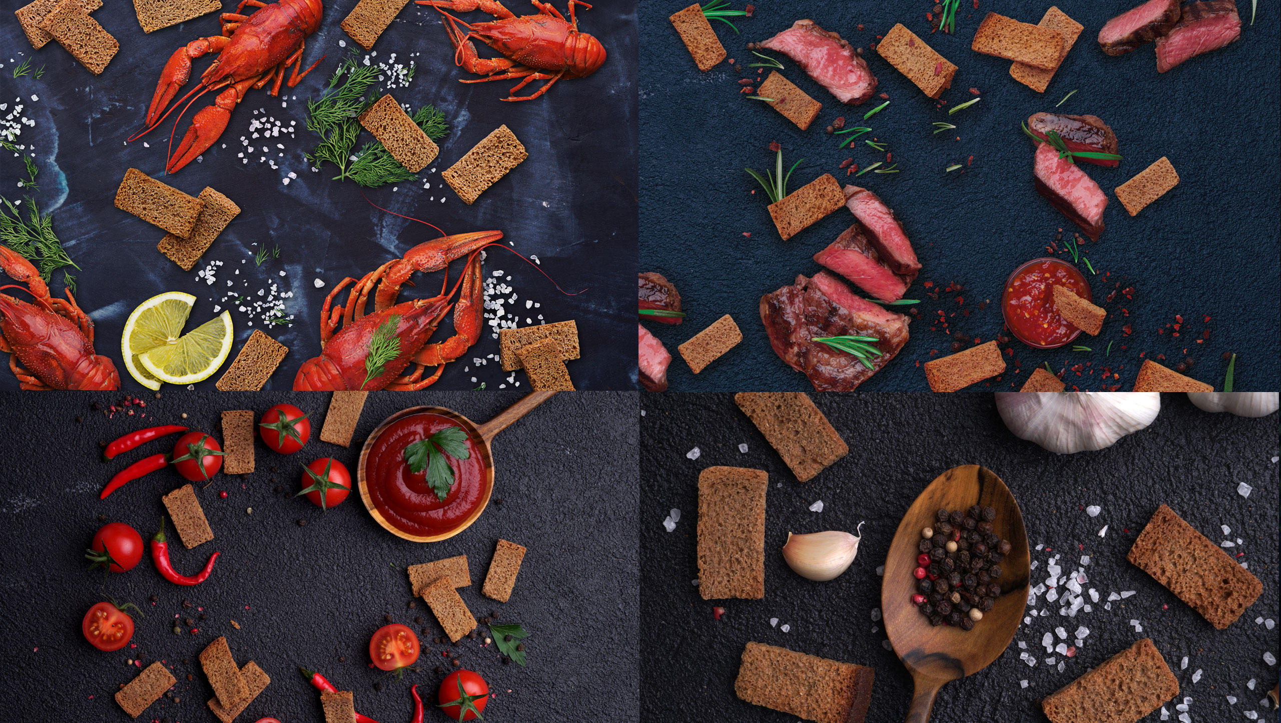
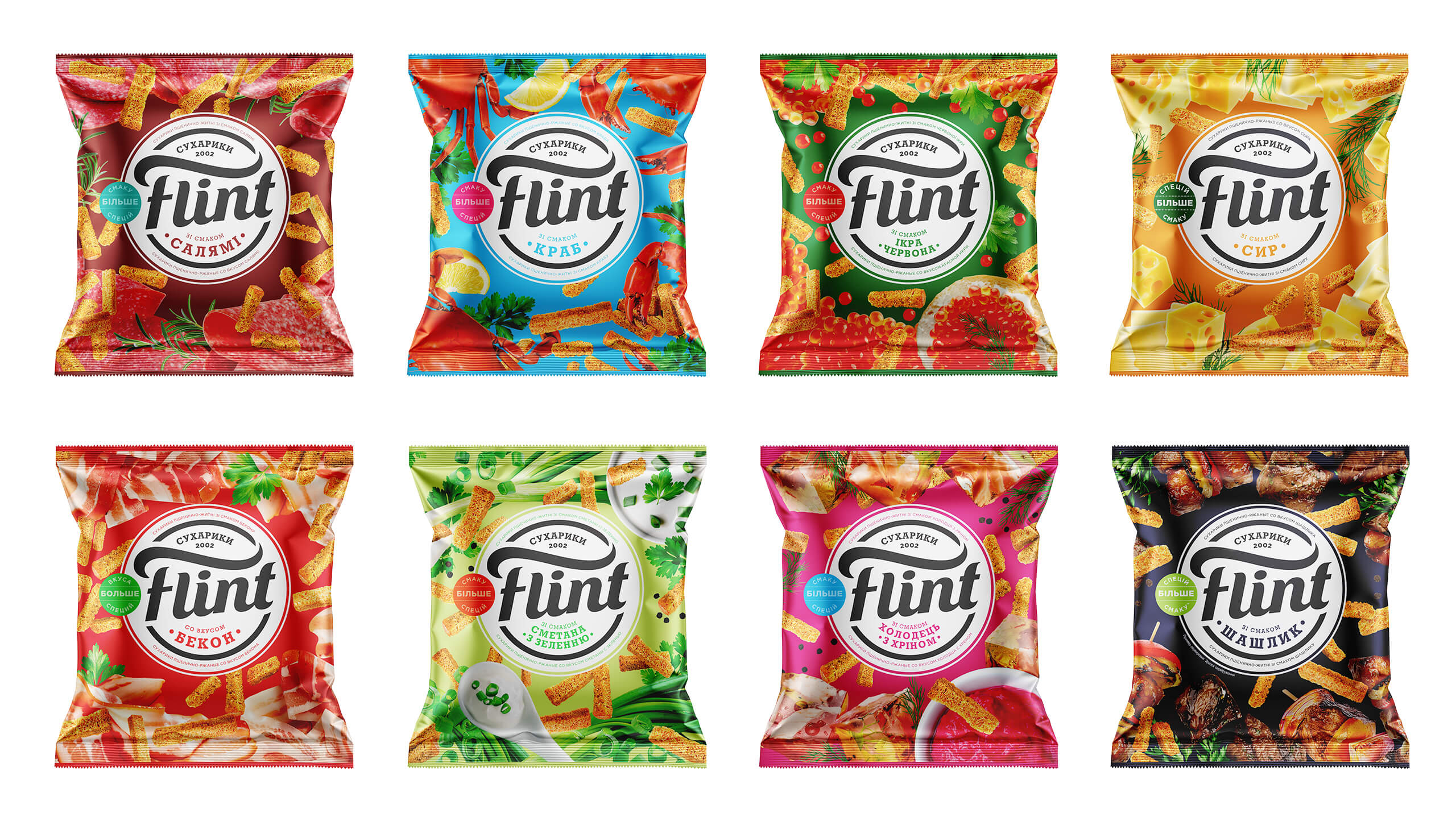
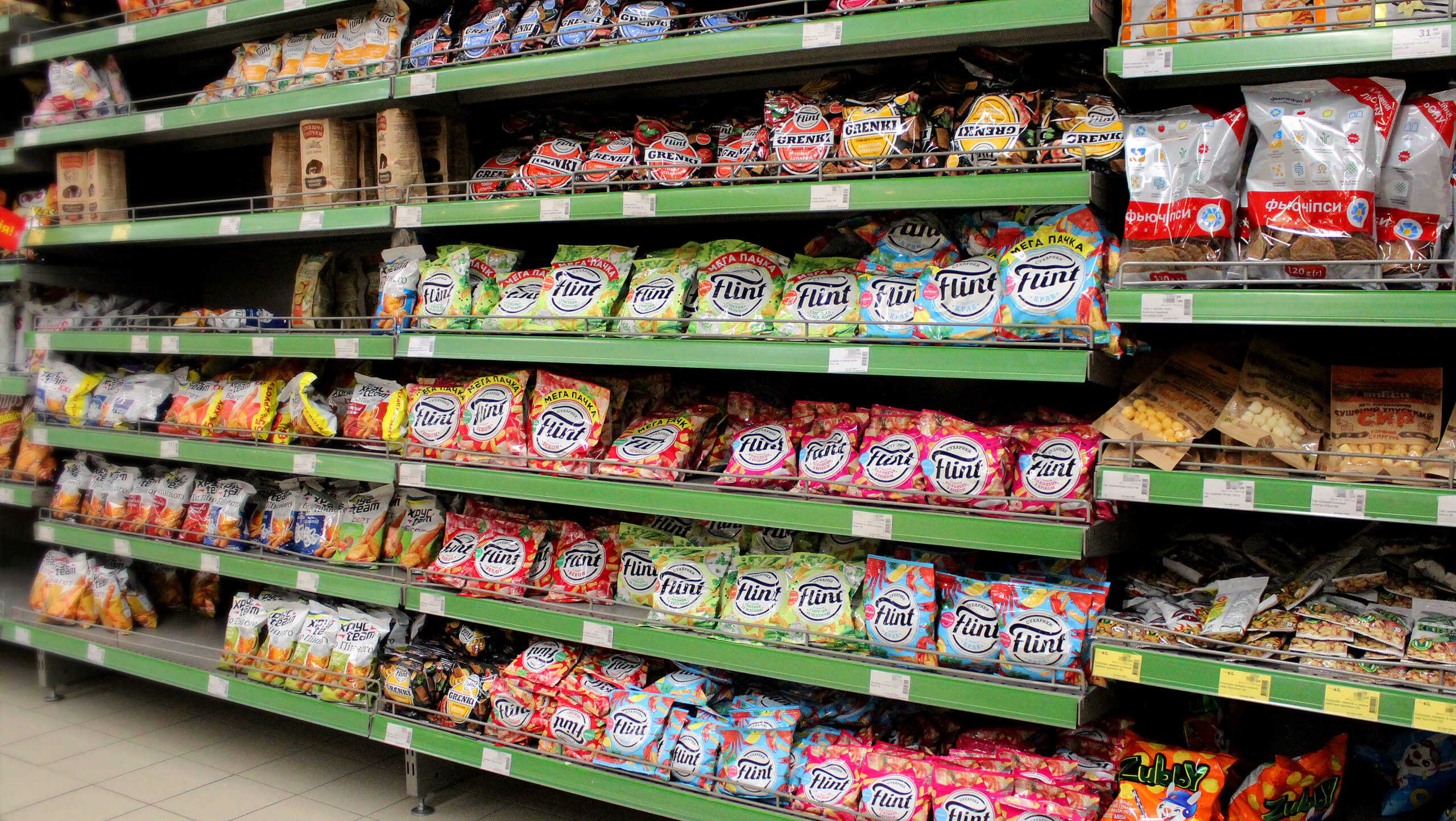
THE MISH-MASHof colors on the supermarket’s snack stacked shelves is, of all places, the worst. To stand out against such sloppiness is quite a challenge. We had to find a visual identifier. We drew up a vibrant logo block to strike the eye amid the brightly-colored products. We suggested a free and dynamic food composition to represent the brand essentials. We plunged the croutons into the beer aesthetics and wrapped the baguettes with exquisite hedonism. |
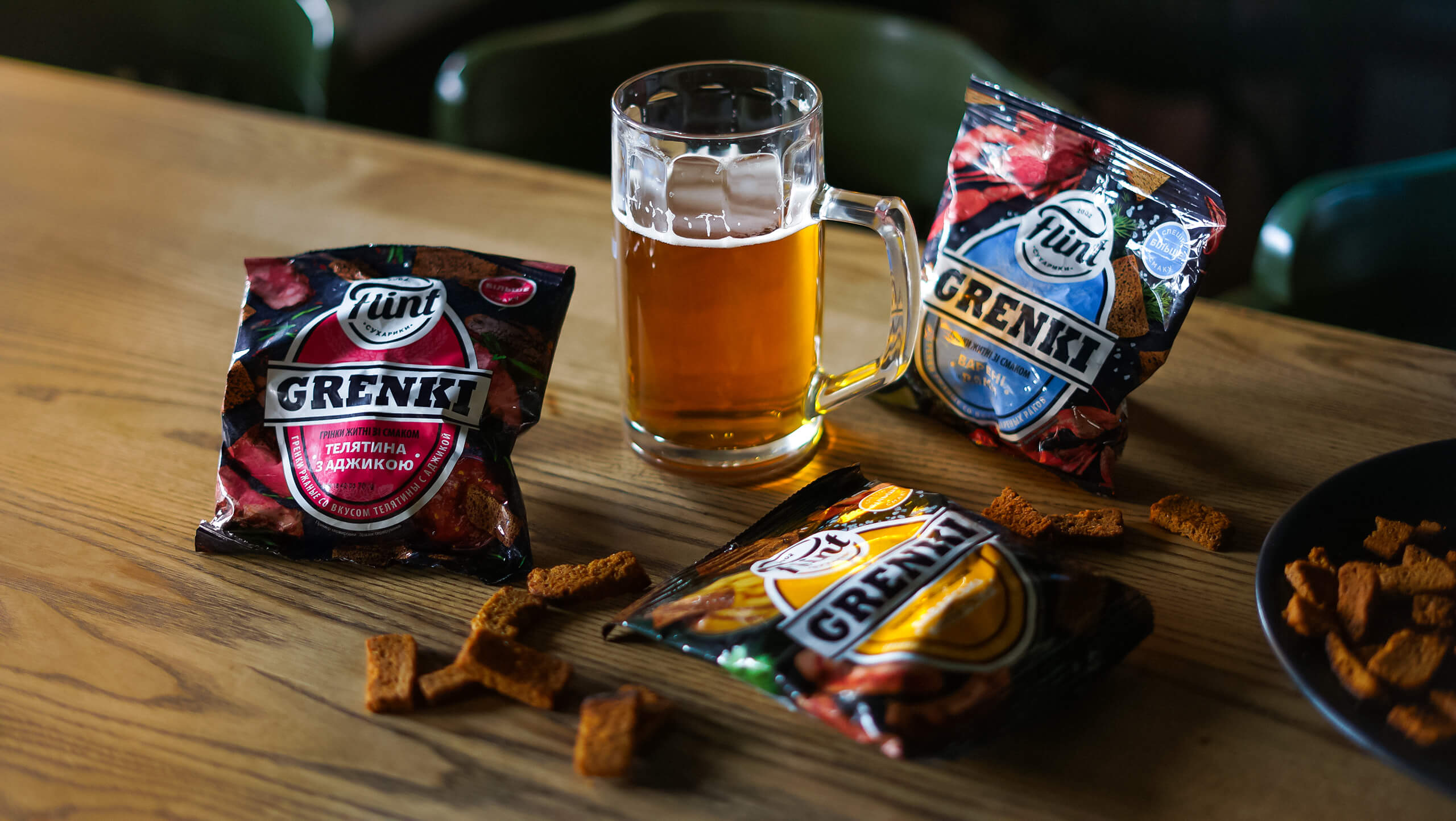
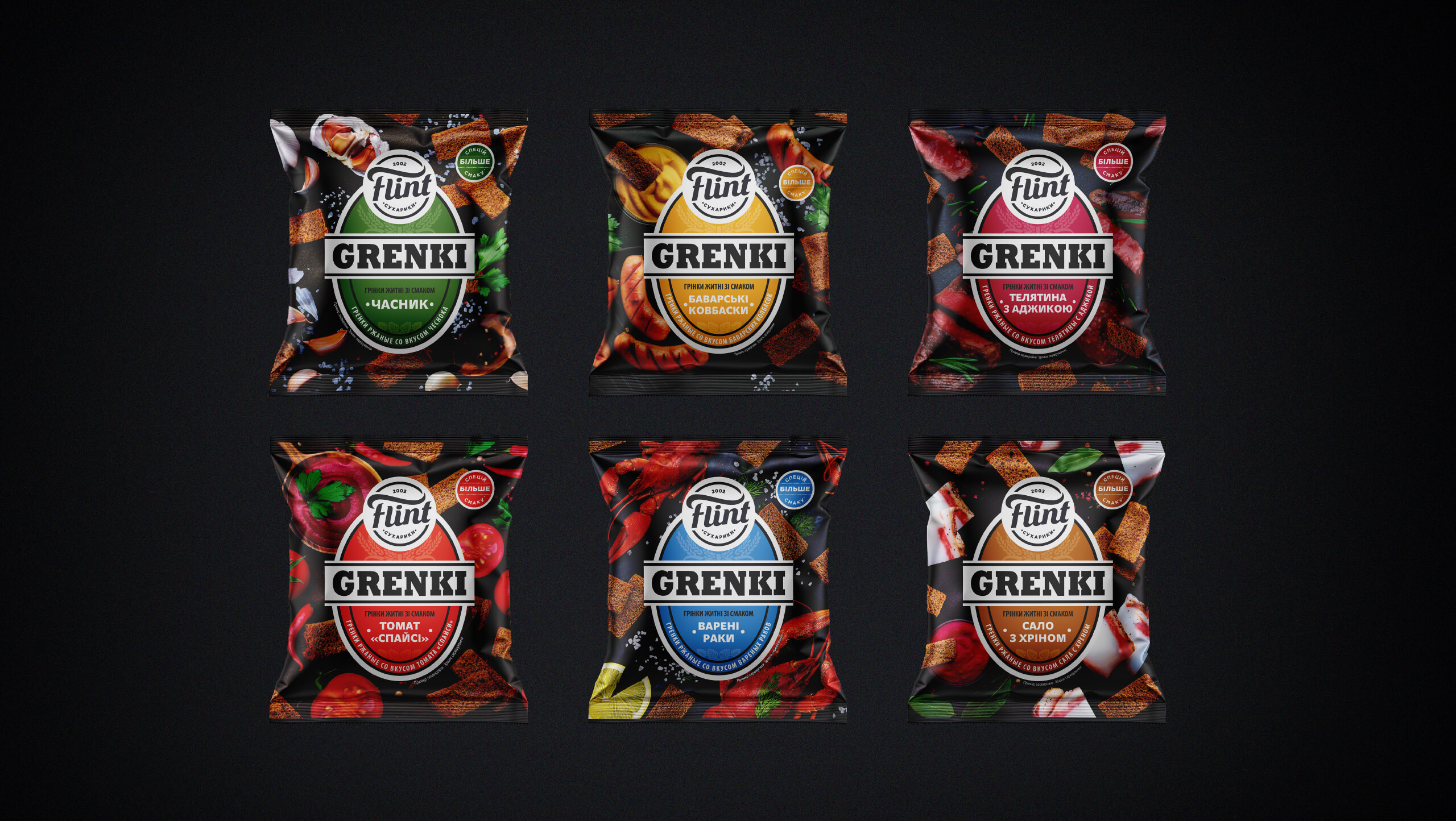
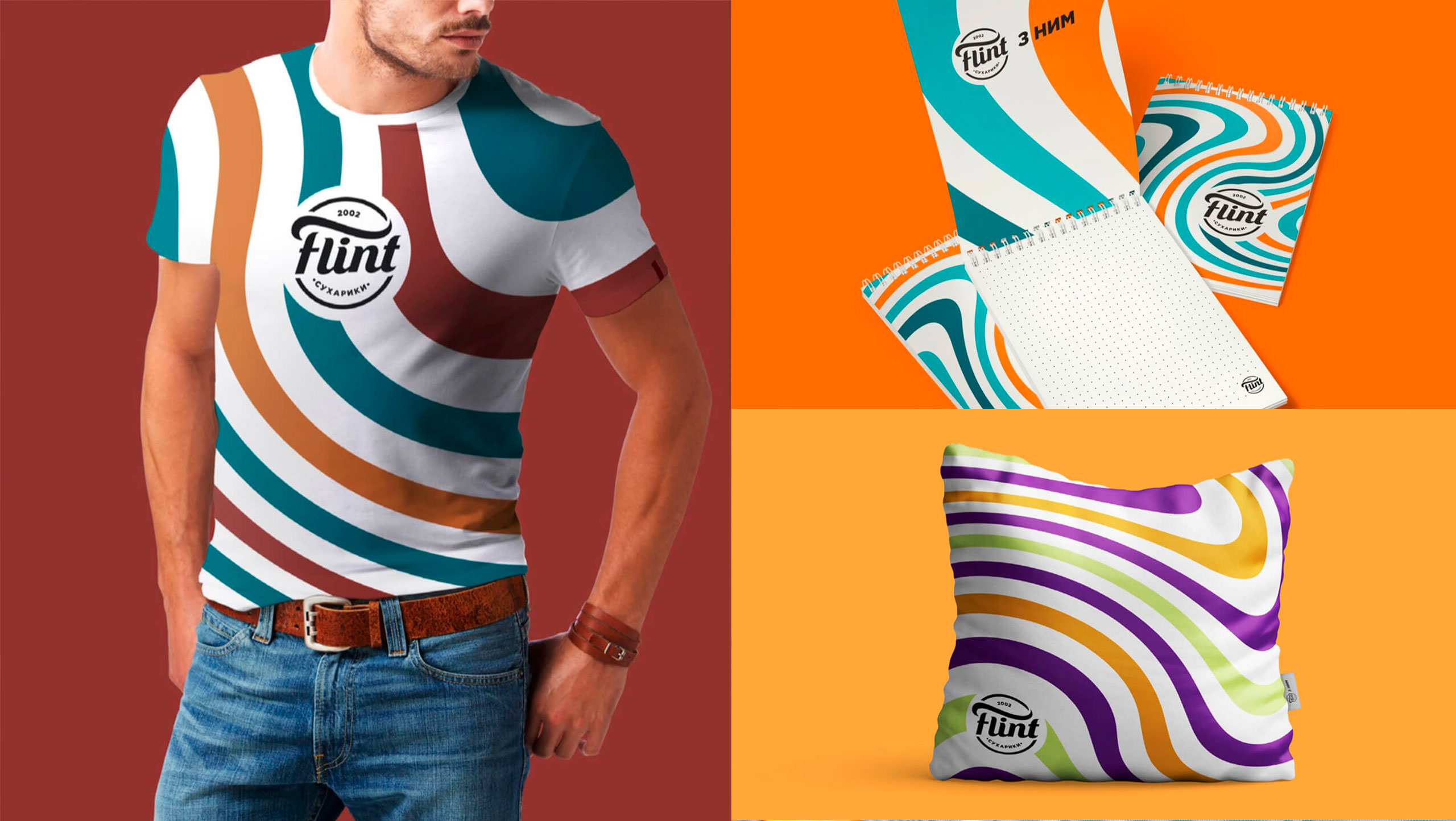
FLINT PINT LINEcontinued the story of taste. These round baked breads are made from special bread and fried using the new SoftFry technology. The bold «Take it Easy, Crunch it, Wash it Down» call hints at the consumption situation. CATCH THE WAVE, buzz, and catch the crackers too! New corporate identity embodies the essence of the brand. Treat life easily, dodge problems and immerse yourself in pleasure. Bright, but calm waves - a lighthouse for living in Flint style. |
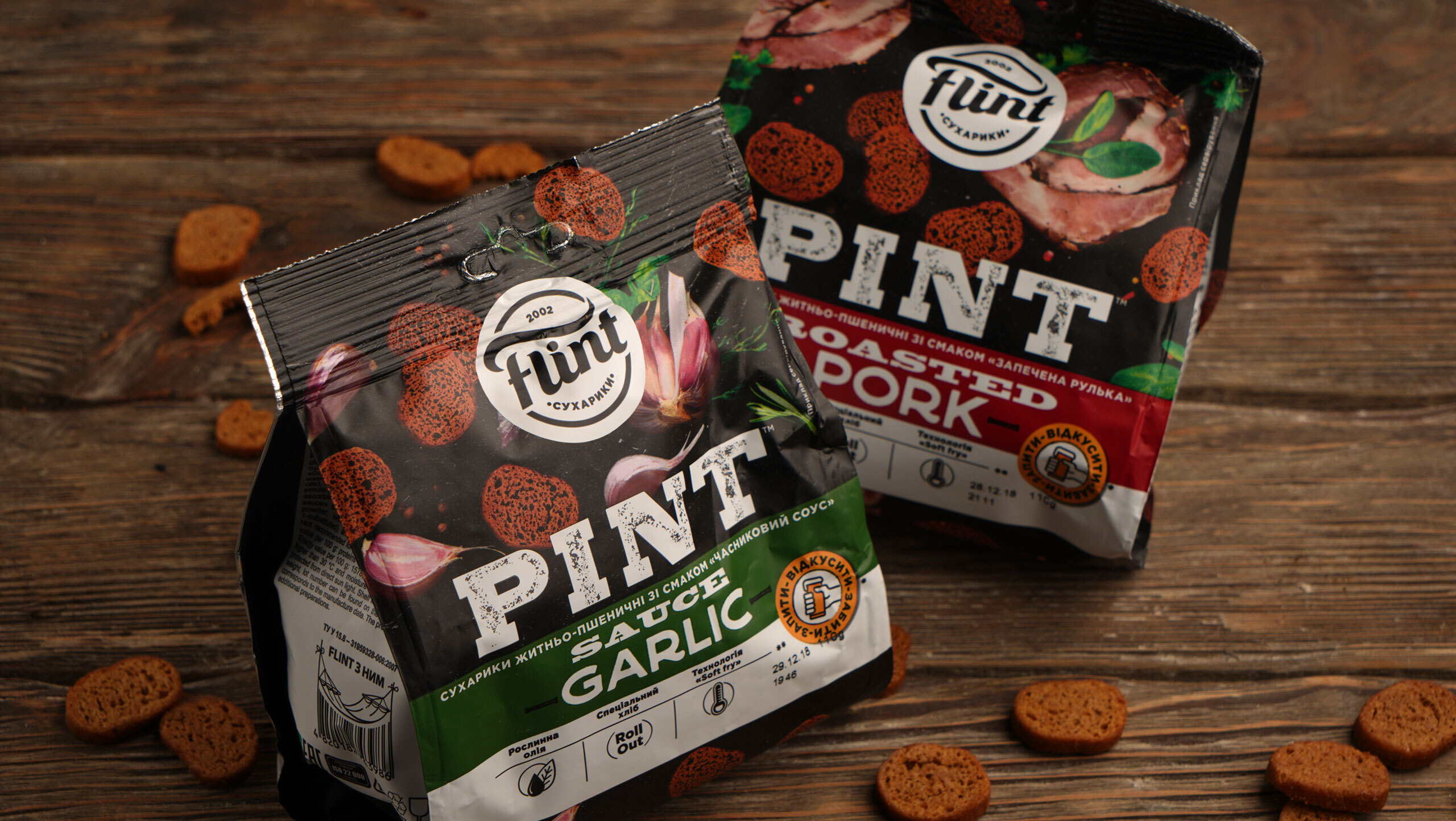
CATCH THE WAVE,buzz, and catch the crackers too! New corporate identity embodies the essence of the brand. Treat life easily, dodge problems and immerse yourself in pleasure. Bright, but calm waves - a lighthouse for living in Flint style. |
THIS TASTY PLEASUREis very easy to find now on the shelf of any store. The work was a pleasure for us. The same pleasure you have when you open a packet of Flint bread snacks, leave everything behind, and just crunch it, enjoying the taste and pleasures of life :) |
ПроектCreative Director: Maxim Lesnyak |
КейсArt Director: Helena Gavriluk |