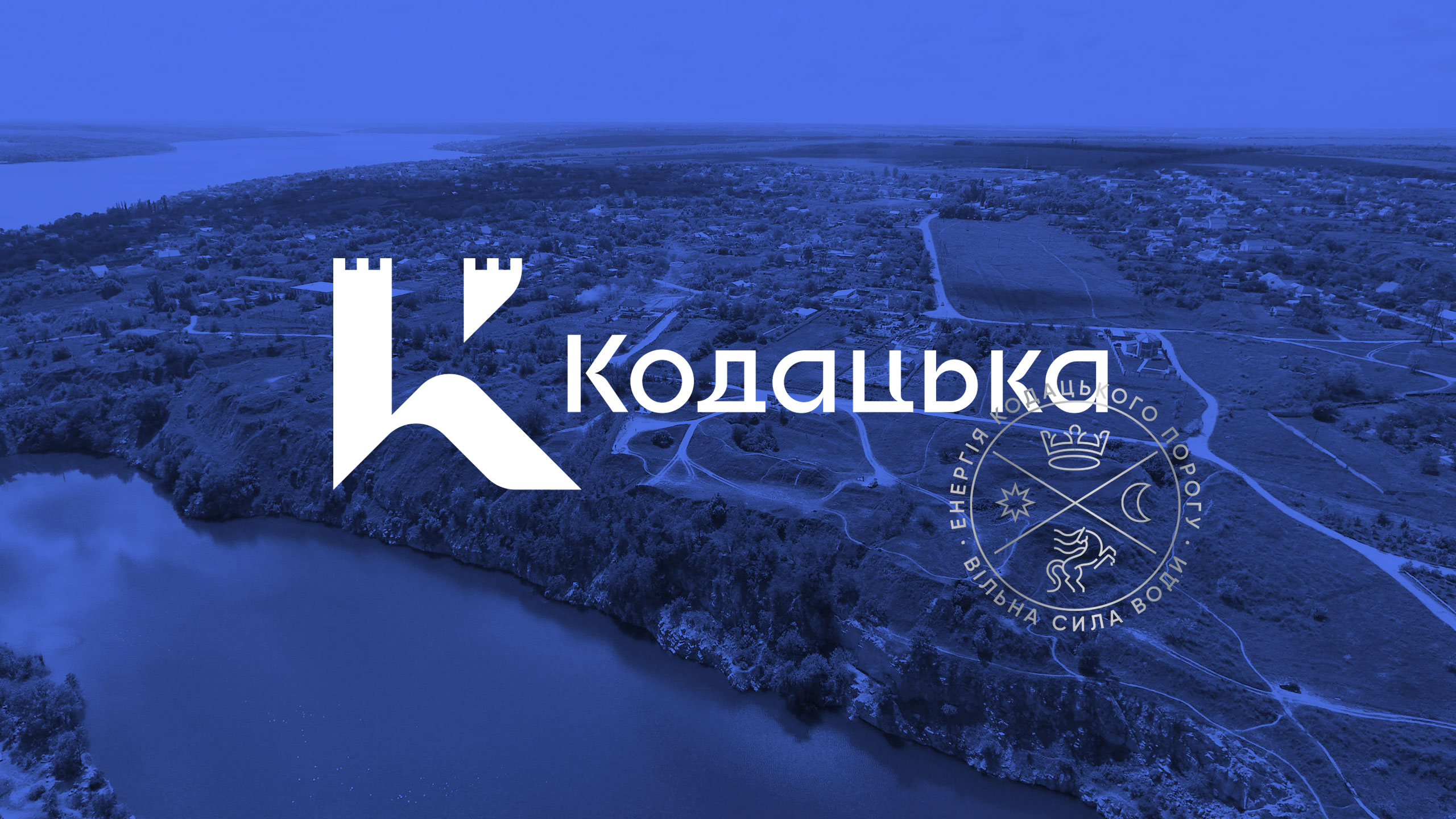
KODATSKA SOUNDS IMPOSINGby itself—even without knowing the historical context, one might see it combines two words: kozatska (Ukrainian adjective for Cossack) + voda (Ukrainian for water). Meanwhile, the Dnipro-based Kodatska Voda company has been on the market for over 20 years. And the Kodak fortress is older still at 400 years! It is about the Kodak fortress that Bohdan Khmelnytskyi said, "What human hands built, human hands will destroy." Initially, the fortress was constructed to keep Zaporozhian Sich in at bay. However, Ukrainian Cossacks conquered the Stari Kodaky fort standing on the turbulent Kodak rapids of Dnipro. |
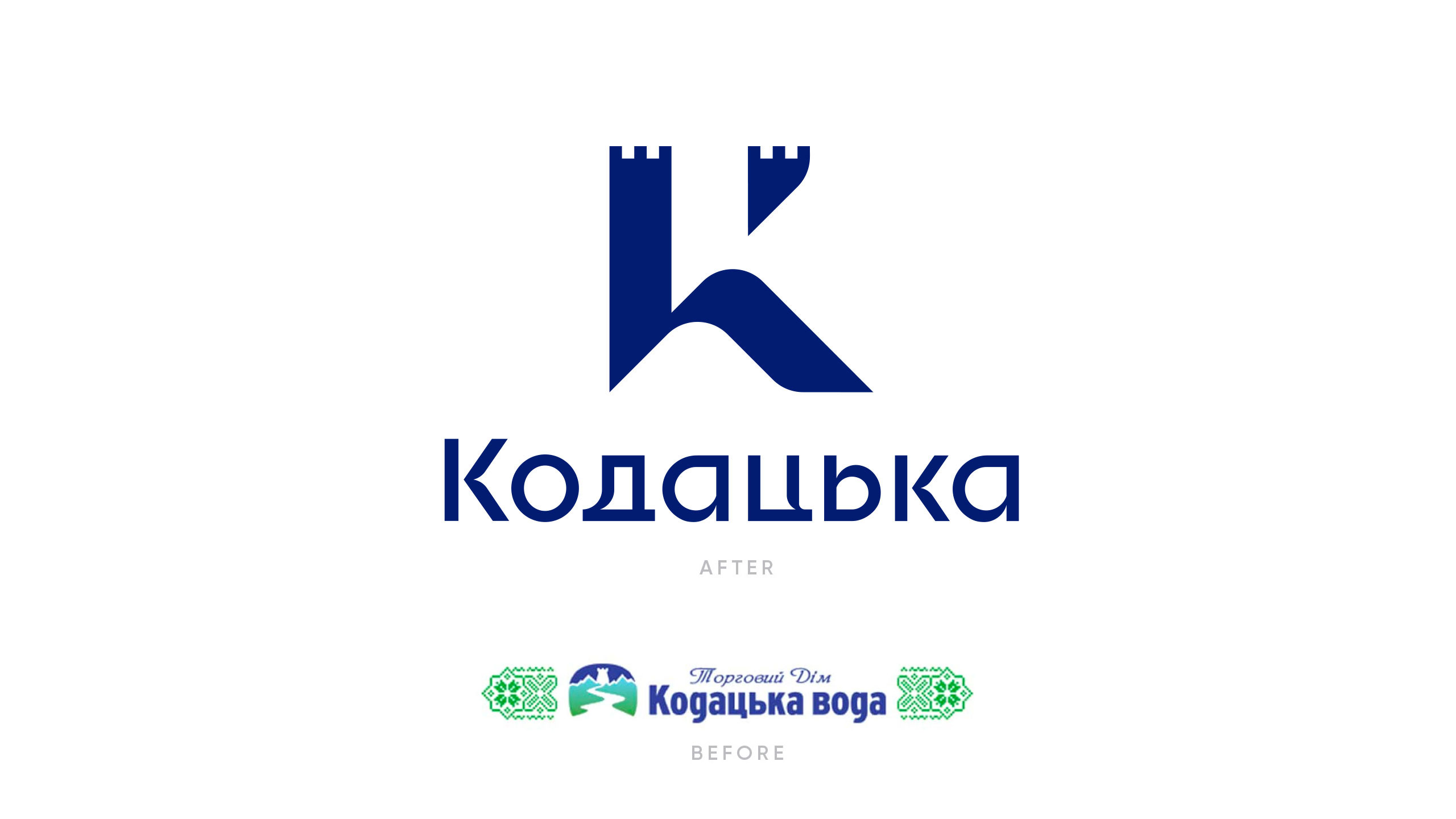
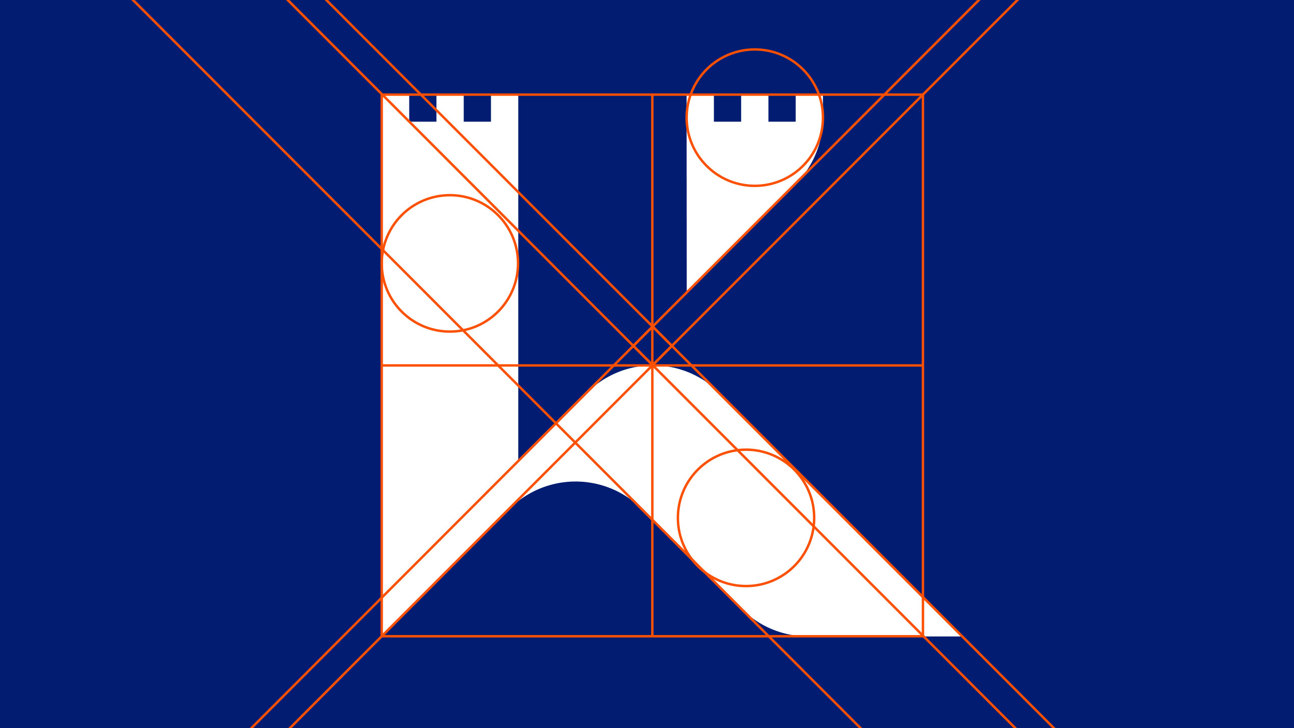
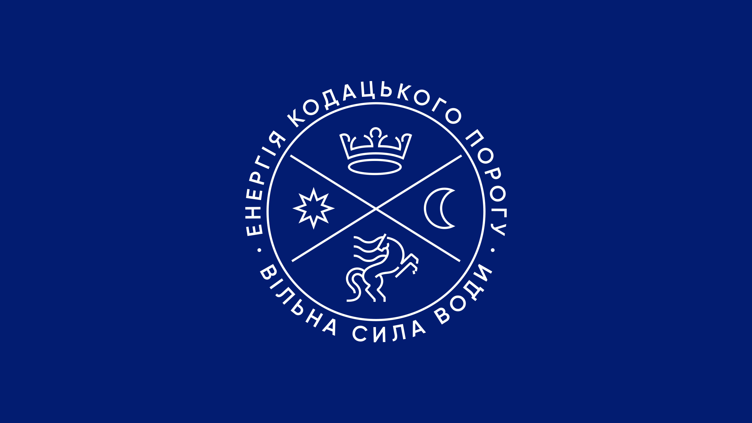
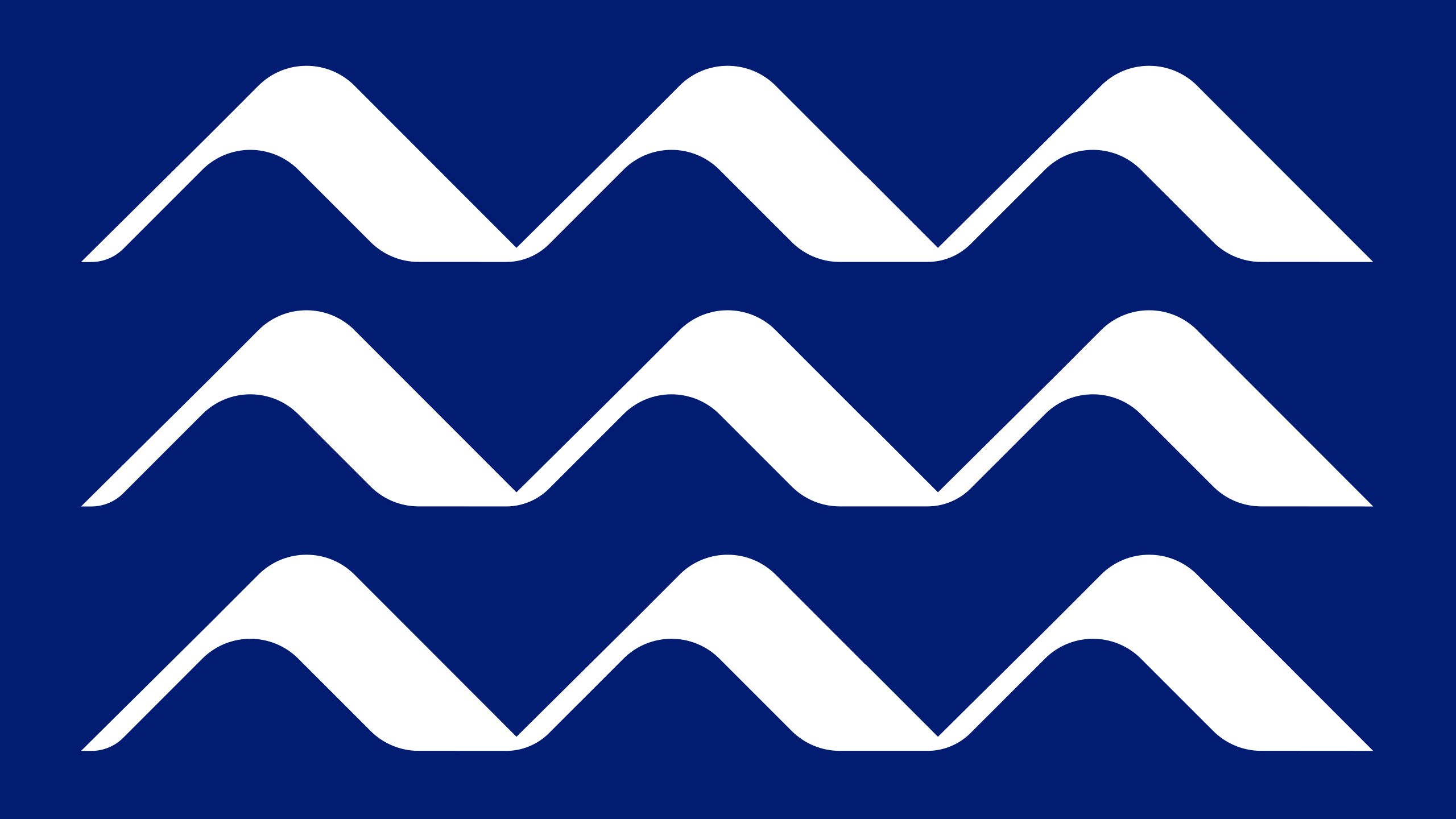
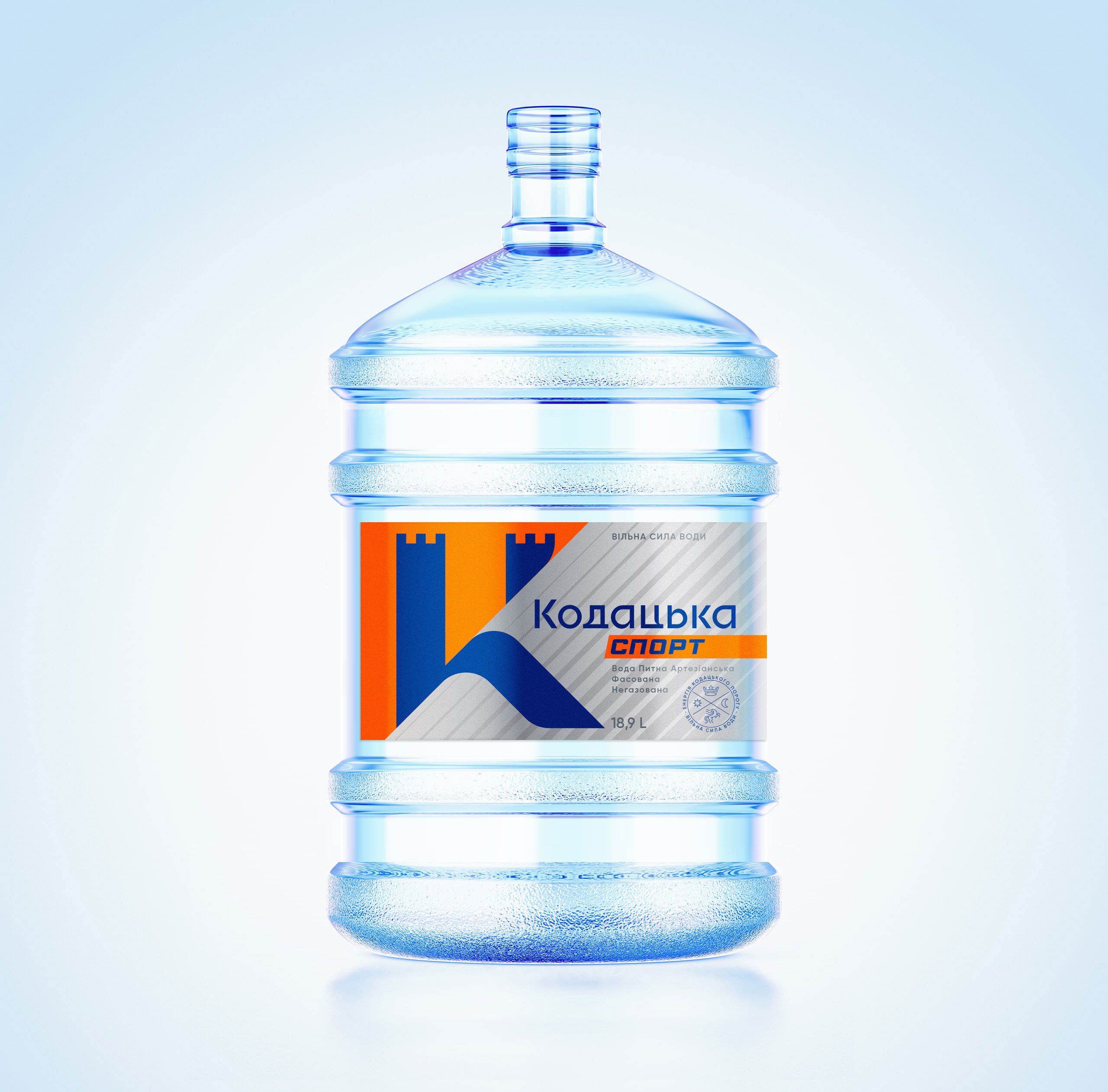
HAVING LOOKED AT THE BRANDINGof Kodatska, we decided, as the Zaporozhian hetman put it, to destroy it and build anew with our hands. This is how the K letter became a symbolic combination of a fortress and a wave. Also, the distinctive brand seal echoes the Kodak Palanka coat of arms. Then we bolstered the visual component with the slogan "The Power of Water Unleashed," the water carrying the very spirit and taste of freedom itself. Although we had to dig deep while developing the visual language, the new style turned out rather contemporary and fresh, increasing the brand's weight in the context of our time. |
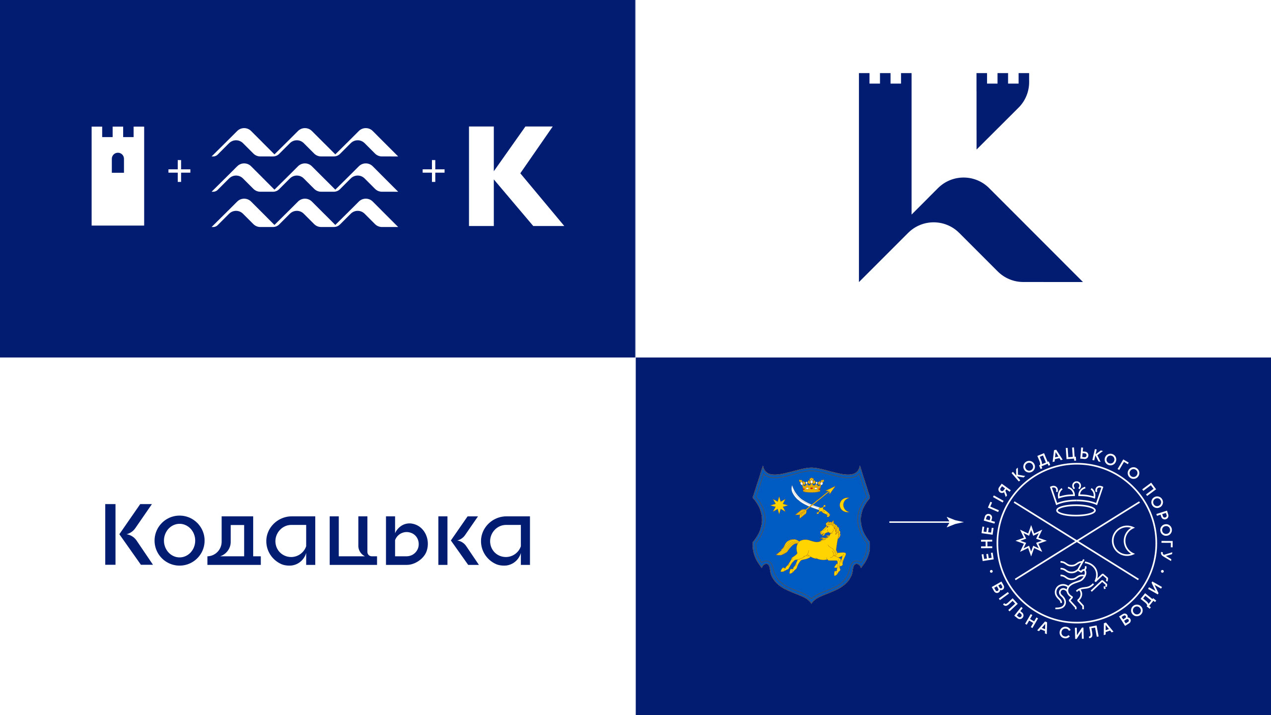
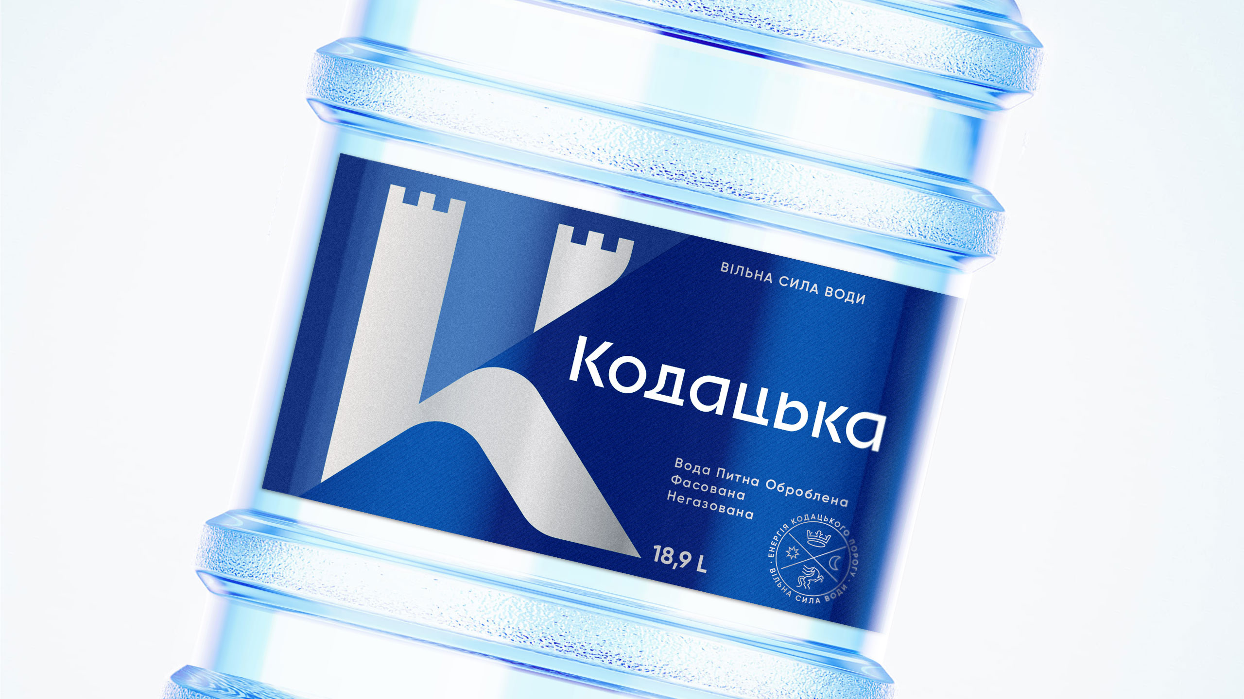
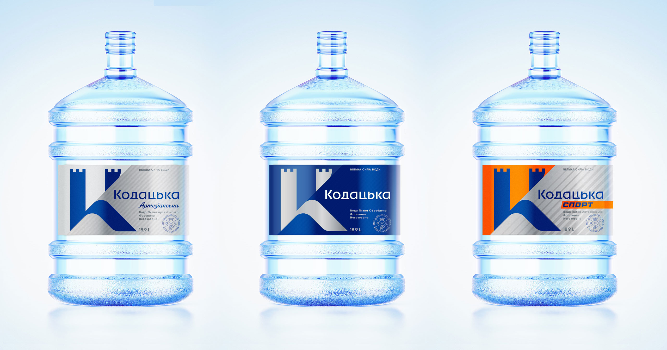
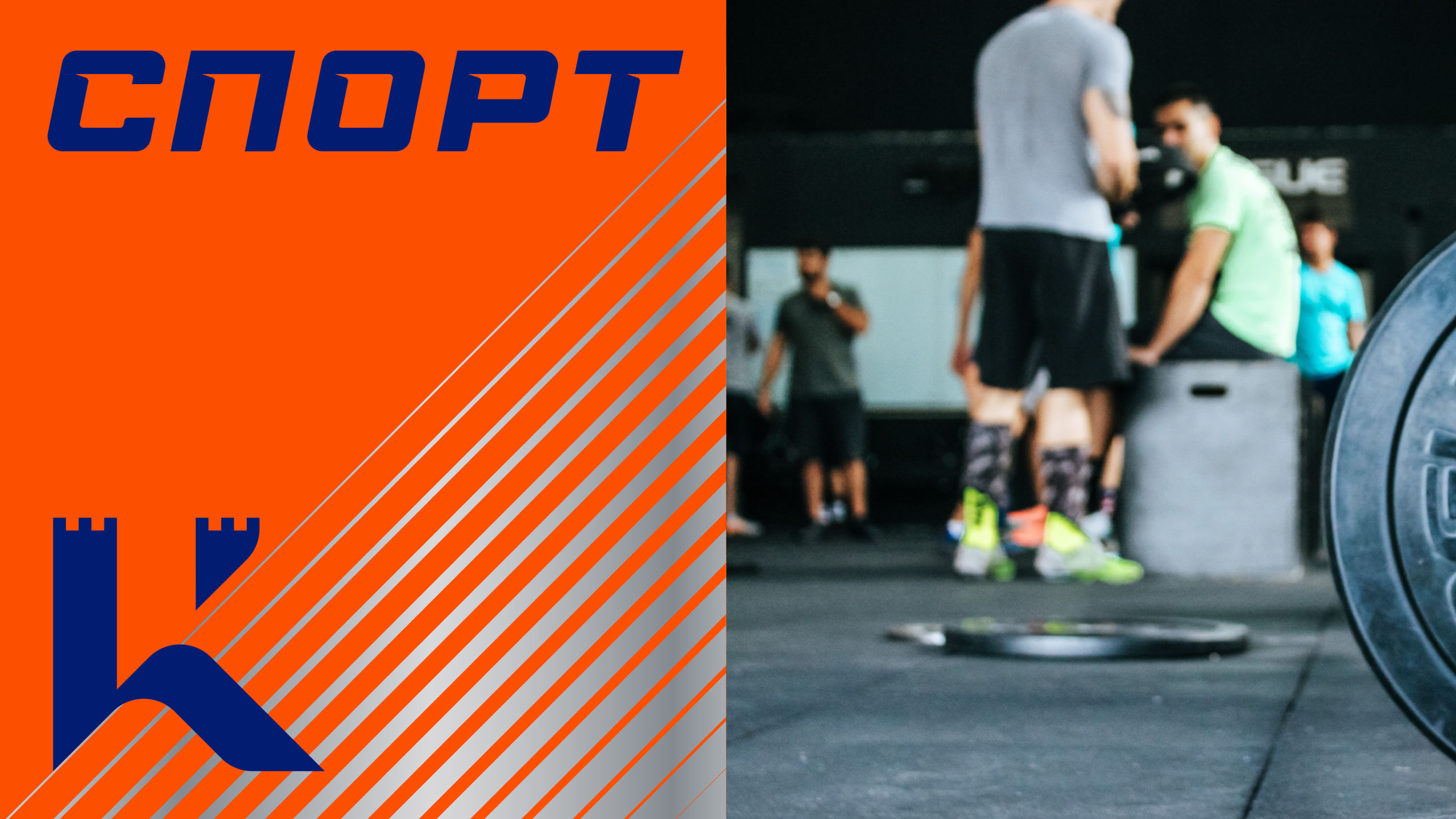
THREE DESIGNSdistinct in terms of mood but similar in terms of compositions were created for the current bottled water line: nobly blue Kodatska, sliver Kodatska Artesian, and energetic orange Kodatska Sport. The decorative effects and color planes divide the label diagonally, leaving one half of the K letter with fortress towers and one color/shade on the left side. Meanwhile, on the right, the lower part of the letter transforms into a rolling wave put on the background with a diagonal dynamic. As a result, a water flow effect is created, showing how the turbulent waters collide with the fortress walls. |
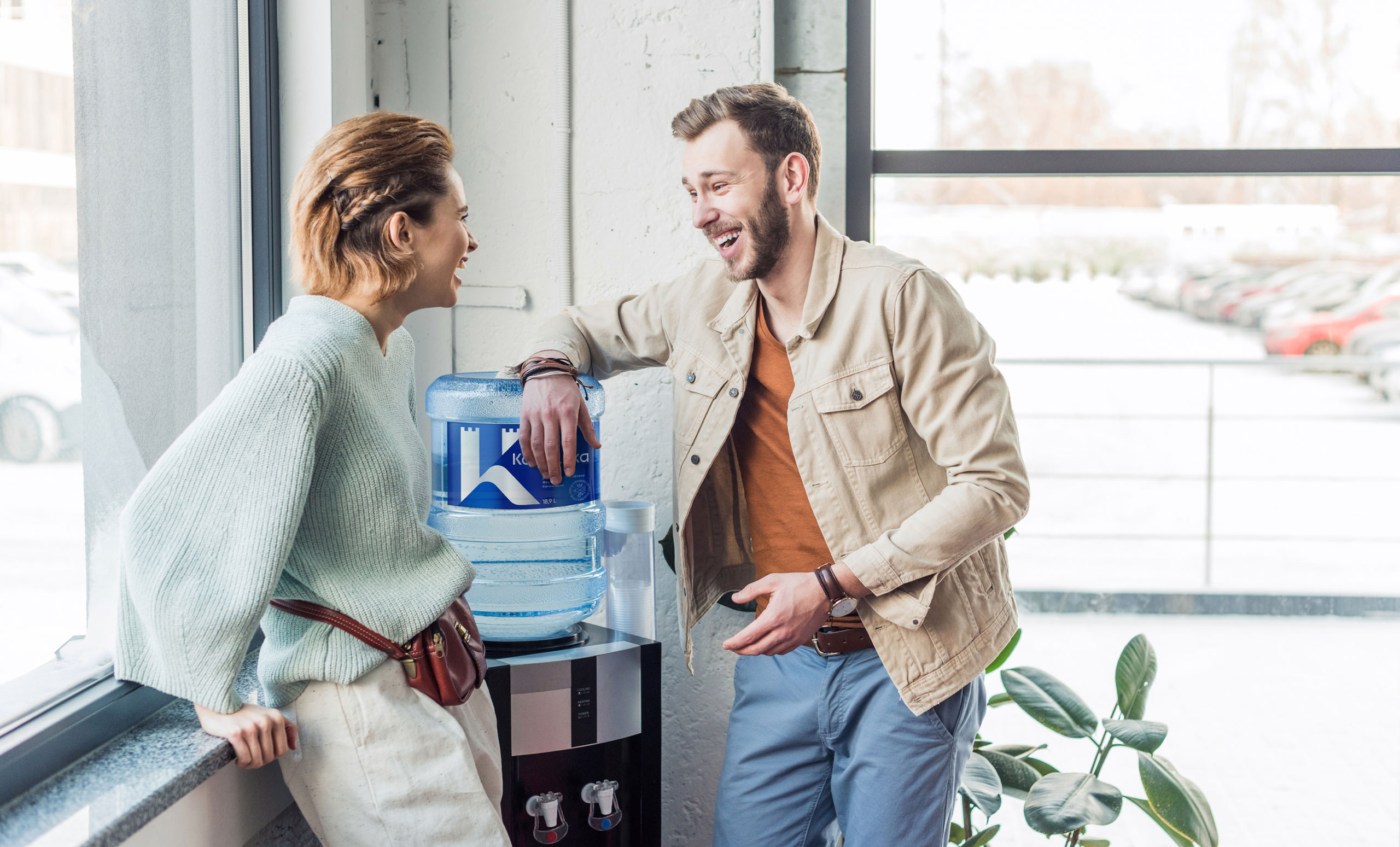
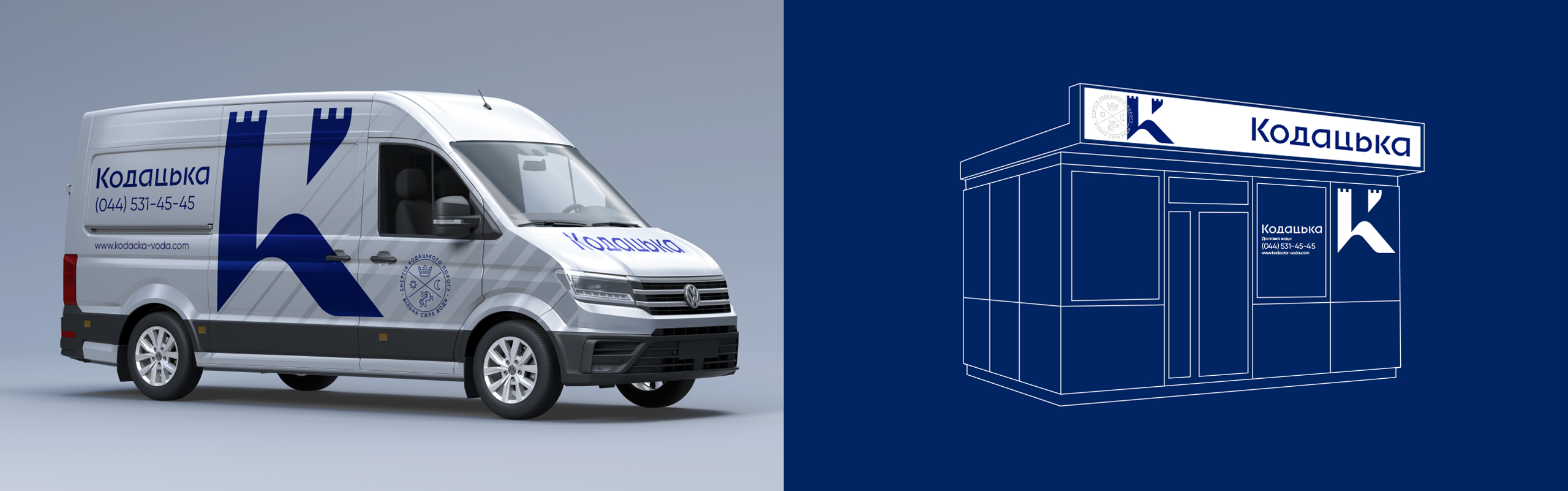
HONEST WATER AND GREAT SERVICE—this is what Kodatska is meant to taste like. Therefore, we and the client's team carefully approached the elements of style that shape the impressions about the brand. Deft guys in the ship pilot uniforms driving in branded cars to deliver the water that would look appropriate in any metropolitan household or office at a time convenient for the client—this is how we envisioned the launch of the project. However, the refreshment of Kodatska coincided with a period that calls for truly Cossack courage. The first batches of water in the new packaging were delivered by newly-branded trucks as humanitarian aid. The power of water has been unleashed for the free people! |
ProjectCreative Director: Maxim Lesnyak |
CaseDesigner: Anastasia Churbanova |