|
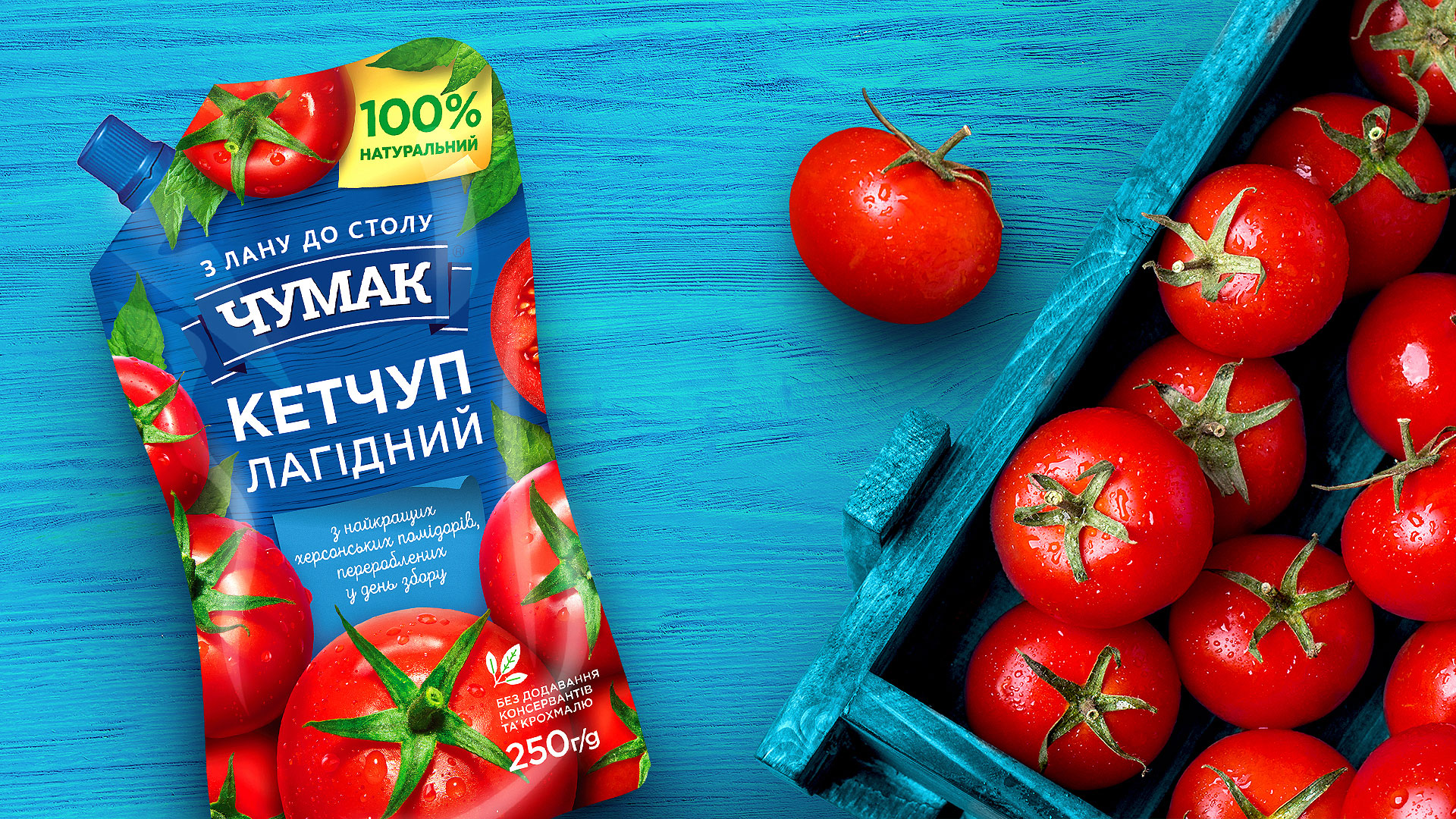
KETCHUPis a frontman on the world’s sauce scene and undoubtedly a regular at almost every Ukrainian family. Doing the major redesign for Chumak’s portfolio, we paid special attention to the ketchup category. Follow this link to learn more about the ketchup line for children, and now meet the one for adults. |
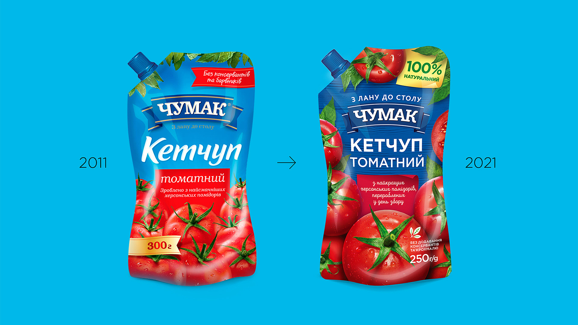
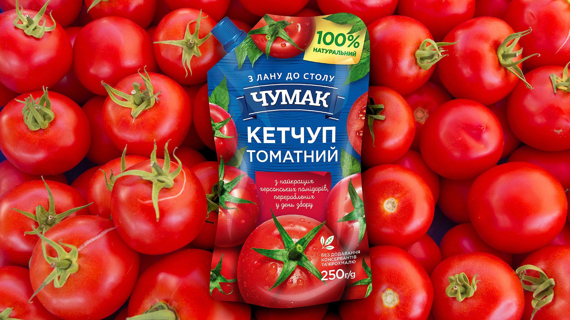
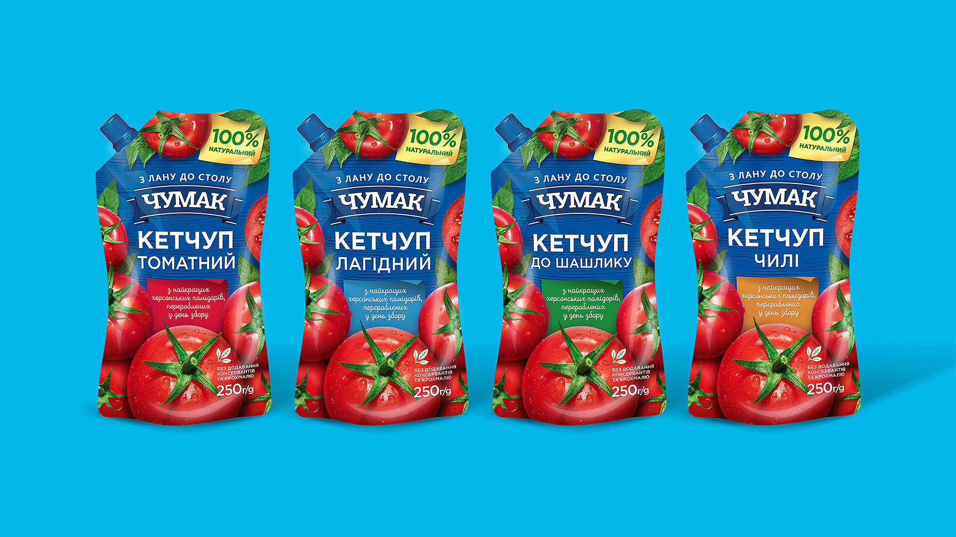
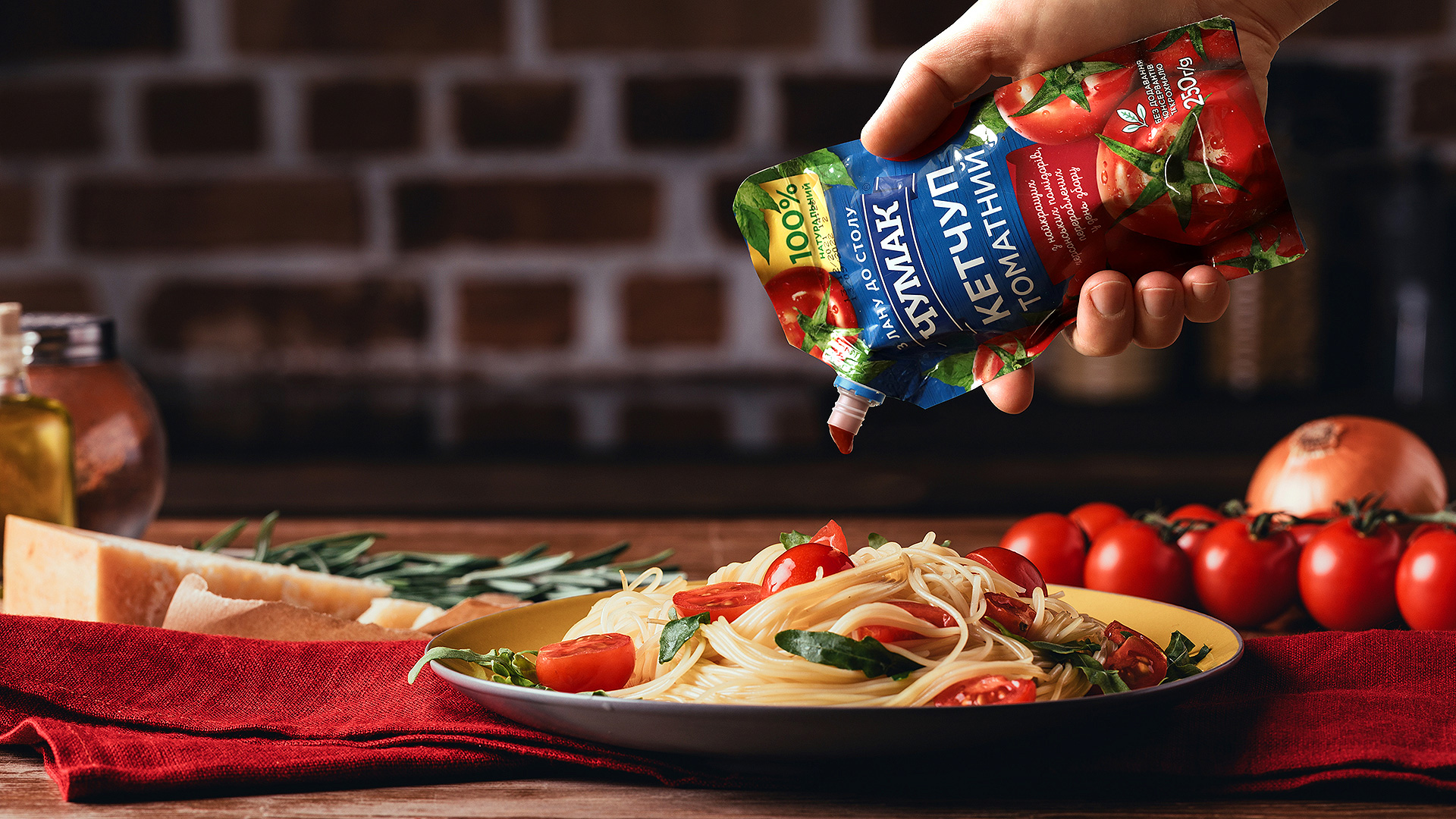
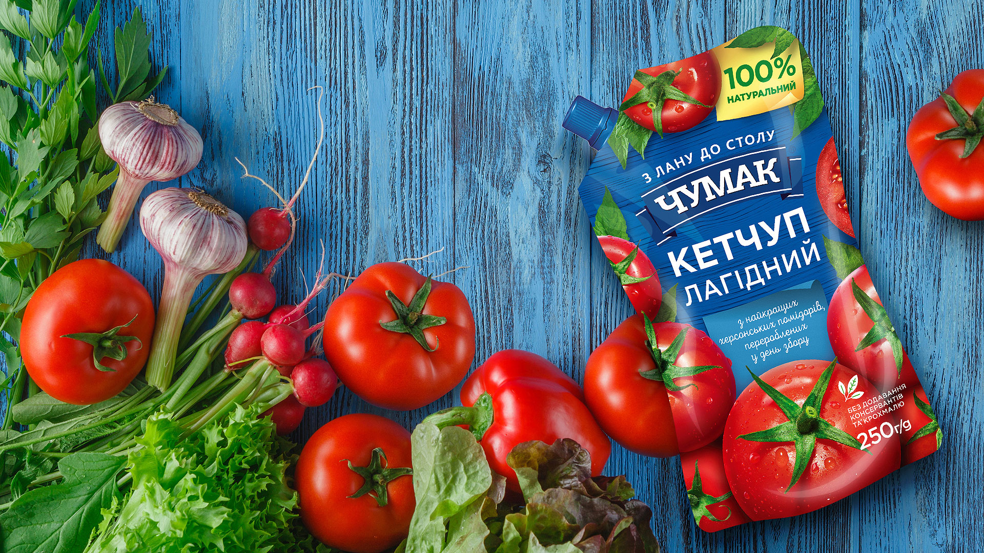
RIPE KHERSON TOMATOESget processed right after harvesting and later turn into Chumak’s ketchup. Well, the tender and juicy tomatoes are the only ones who passed an audition for a photo shoot to showcase the ketchup packaging design. What could be more natural than a tomato that basked in the southern sun? The answer is more tomatoes! We didn’t change the background color—it’s still corporate blue with its classic pantone. By color-coding boxes with marketing texts about the product, we differentiate between the flavors in the line. |
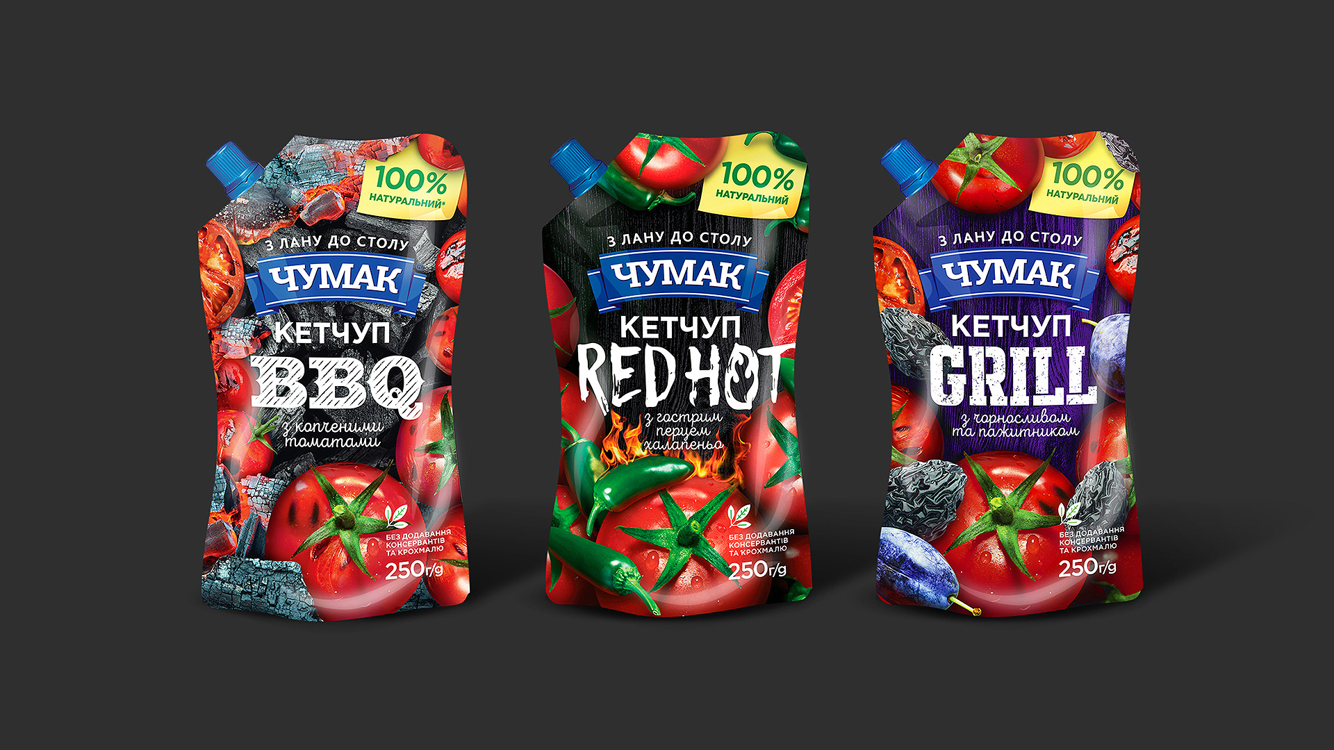
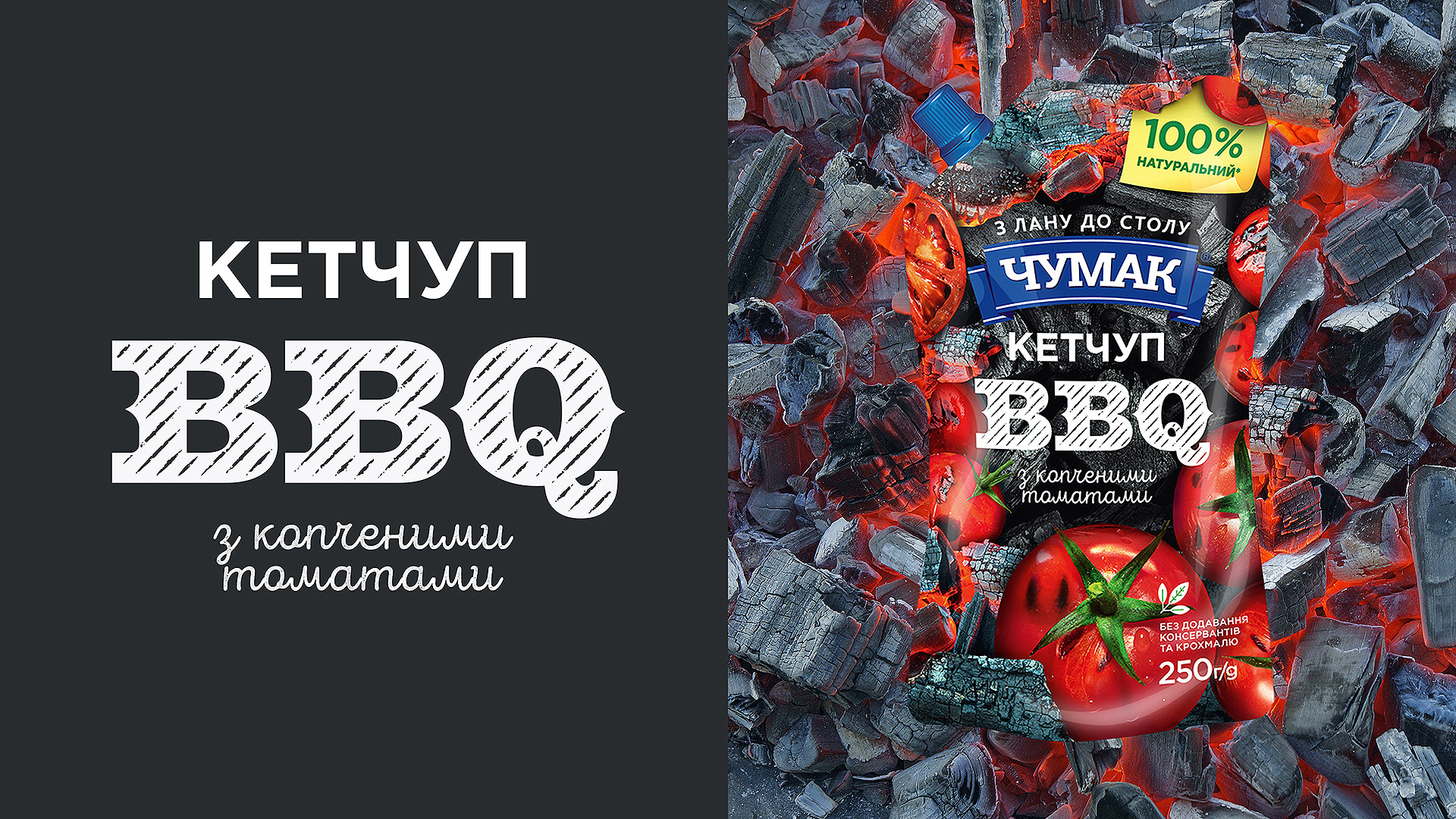
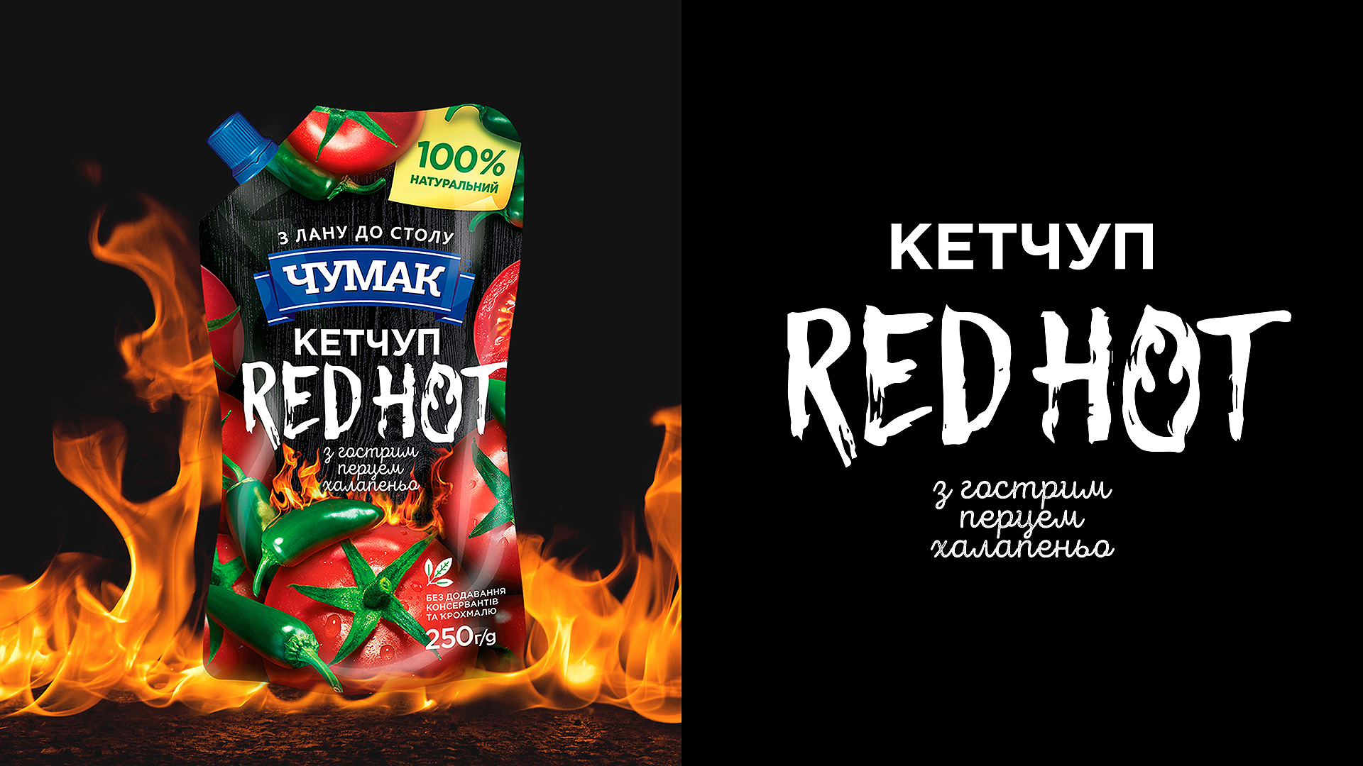
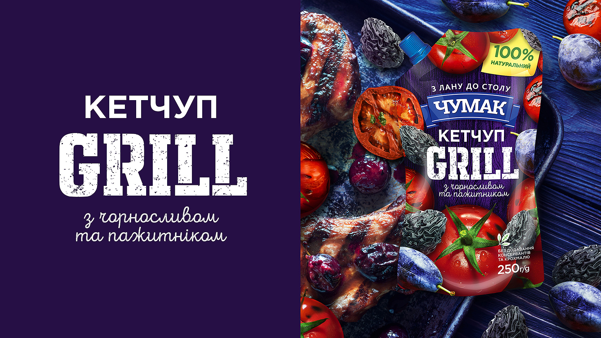

INNOVATIVE FLAVORS:BBQ, Grill, and Red Hot—outdoor recreation headliners—are the leaders among kinds of ketchup. We customized and emotionalized the products’ names, thereby emphasizing their character. Of course, we added signs of BBQ culture: fire, smoke, and related ingredients for each flavor. All in all, we integrated a new line into the global corporate portfolio to make sure each ketchup remained attractive and noticeable and at the same time burst with its bright colors and delicious undertone. |
ProjectCreative Director: Maxim Lesnyak |
CaseArt Director: Elena Tverdokhleb |

