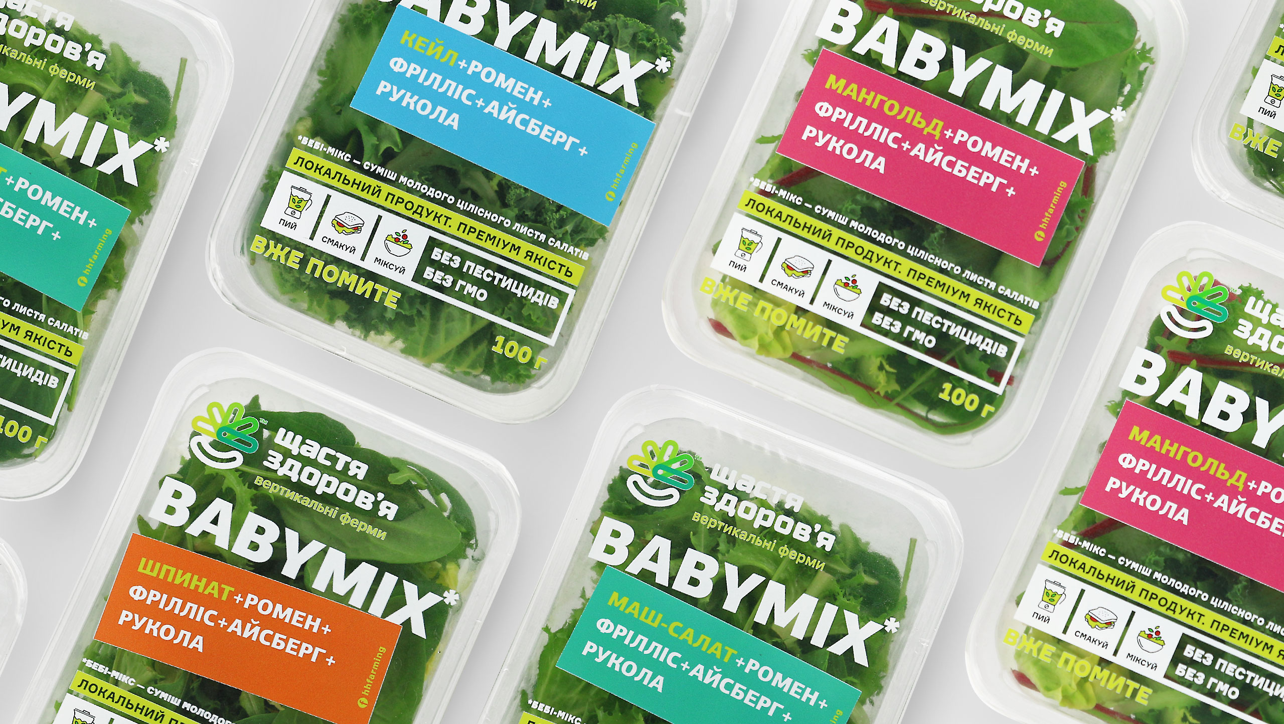
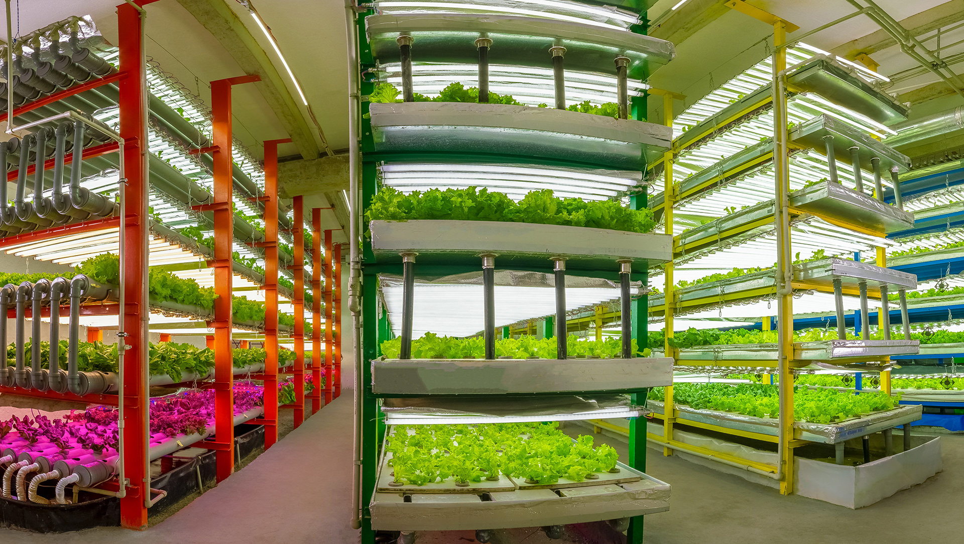
VERTICAL FARMINGIt imperceptibly keeps finding its way into the life of the capital and megacities, pushing the limits of traditional agriculture. Frankly speaking, we were not concerned about the issue until we met Maxim Kirichko, the founder of the vertical farm Happiness Health. From that moment on, a few "wow" factors came in at once: the acquaintance with an interesting and multifaceted person, the immersion into a promising innovative environment, a serious brand name of a local meme type, a logo created by another company, and our task to develop a green salad packaging for the first vertical farm in the city. |
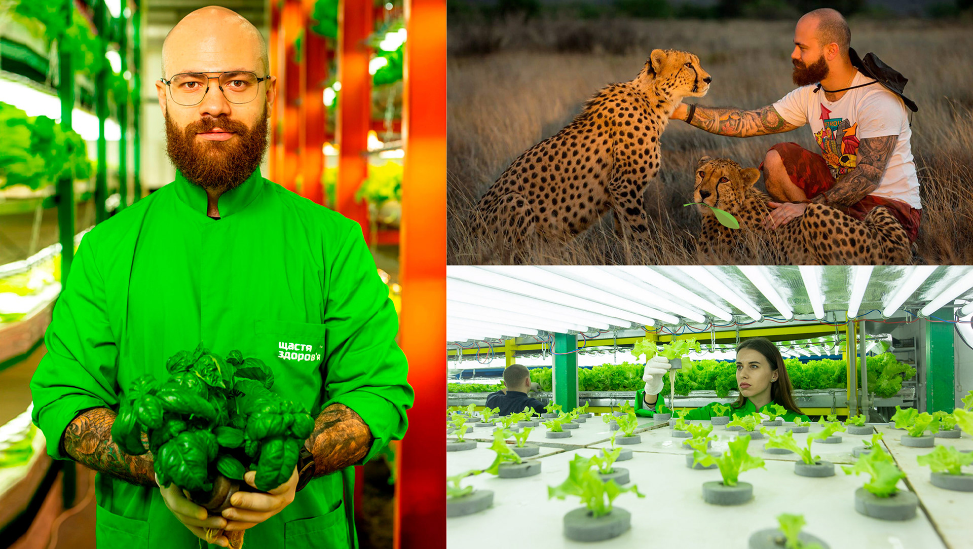
THOSE WHO DO NOT CAREwhether it is vertical or horizontal farming should lend an ear to Maxim's explanation, "Historically, agriculture has always been flat: the man used a horizontal surface of the fields to grow food. It was the "horizontality" that did not allow agriculture to compete with urban 3D-industries housed in multi-story buildings for the area in megacities. We've made agriculture a large-scale industry – we build farms in cities and minimize the distance and time between the producer and the consumer. In addition, we cultivate a more environmentally friendly product by using much fewer resources: for example, only 5% of the water in comparison with classical farming." Don't you feel inspired? |
HANDLING SPROUTSwas left to the care of our client. We were primarily interested in whom we would have to "handle" in retail chains. In the "fields", questionnaires and joint workshops, together with our client, we were trying to figure out the portrait of a female consumer who would be interested in the product – the freshest and cleanest green salad. We reasoned about the language we'd speak to her and the promises we'd give, as well as we discussed the kind of packaging that would ensure the best storage and would be different from other brands available on the shelves. |
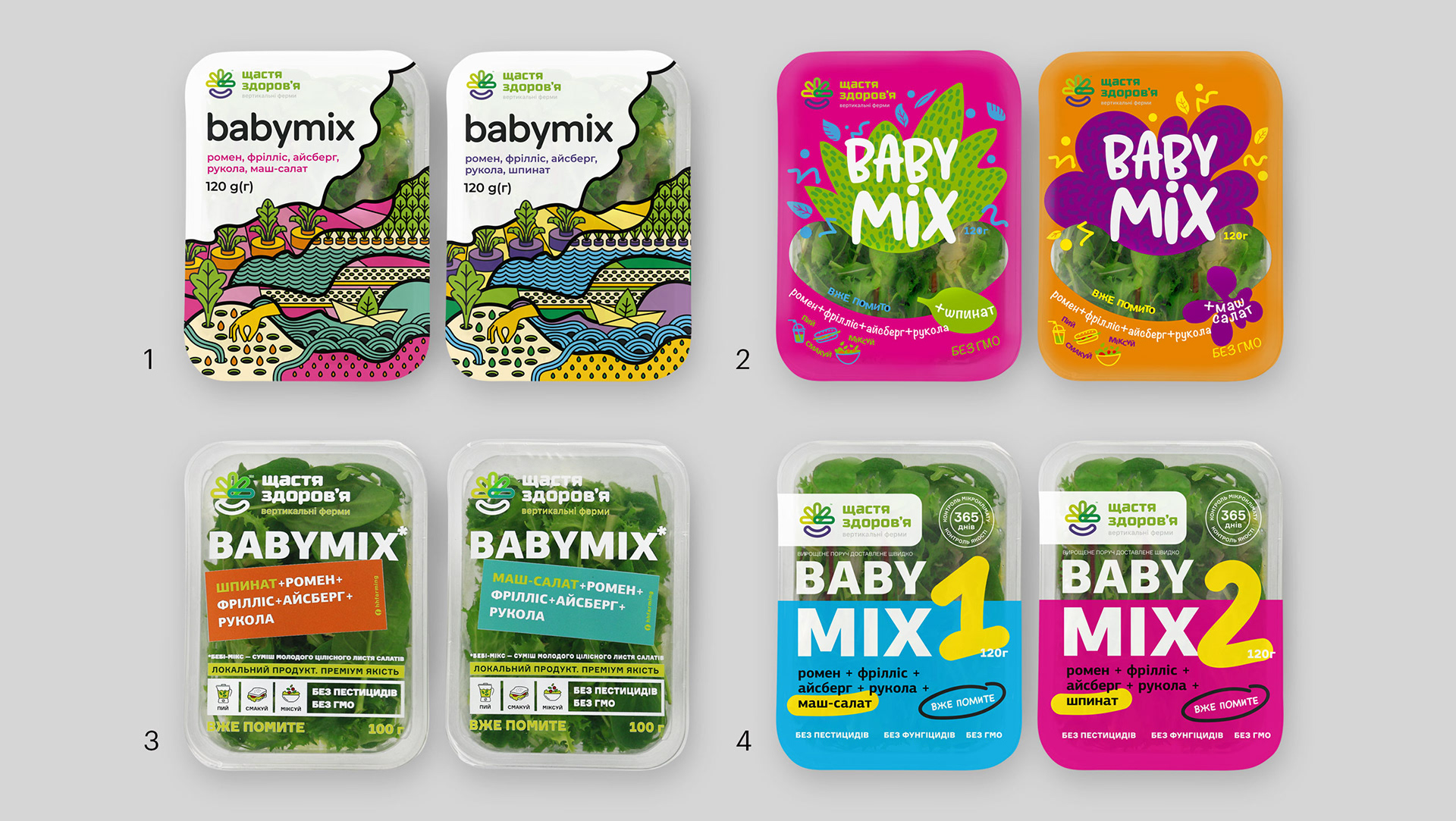
USUALLY,we do not reveal the process and intermediate developments, but not this time. It took us two approaches to generate the ideas we happened to grow on. The first approach was categorical: the most transparent packaging, modern typography, classically structured layout with infographics. And the second approach verified another speculation as the creative nature of the client with references to comics and exciting ideas on Pinterest required a bright art design. Thus, two ideas from each of the two speculations were selected for testing. |
TESTINGthat the client conducted was both qualitative and quantitative. The client cooperated with different research teams. However, the consumer choice turned out to be unanimous, with the leader winning by a wide margin. According to Yuliia Slesarenko from the Q&Q Digital agency, they had not seen such representative results in their practice for a long time. Each party – the client, the agency and research teams – had their odds-on favourite. However, the testing showed that the consumer had the final say. |
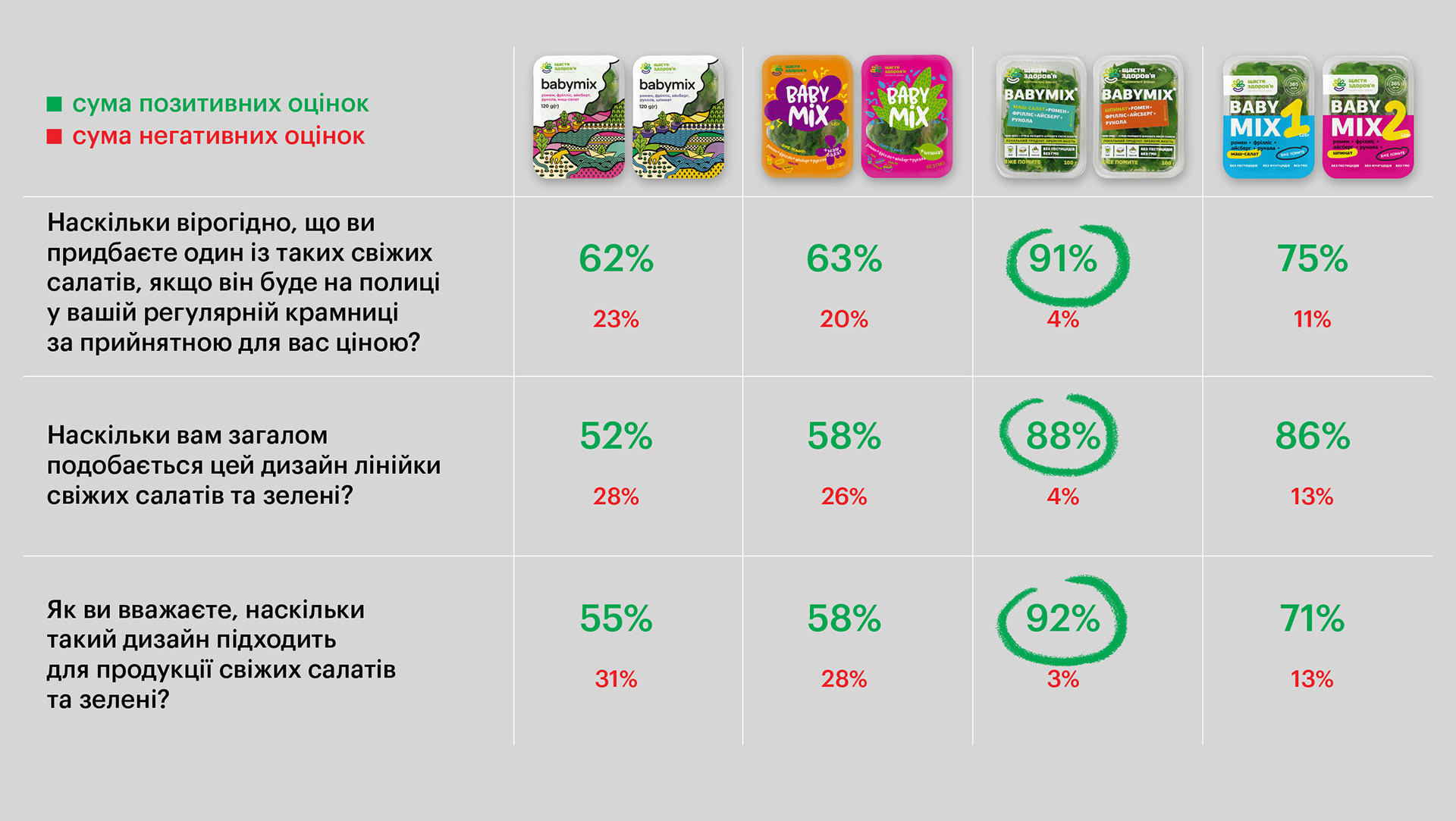
THE LEADERof consumer sympathies proved several important speculations. Firstly, naturality through transparency is what the consumer wants to see and evaluate in the packaged products. Secondly, the consumer wants to make out what is offered inside the package. Therefore, the maximum readability of the composition of salads is positively accepted. Thirdly, when buying salads, consumers are not ready for a brand new design that seems to come from the shelf of the future: categorical stereotypes have their effect. There is no denying that simplicity and obvious choice dominate the sense of beauty. |
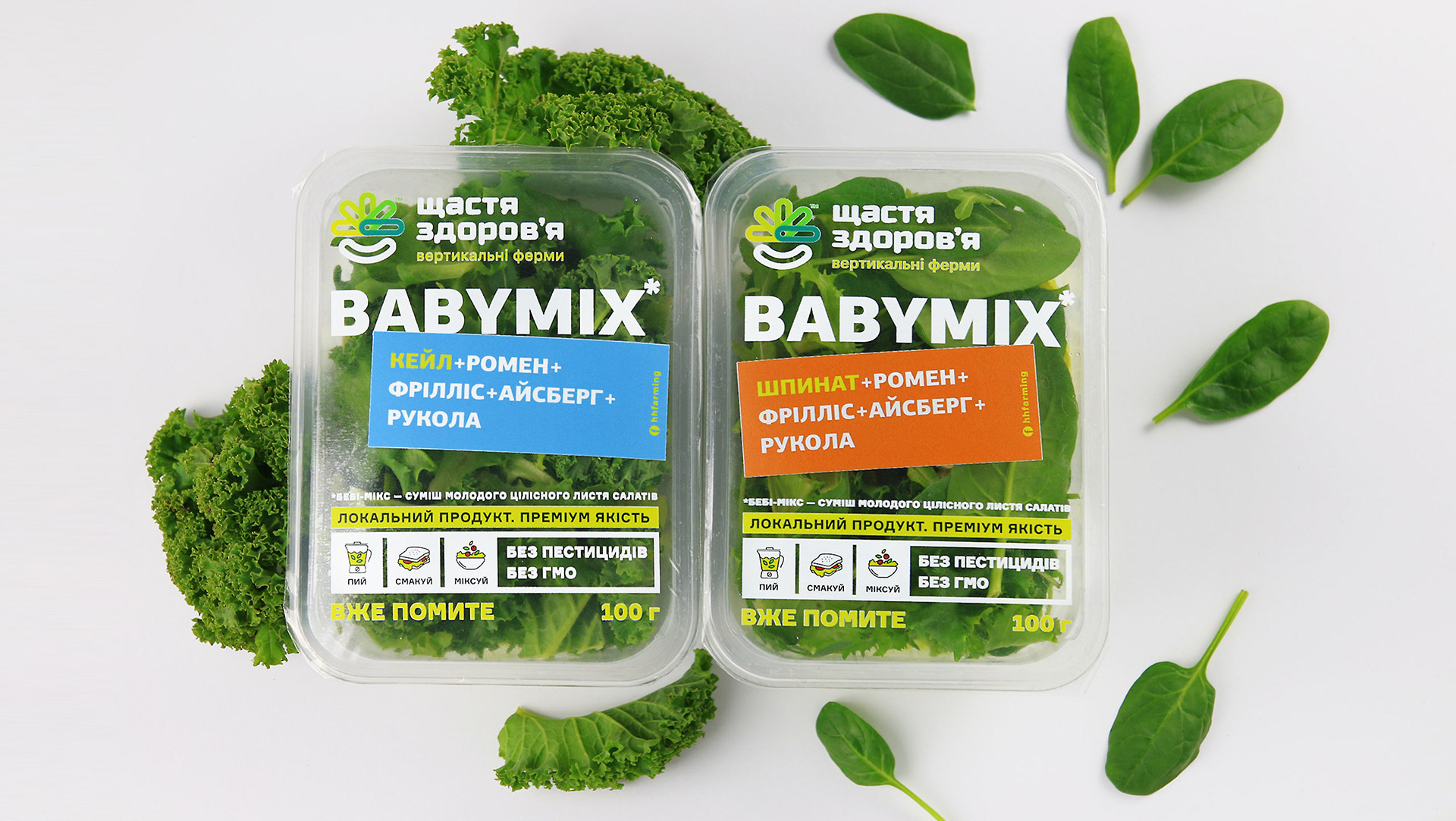
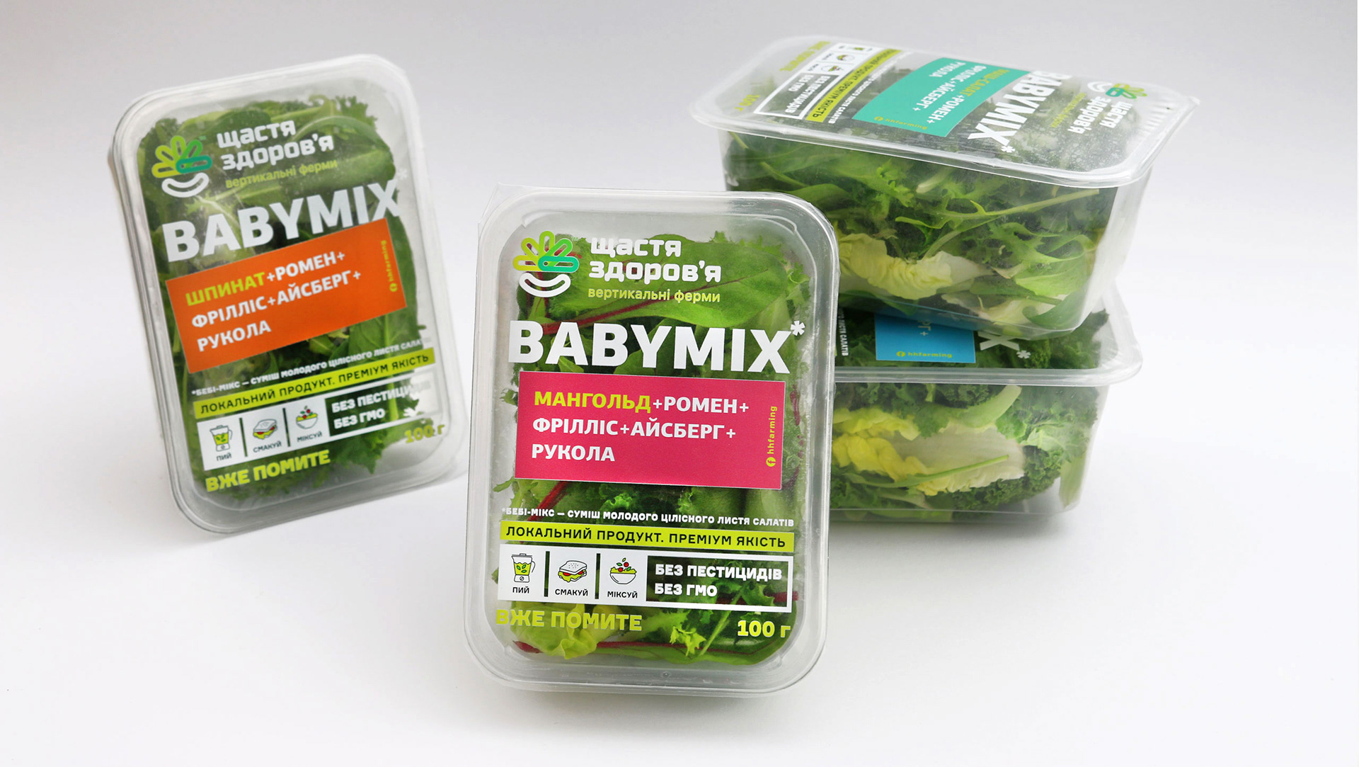
HAPPINESS HEALTHis what the brand offers prospects of. We decided to add some information value: we spread the word that inside the package, there is a baby mix – a mixture of young leaves grown in pure conditions around the block. We also encouraged consumers to have them in any format – smoothies, salads and other dishes, occasionally including them even in less healthy meals. |
ProjectCreative Director: Maxim Lesnyak |
CaseArt Director: Helena Gavriluk |

