THE RUMOR HAS IT THAT THE HISTORYof Krauff, a kitchenware brand, began in Germany over 100 years ago when German craftsman Jörgen Krauff started making frying pans in honor of his mother. Now Krauff is a Central-European company embodying the values and aspirations of its historical founder. It focuses on using the latest technologies to enhance the productivity, ease, and quality of cooking. New business goals and the preparation of a new kitchenware collection gave the client the idea that its brand needed an evolutionary update. |
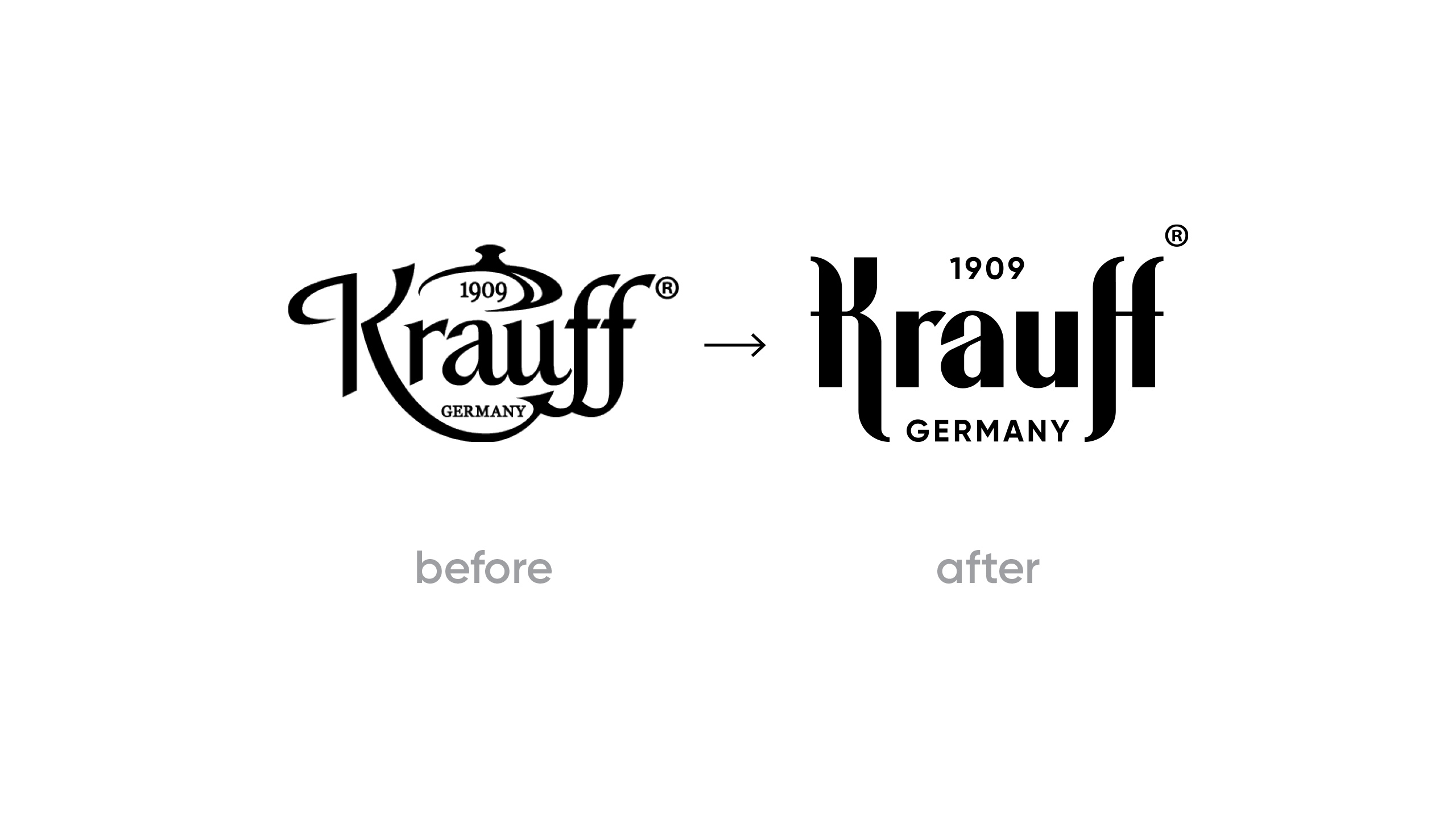
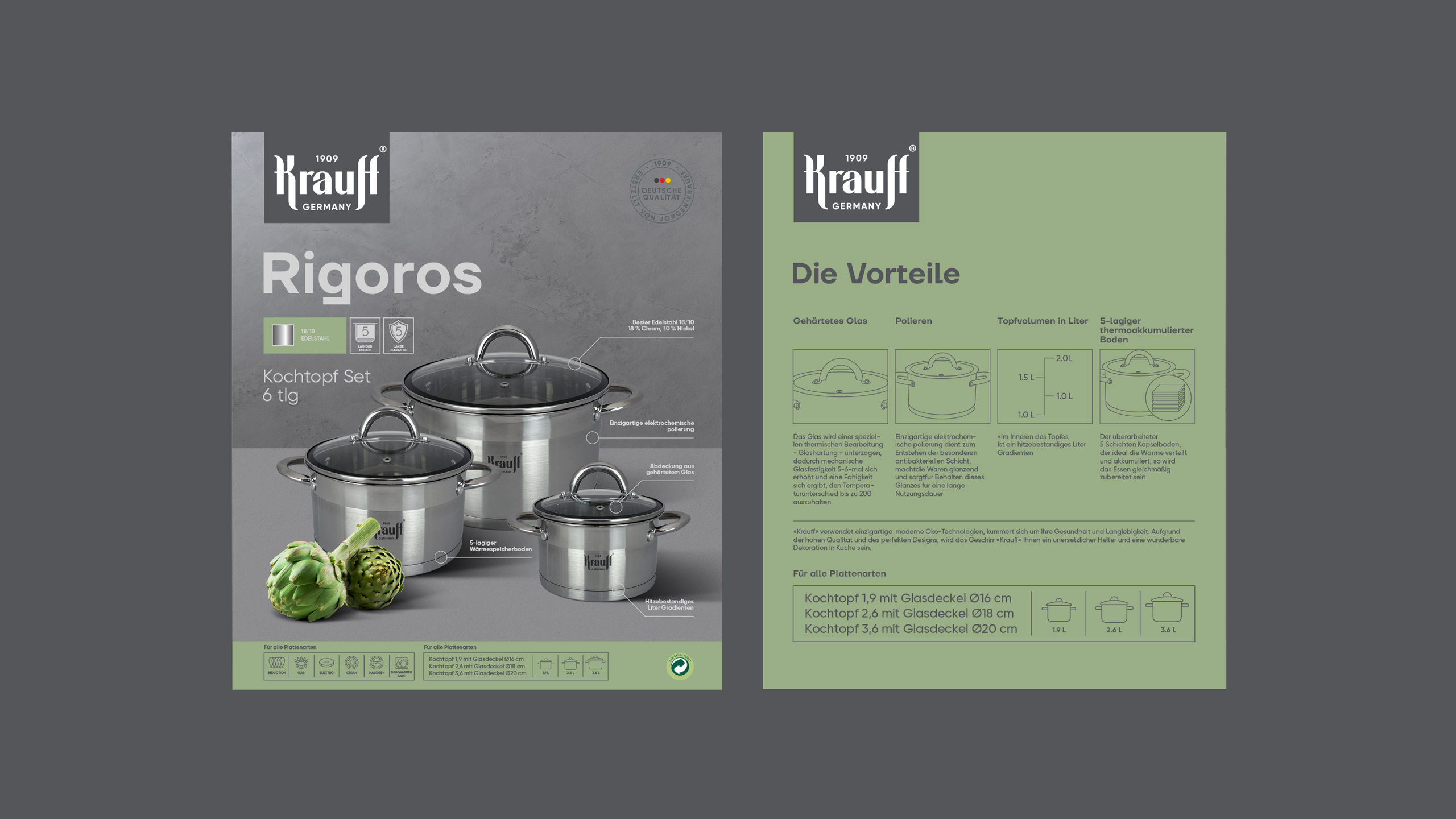
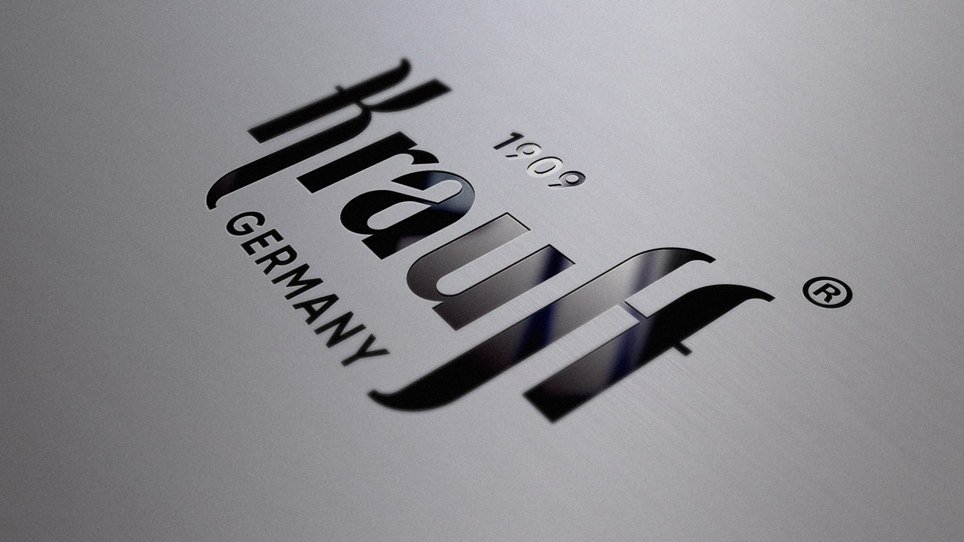
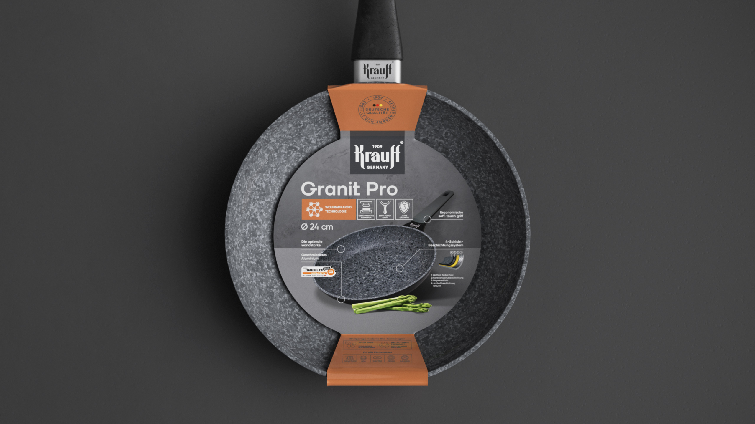
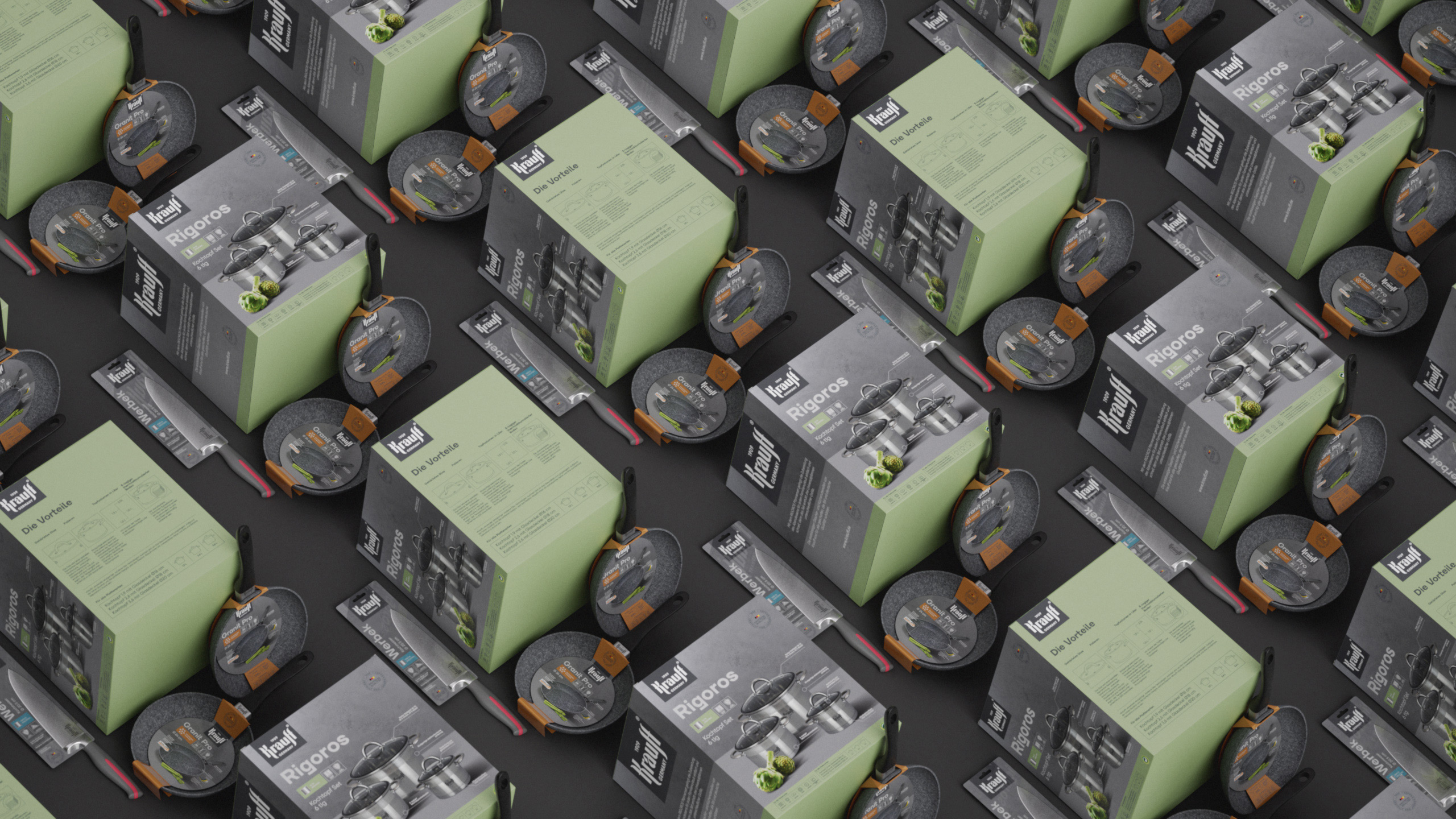
STOCKPOT IS KING.This was the conclusion we came to, having analyzed the brand’s identity. And then, we went on to redesign its logo. We decided to retain the image but make it more modern, simple, and monomark-like. The design we used for our idea is rooted in calligraphy, which enabled us to eliminate unnecessary graphic elements. Also, we created packaging for stockpots, frying pans, and knives. What was our intention for the brand redesign? We aimed to make it into a stylish German with whom you feel comfortable and safe. |
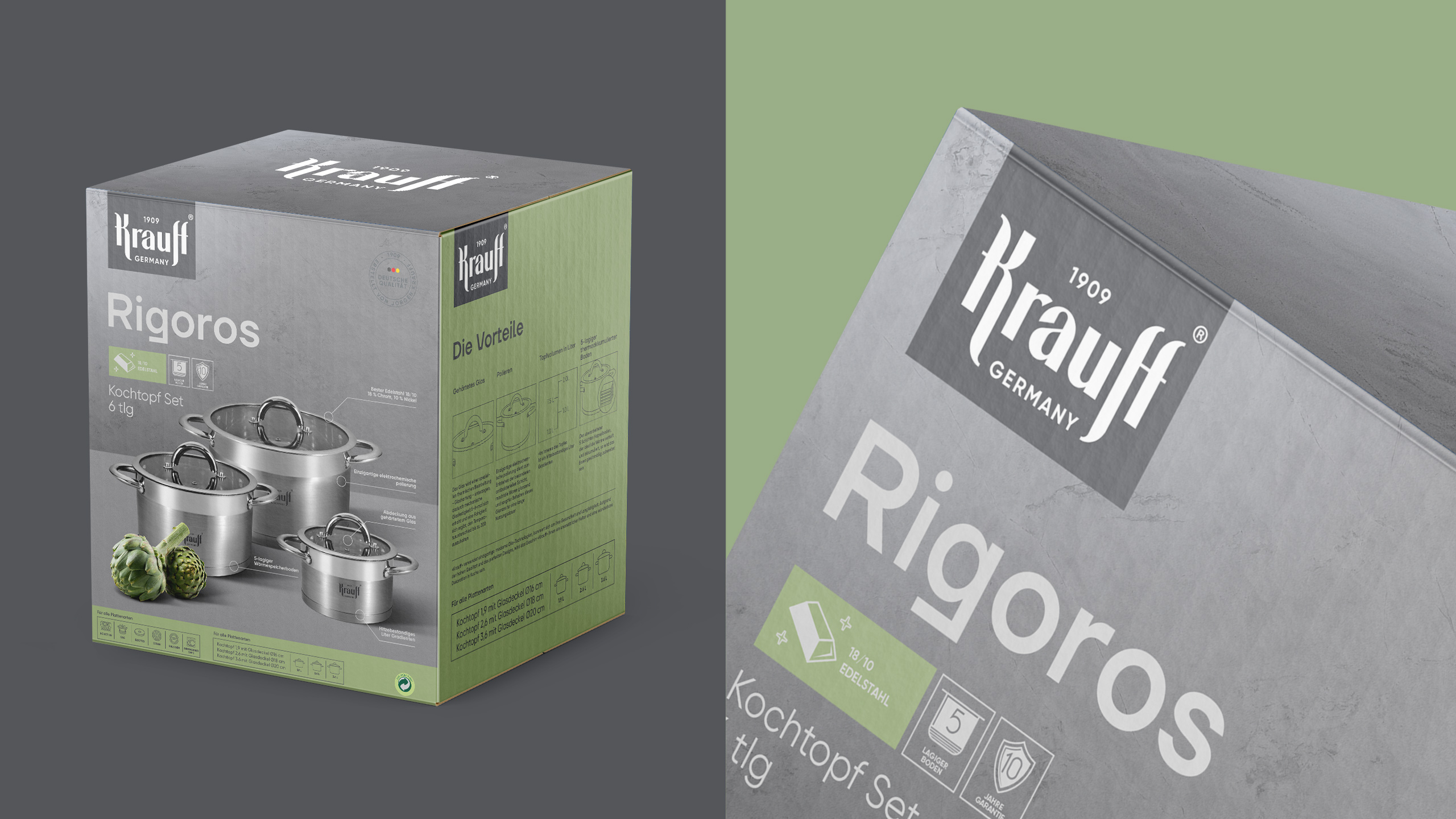
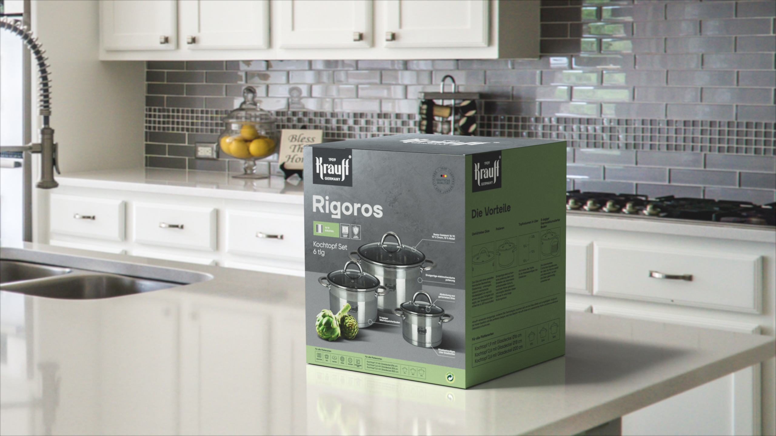
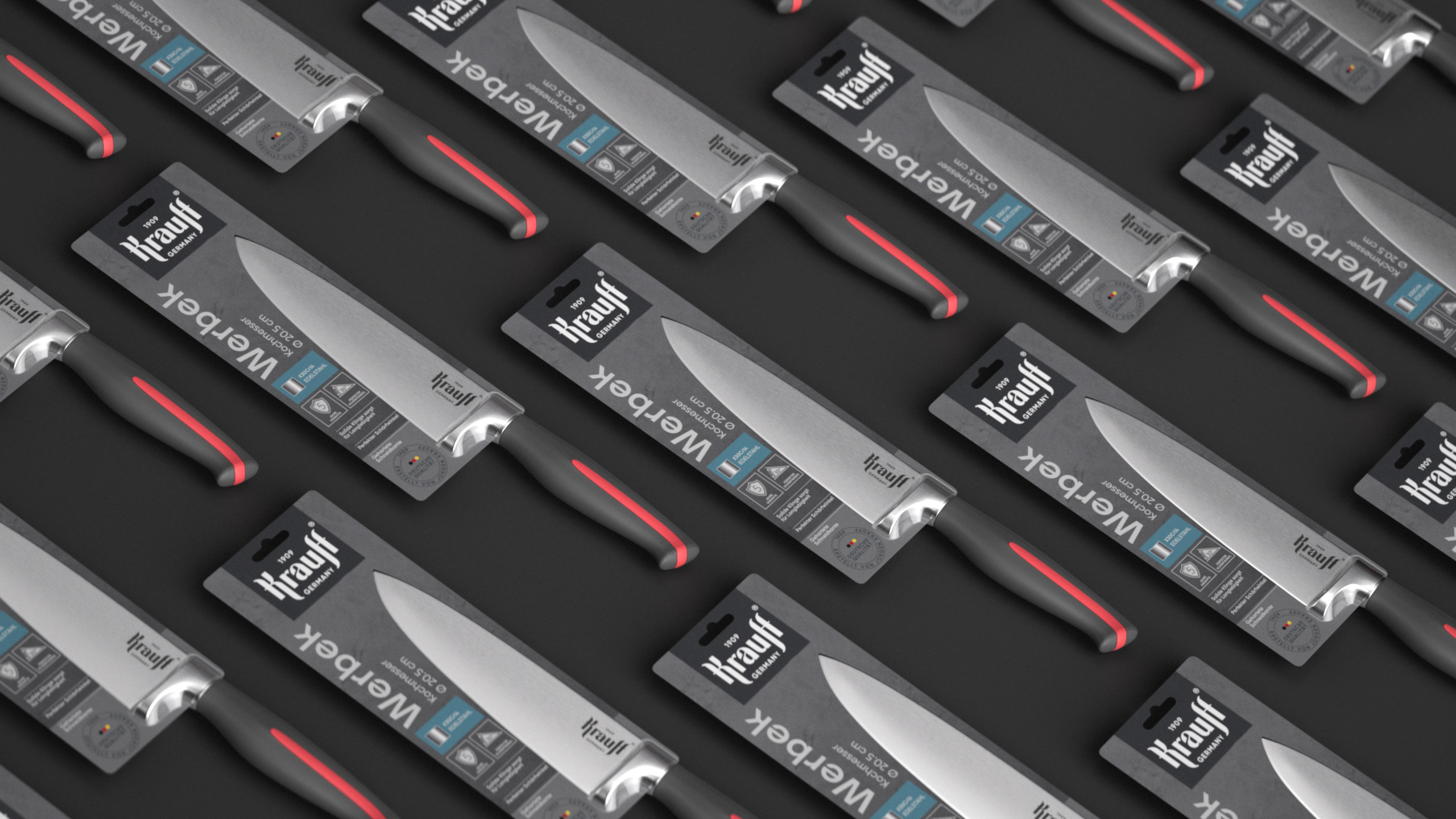
GRAY AND FIFTYshades of it became the brand’s palette, with the concrete gray background used as a foundation for our look and vivid color pairs—as a finishing touch enabling the navigation within the sizeable product portfolio. In a characteristically German manner, the brand broadcasts a lot of essential functional information about itself. Each package features at least 3 to 4 key messages with a clear hierarchy: from the driving unique selling proposition to text messages and icons indicating the product’s features. Working on this project, our designers became intimately familiar with the German keyboard layout and made the Deutsche Qualität stamp the proof of the brand’s German origin. Our design system proved to be as robust as a Krauff skillet, enabling the client to adapt the basic concepts initially created for just three categories for its other SKUs effortlessly. |
|
Project |
Case |

