ONCE UPON A TIME, THERE WAS(actually, there still is) in the UK quite a serious brand of serious products with a serious purpose—to ensure protection and safety at production sites. Its name is Ogrifox. Protective clothing and accessories are sold online under this brand. As it happens, it’s intended for serious consumers in serious working professions. And one day, brand co-owners thought: “Aren’t we just too serious? How can we ease not only the working conditions for our consumers but also our communication with them? Because we don’t even have any human factor to build brand loyalty, just serious e-commerce. Why don’t we create a mascot?” |
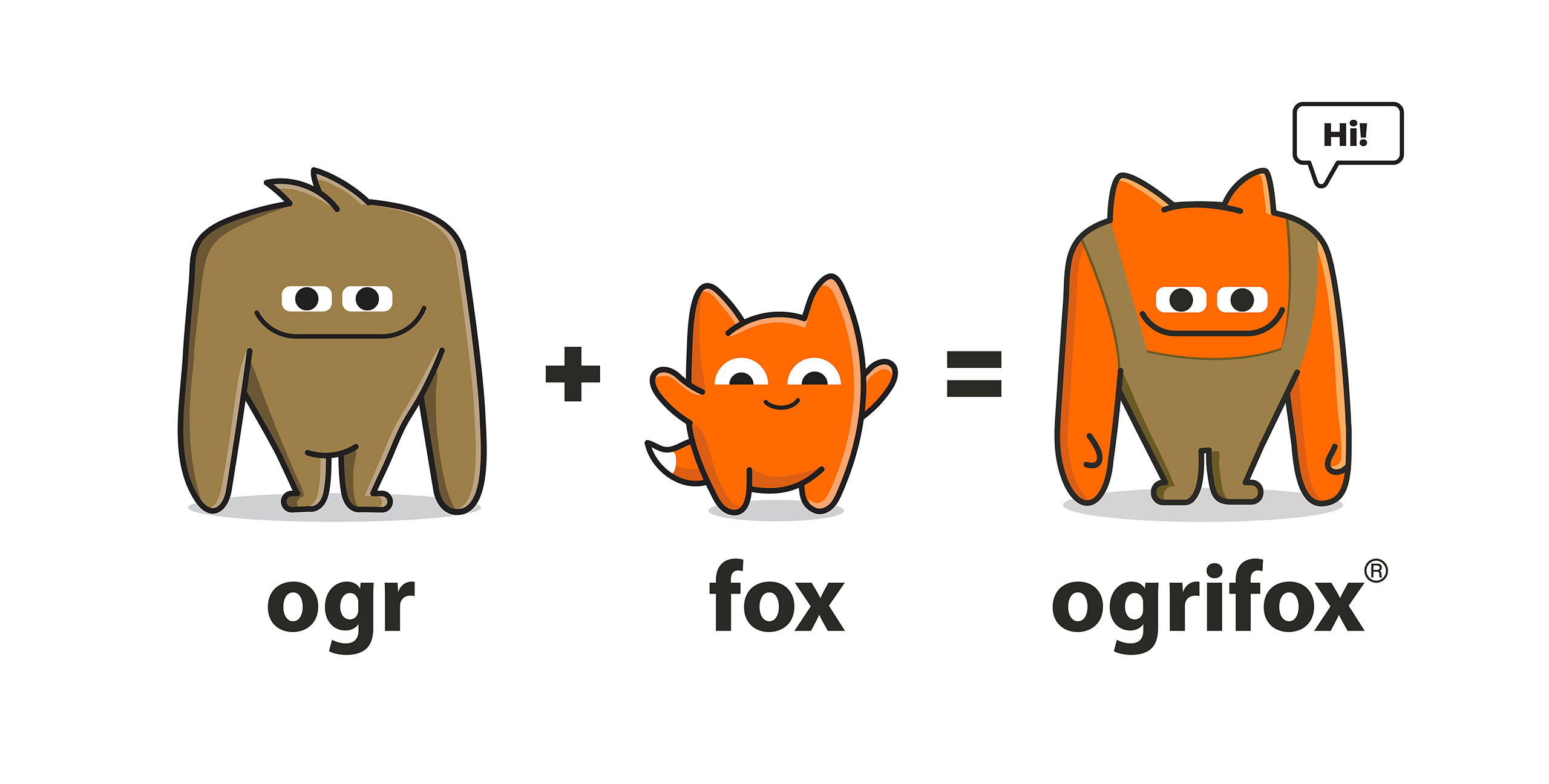
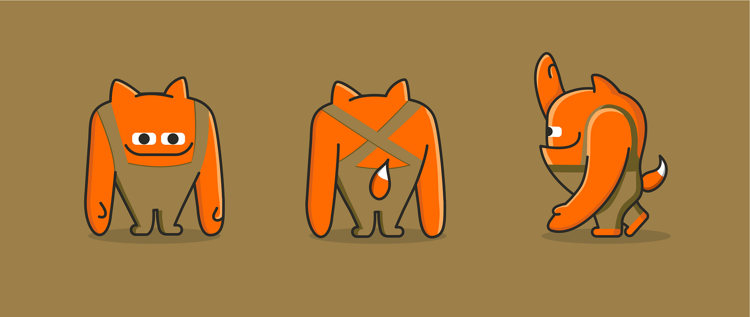
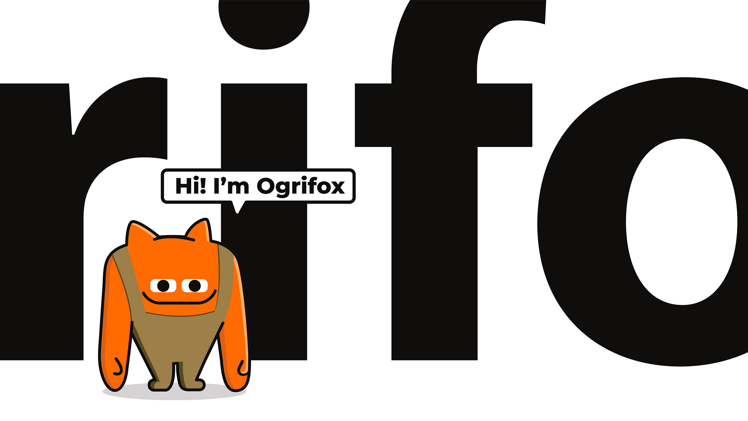
AND IT COULD BE CREATEDfrom the things already present in the brand: Ogr, a mighty, hard-working giant, and Fox, a clever and friendly fox. That’s how the brand started cooperating with Dozen’s team, which led to the creation of the mascot and an updated big brand book. There were two characters at first, but then we decided not to overcomplicate it (or vice versa—to complicate the task) and combine the two entities—the giant and the fox—into Ogrifox. And thus he became a charismatic anti-cannibal with an almost human face and a fox tail. |
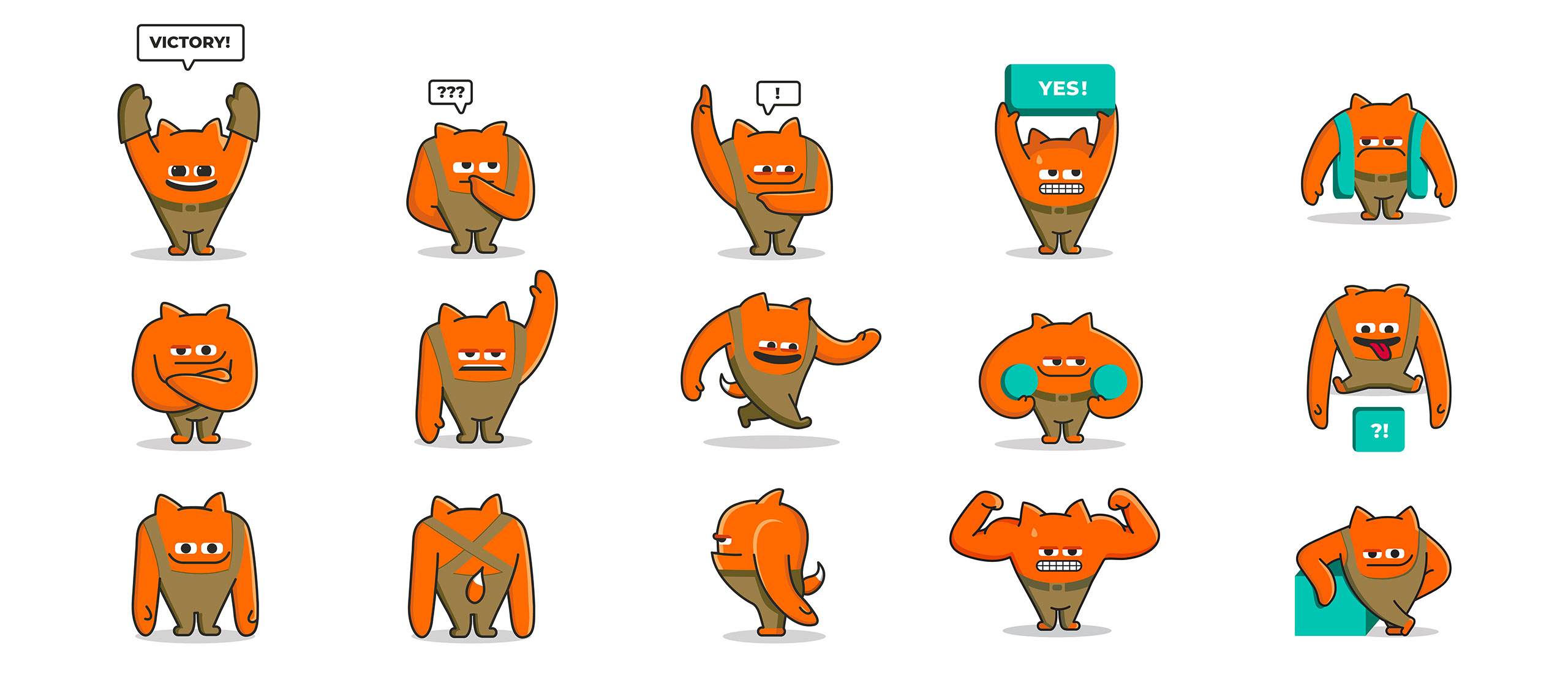
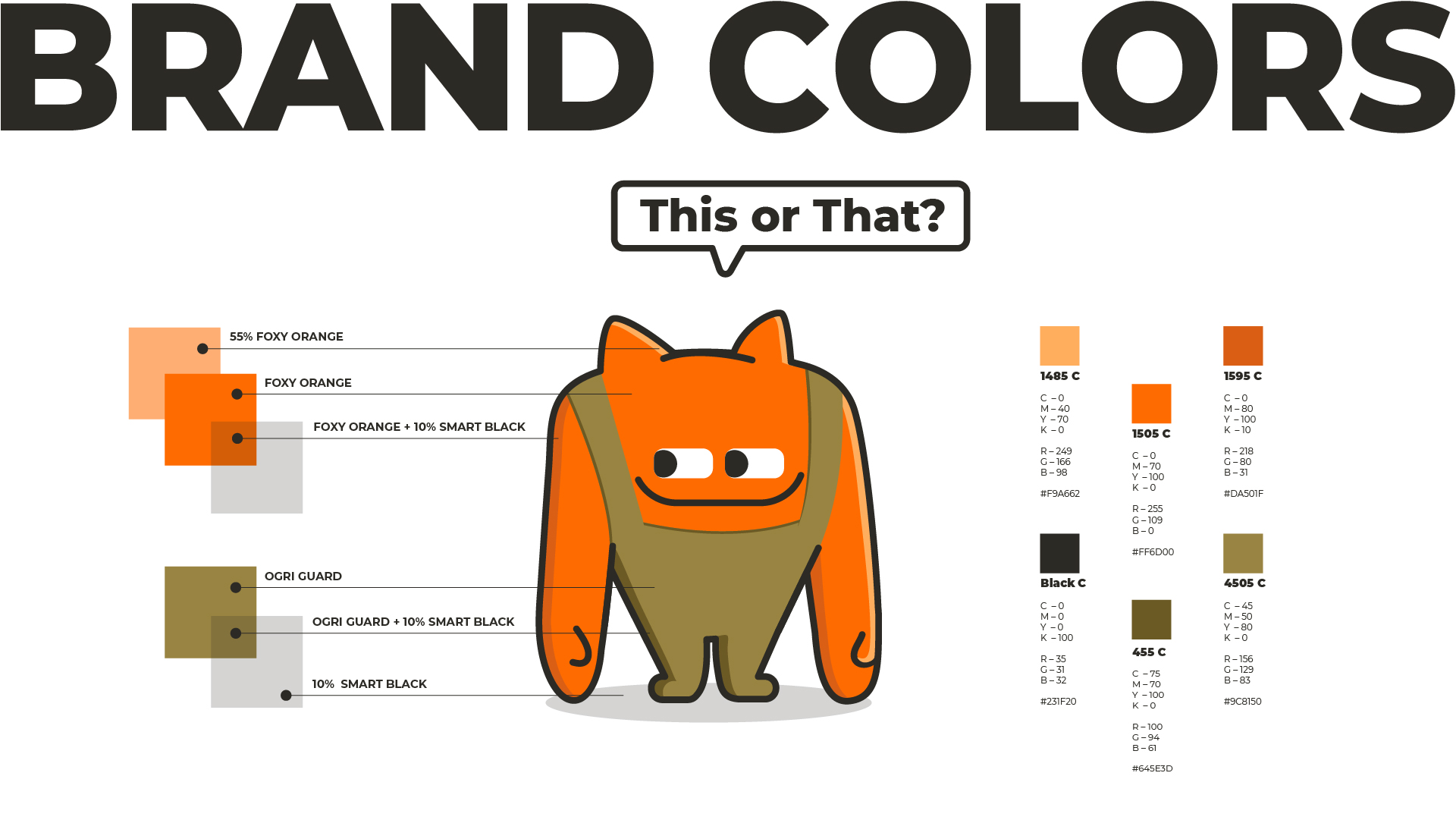
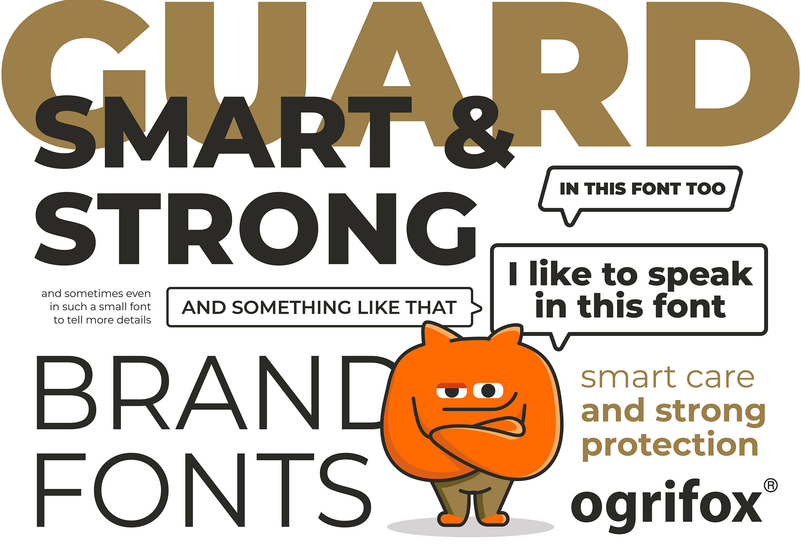
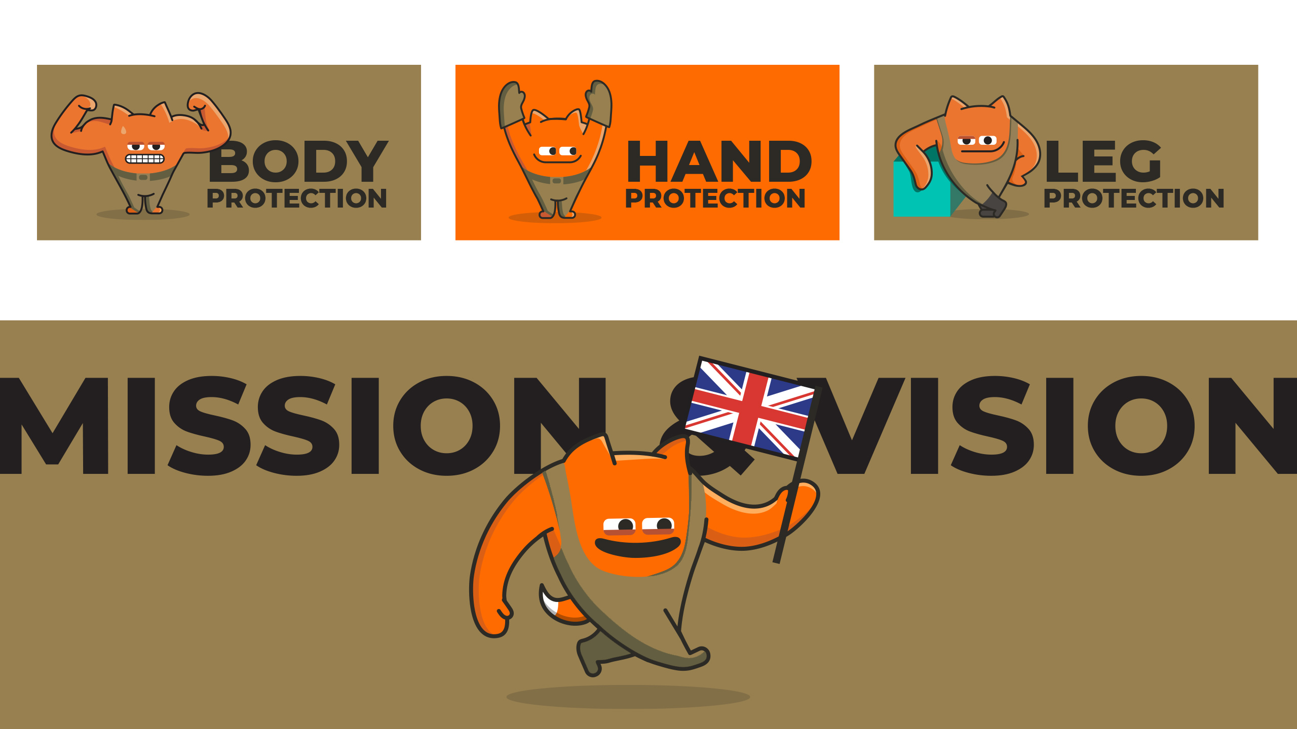
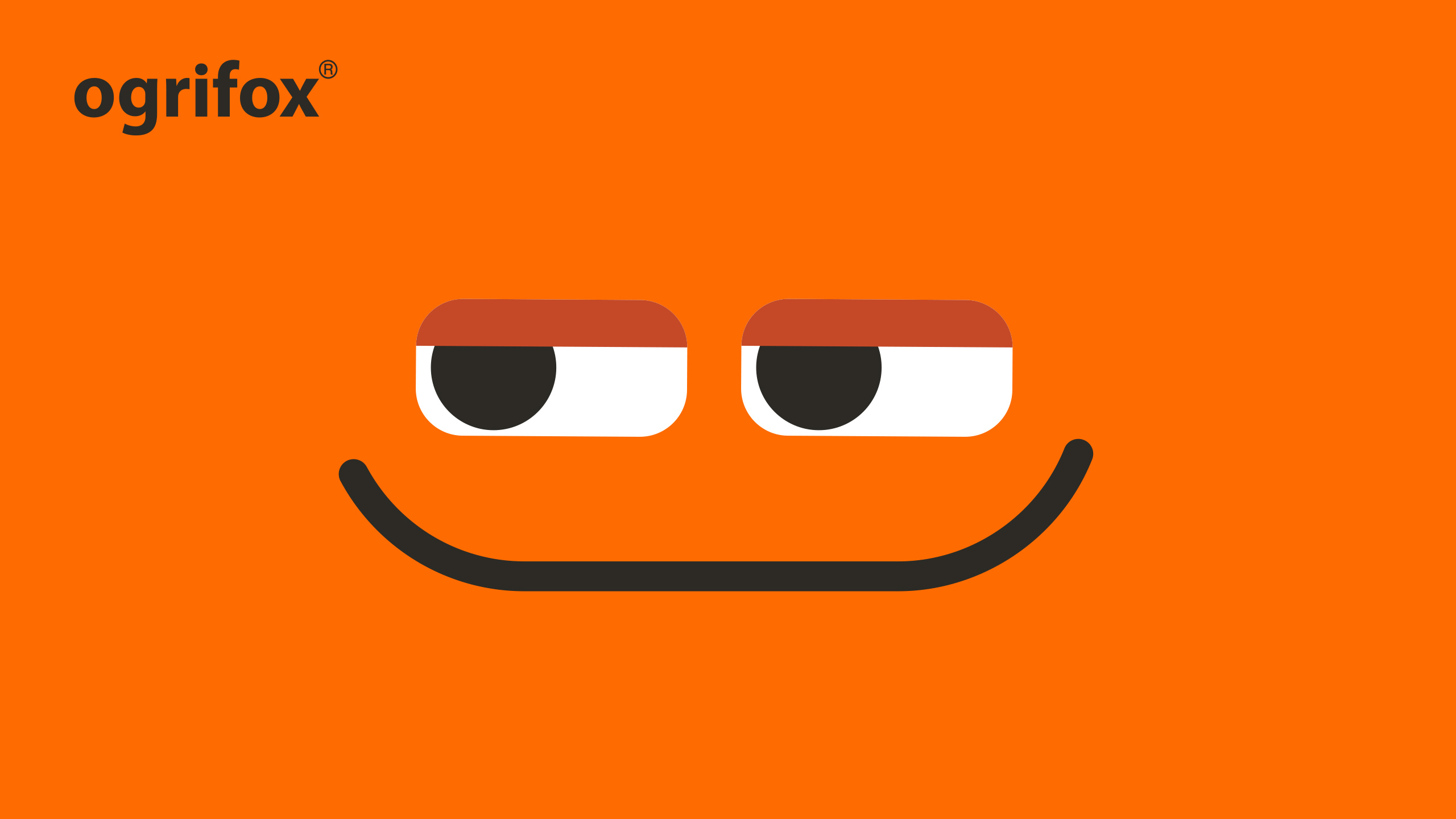
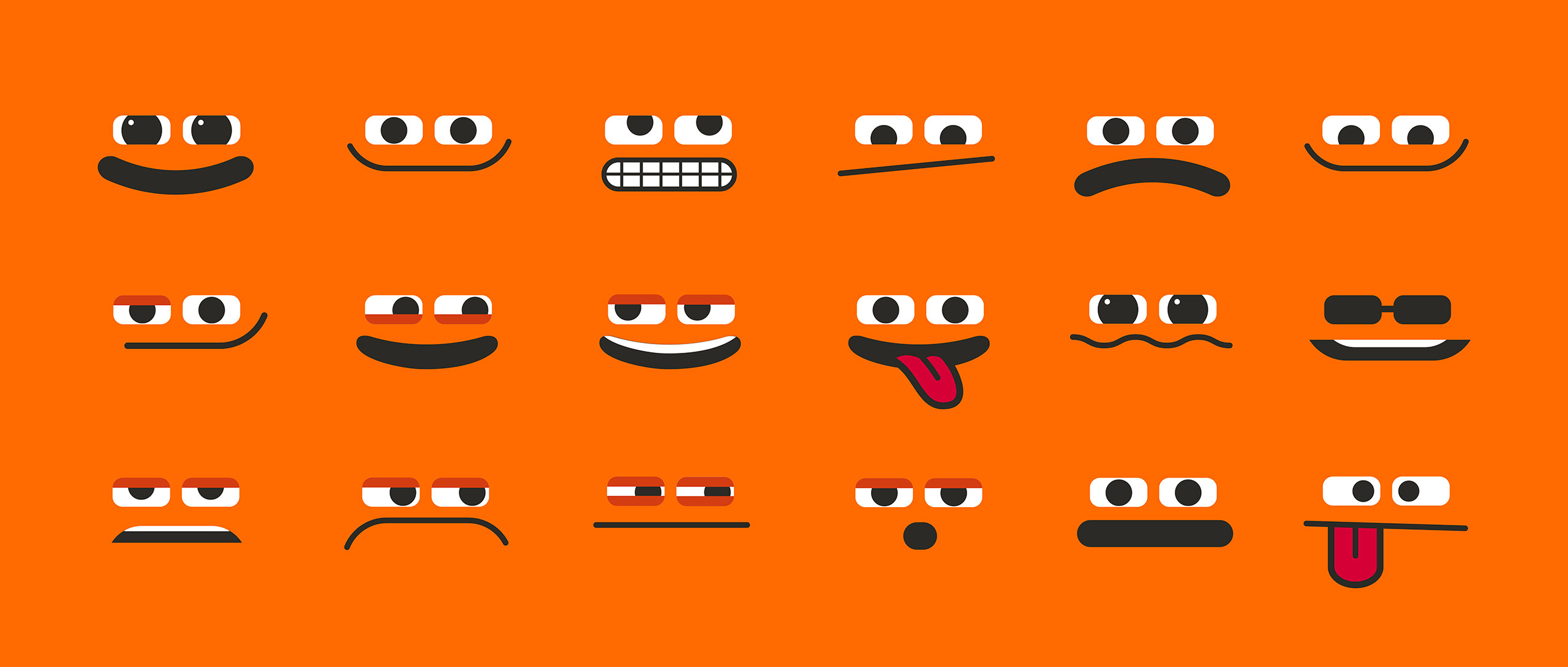
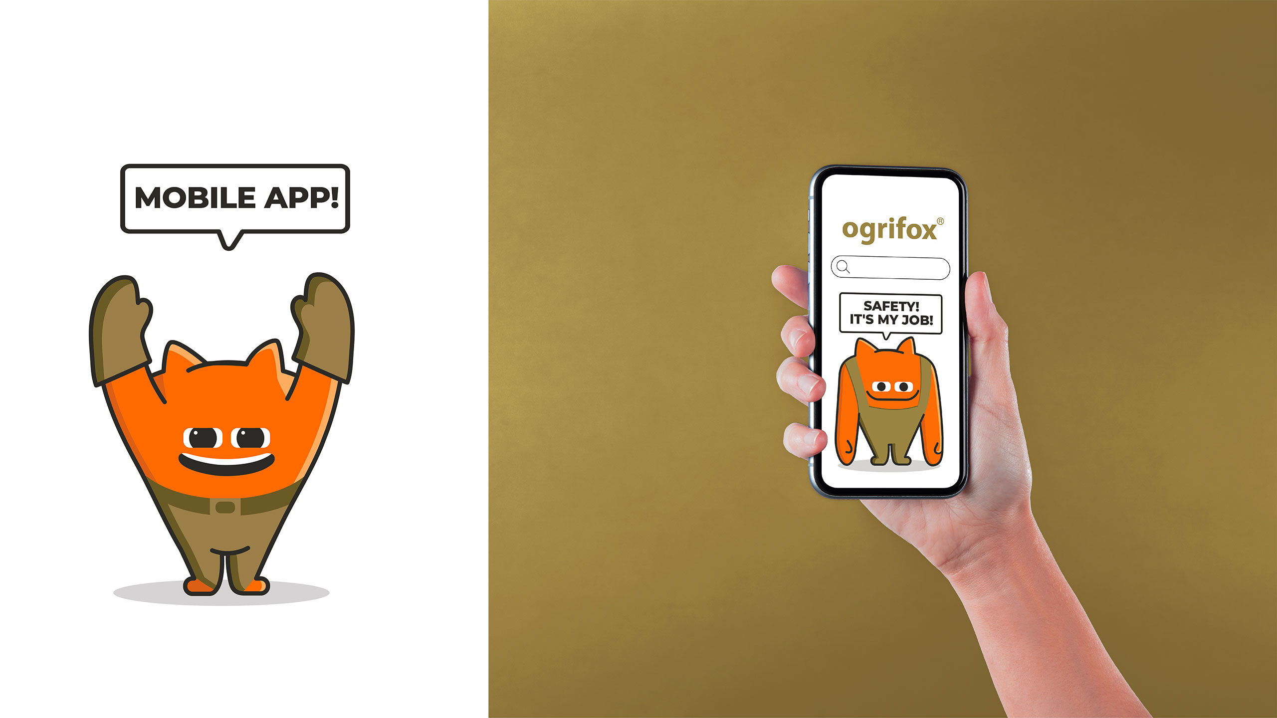
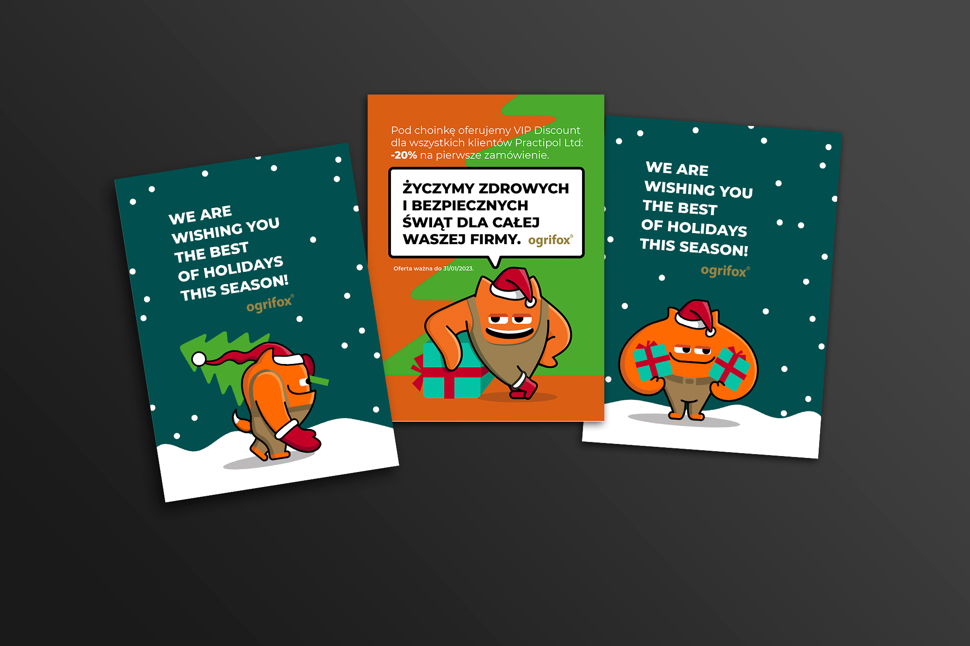
THE PERSONIFIED BEINGrequired a whole construction set of emotions and poses. We designed two sets, one with faces and another one with poses, which can be combined to get multiple non-verbal expressions for our mascot. As an active form of verbal communication, we proposed a bubble that can be used in digital communication and merchandise since our Ogrifox always has something to say besides flexing muscles or wiggling eyebrows. |
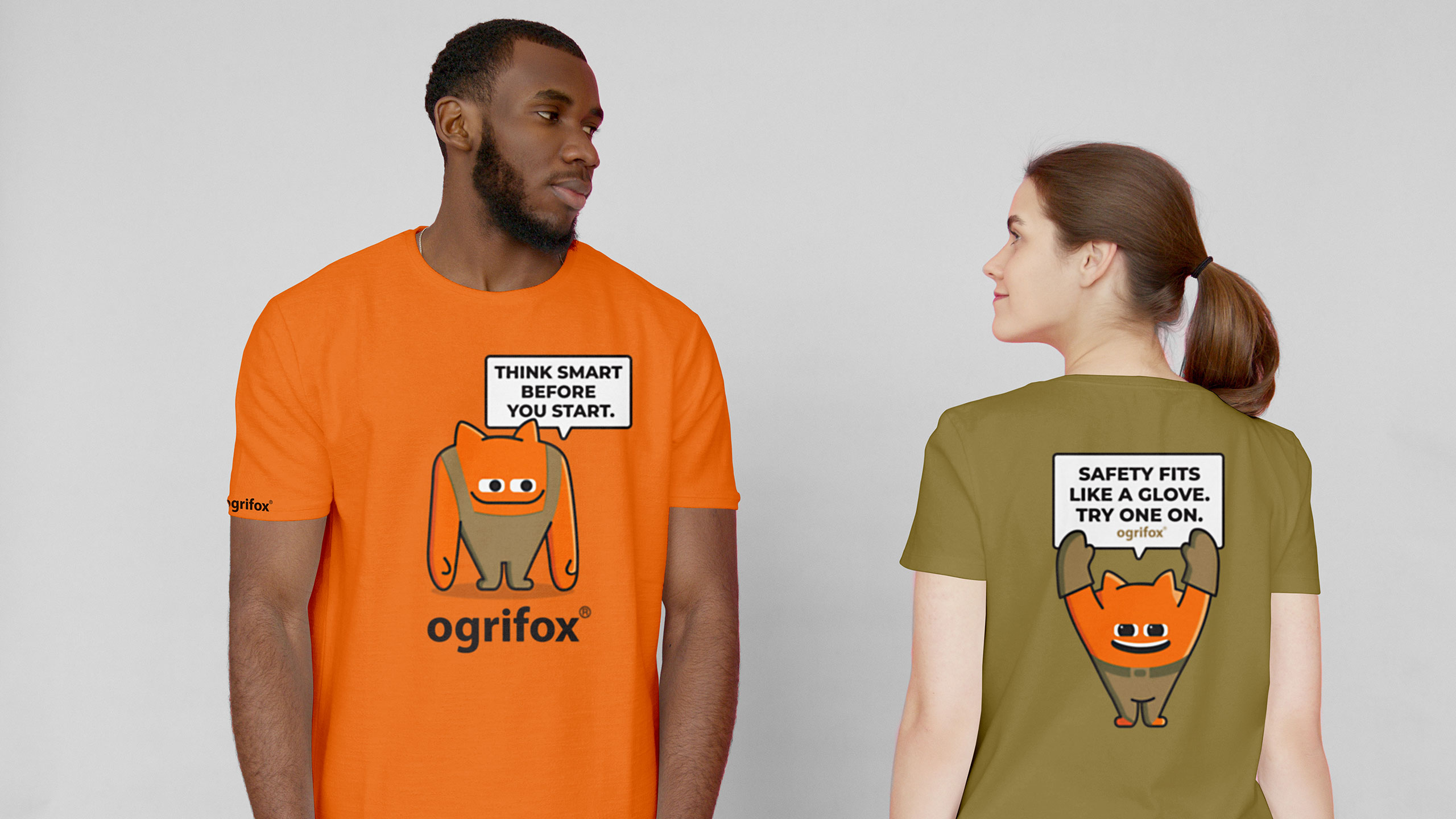
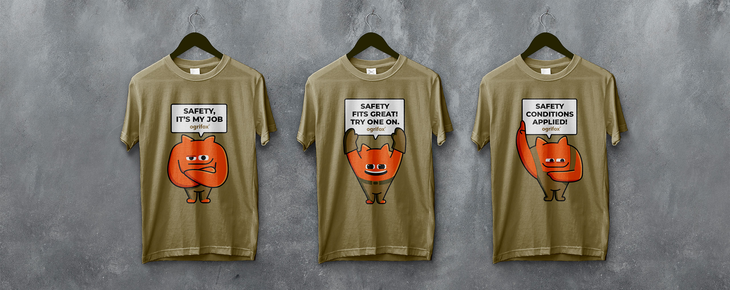
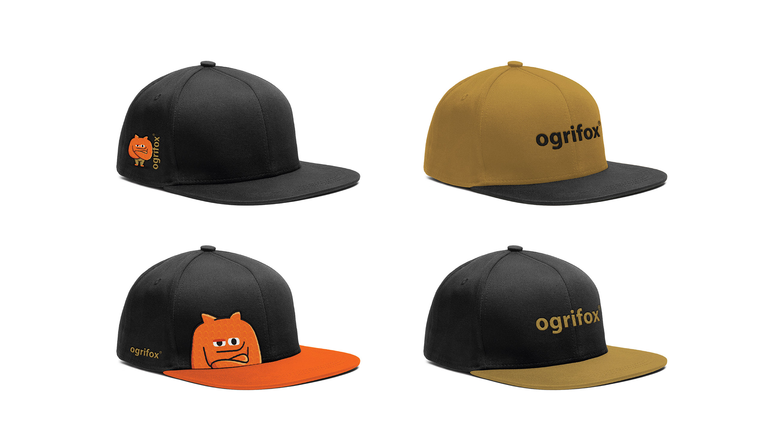
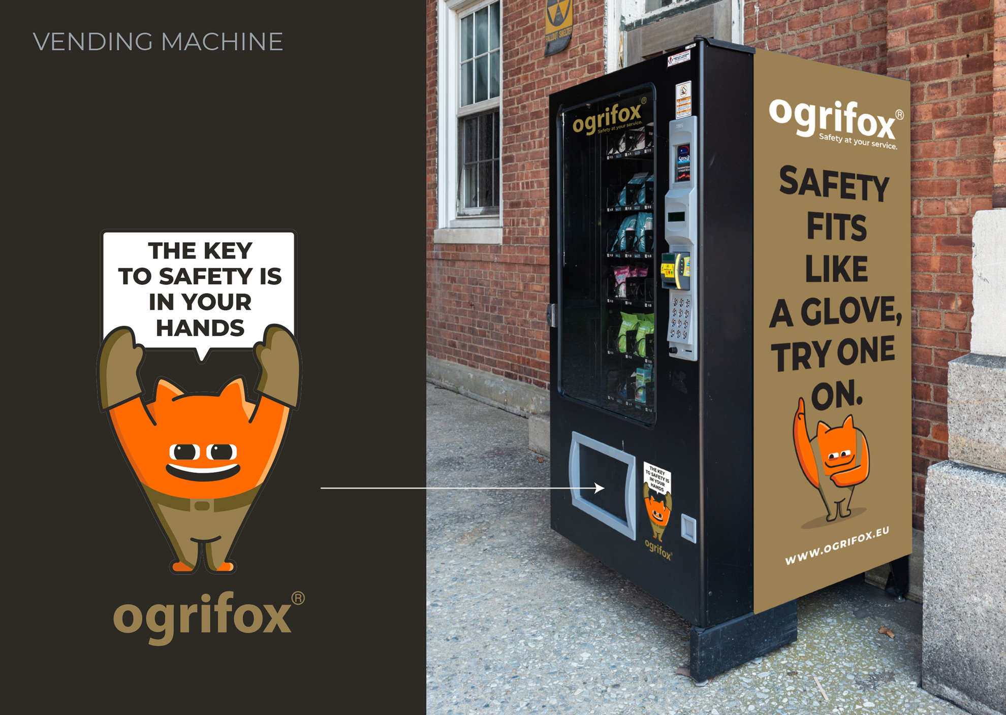
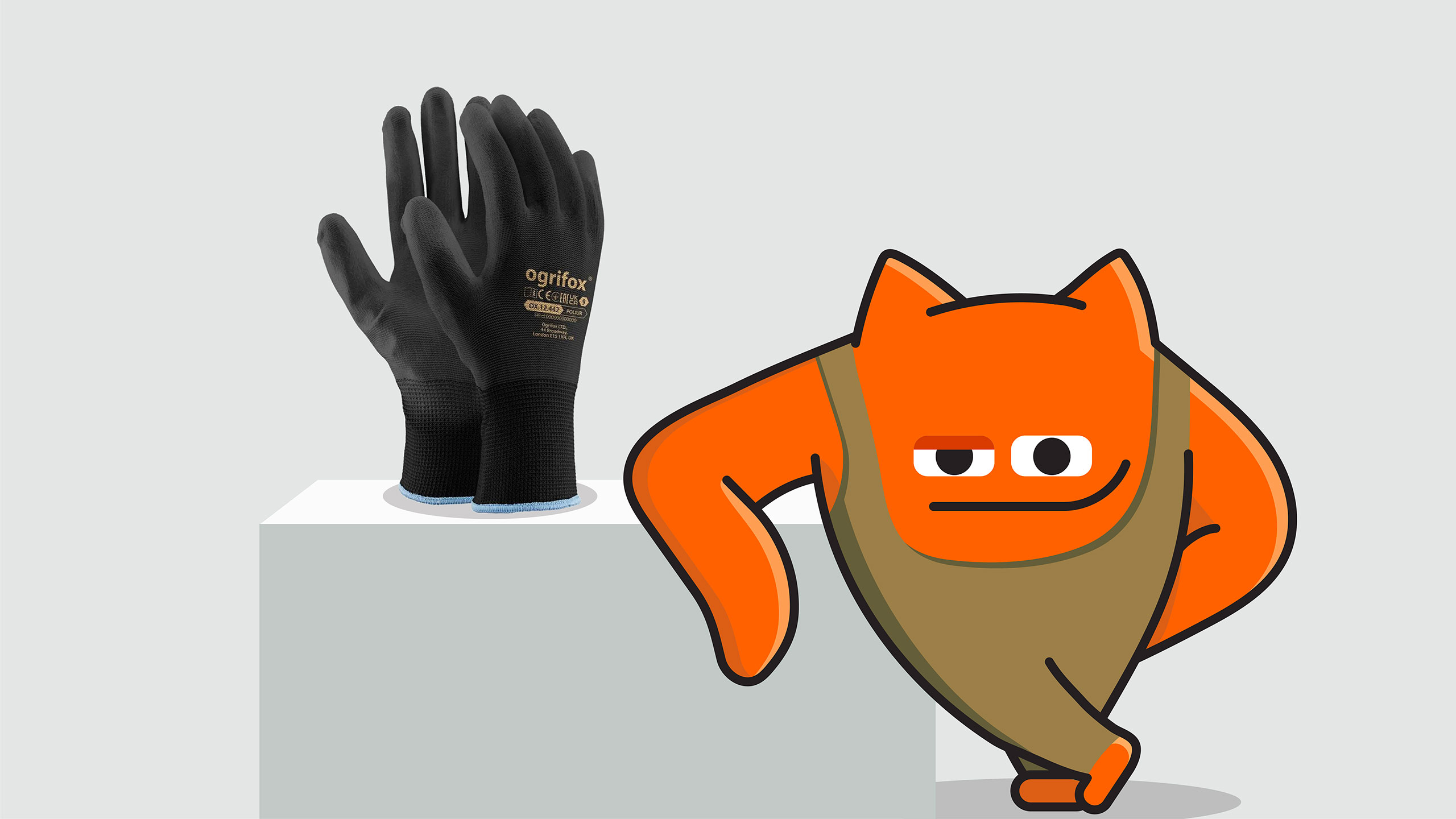
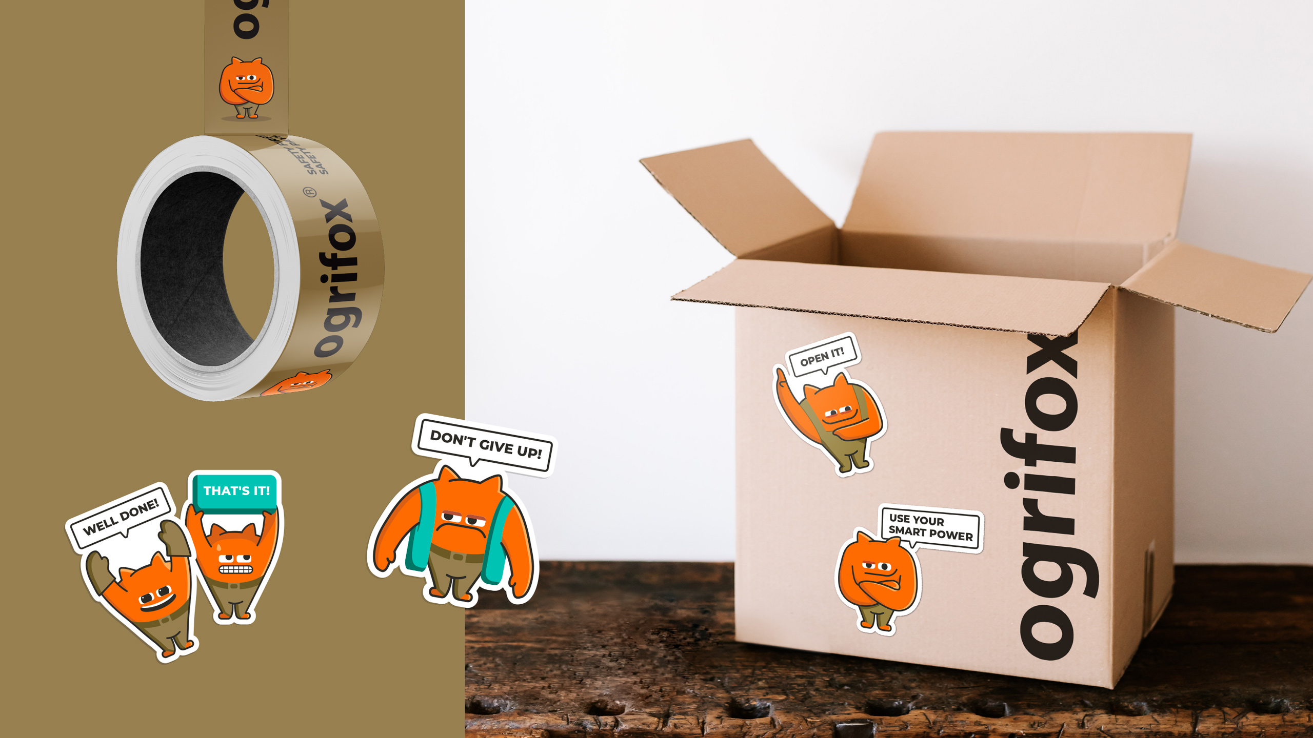
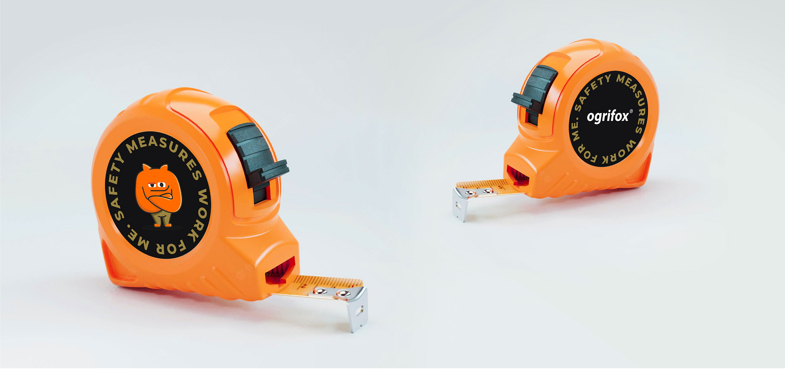
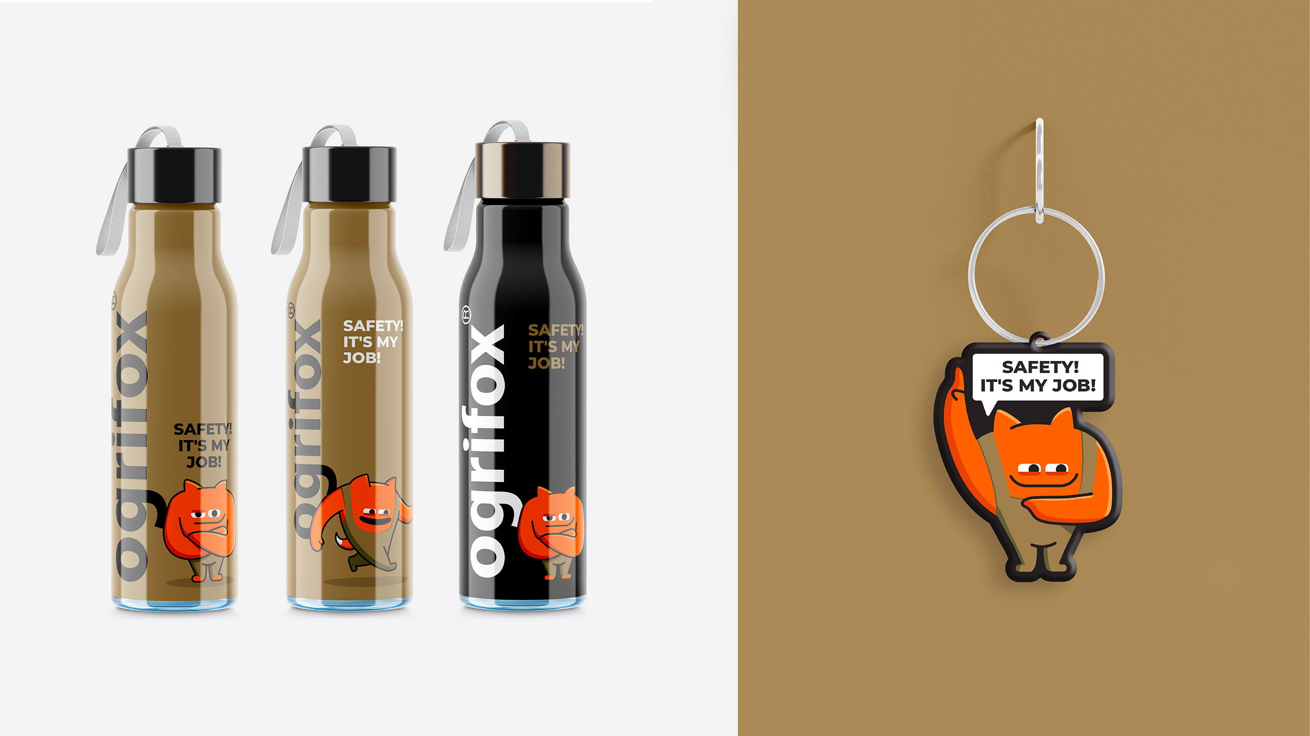
THE BRAND BOOK BECAMEthe visual guide that’ll help our client to handle Ogrifox on their own in the future. The mascot turned out to be quite agile, energetic, and expert— just like the target audience avatar as imagined by the brand. |
|
Project |
Case |

